Valeriia Kiriykhina | Portfolio
Communication designer and animator
My name is Valeriia. I’m a communication designer
What do I do?
I create visual identities for brands and look for new ways to tell stories through design. My work spans branding, illustration, animation and other creative disciplines.
I like trying new things and mixing techniques. Each project is a chance to expand my visual language and turn an idea into something expressive.
Branding | VOKRUG
Brand: Vokrug
Problem
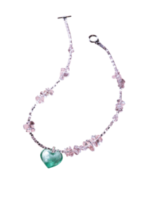
Pearl jewellery is often seen as formal and old-fashioned. Vokrug needed an identity that keeps the elegance of pearls, speaks to a younger audience and works across very different touchpoints: staff clothing, badges, posters and events.
Idea
The identity is built around the pearl itself: its round shape, its soft shimmer and the sea it comes from. The name is set in beads, as if strung on a thread, and gradients borrow the pearl’s shifting colour. A story about a pearl farm adds a human side, where the team are not just sellers but marine biologists and «mother oysters».
Result
Vokrug is a jewellery boutique specialising in pearl jewellery. I developed its visual identity and applied it across the brand’s materials.
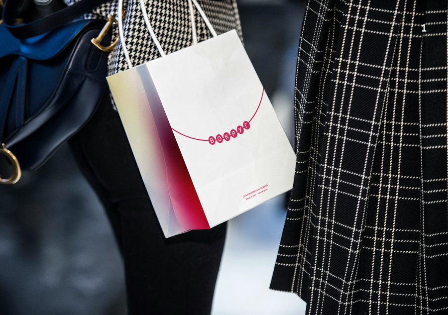
Illustration | KONIX
Brand: KONIX
Problem
Konix Brewery has a wide range of beers, but on the shelf they can look like just another set of cans. The brand needed a visual language that would make each beer instantly recognisable and give people a reason to pick a favourite.
Idea
Turn the brewery’s moose into a trio of friends, each one embodying the personality of a beer style. Instead of describing flavour with words alone, we let characters show it through their hobbies, colours and mood.
Result
I illustrated three moose friends for Konix Brewery, each with a personality drawn from the flavour of its beer:
- The IPA moose is a fearless skater with a bright, high-energy palette that echoes the beer’s tropical and citrus notes.
- The stout moose is a calm meditator in a ring of candles. Deep browns and warm oranges reflect the rich coffee and chocolate character.
- The sour moose is a hiker in hot pink and acid green, with the tart, juicy contrast of the sour in its colours.
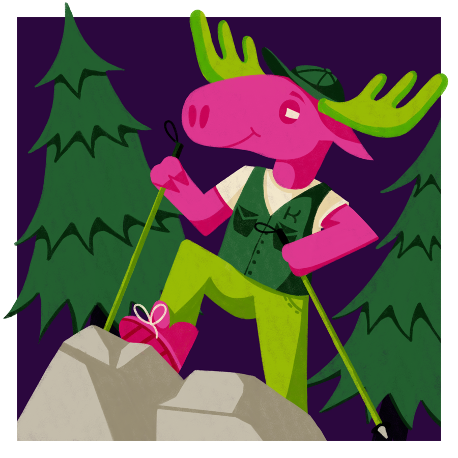
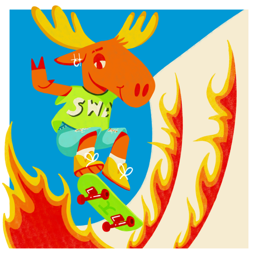
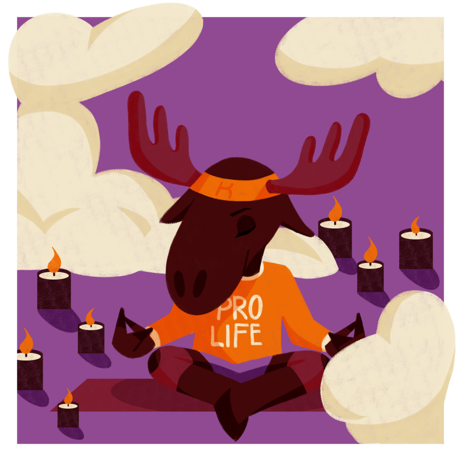
Illustration | Calendar
Problem
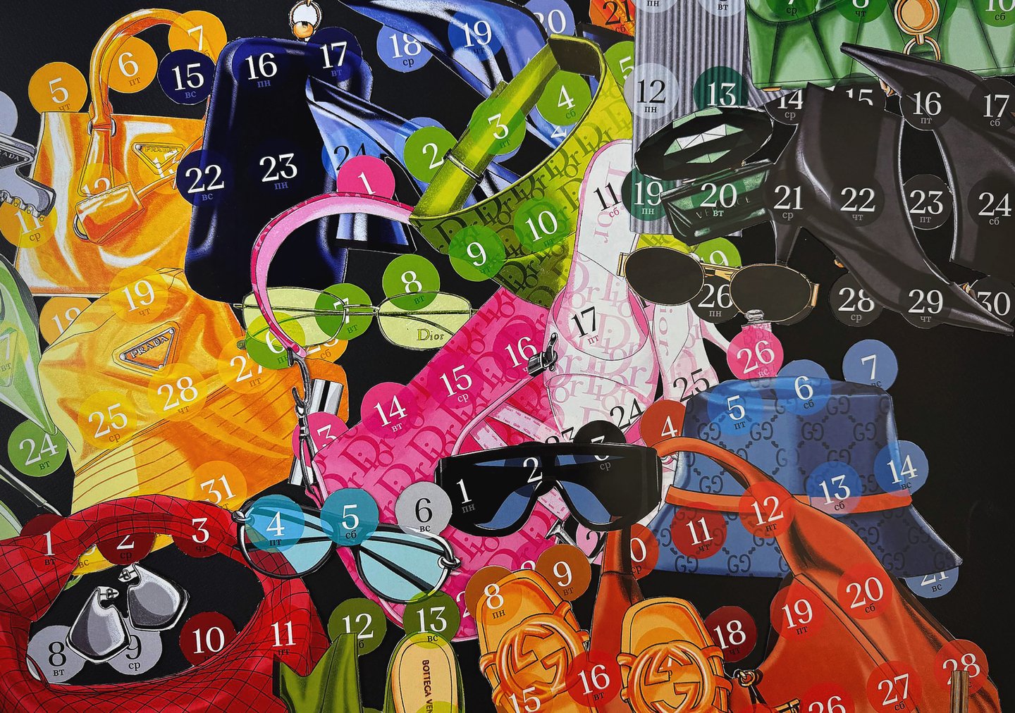
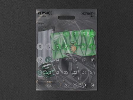
Fashion moves fast, and it’s hard to keep up, so it helps to start preparing in advance. An ordinary calendar doesn’t help with this: it shows dates, but not which pieces and collections will matter in the months ahead.
Idea
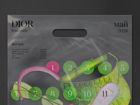
Turn the calendar into a year-ahead shopping guide. Each month gets its own brand and its own transparent bag, as if the pieces were already bought and packed inside. The dates become part of the look: they sit on top of the handbags, shoes and accessories, while an «inside» list shows what to look out for.
Result
I designed a wall calendar of luxury brands in a «each month, its own bag» format. It works as a unique decoration for fashion lovers and anyone who enjoys unusual decor.
Book layout | METI
Project: Layout design for a science book series
Problem
Books about cosmic signals and space communication are full of unfamiliar terms, dates and names. Without a clear structure, this density can overwhelm readers who are curious about the topic but not specialists in it.
Idea
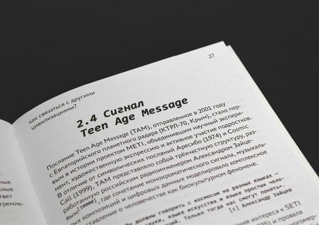
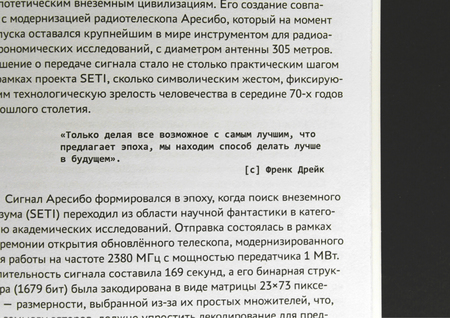
Build the layout around reading rhythm. A strong hierarchy guides the eye, and short explanations of complex terms sit right next to the text where they appear. The goal is for the reader to move through difficult ideas without losing the thread or the interest.
Result
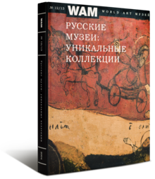
I designed the layout for a science book series exploring the mysteries of cosmic signals, the history of space communication research, and the scientists behind projects that send messages into space. My focus was on creating a clear visual structure and a reading rhythm that makes complex ideas accessible and engaging.
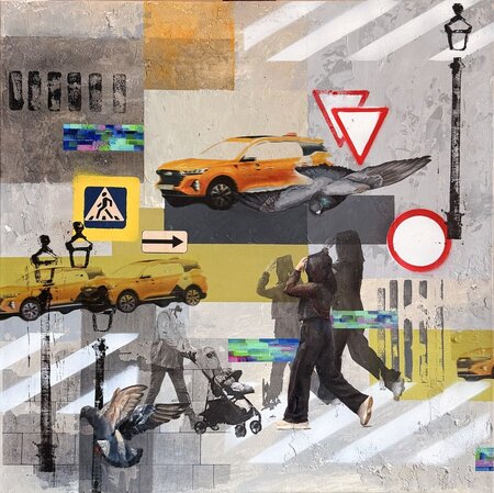
Animation | Mixed Media