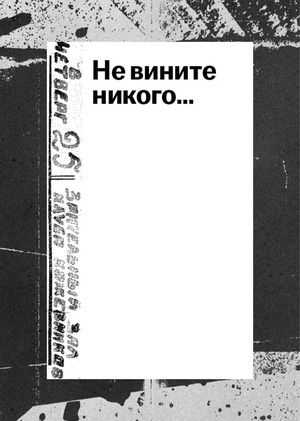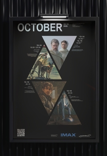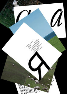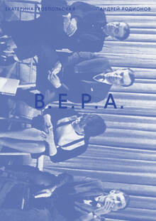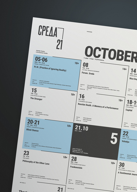
One poster, six formats
I designed the October 2026 repertoire poster for the theatre Sreda 21 and adapted it to six formats: four print and two screen. People look at each format from a different distance, so I changed the grid and the amount of text, but kept the same rules.
Sreda 21 is a small, independent theatre in the Bauman Garden, Moscow. Its idea is theatre without distance: the audience sits next to the actors. In October 2026 the theatre turns five.
The corner line of the logo frames every date cell. Blue means a premiere. Black means 21 October, the fifth birthday. One typeface, Roboto Condensed, joins all formats.
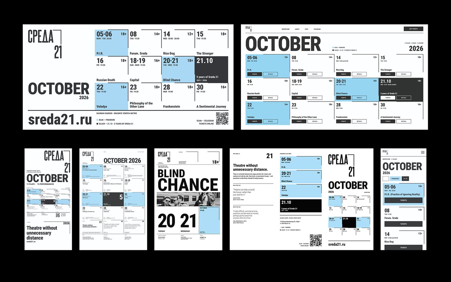
Four rules: one typeface, blue for premieres, black for 21 October, and the logo corner line around every date.
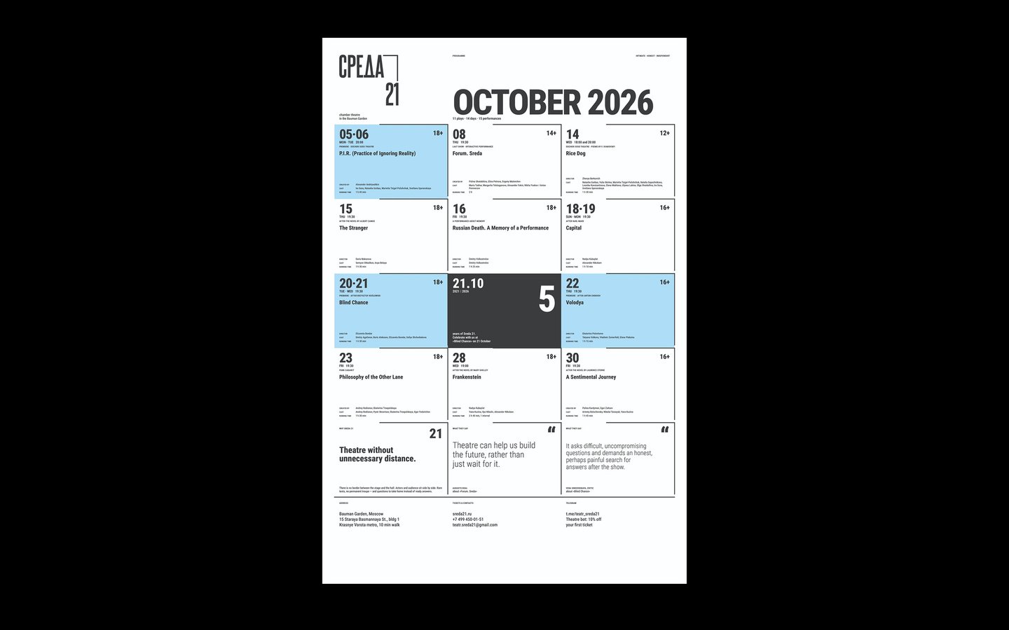
Poster, 60 × 90 cm. This is the base of the system, with all the information. People read it from one or two metres.
Pillar, 1,4 × 3 m. The logo and the month are big at the top. The full schedule is at eye level.
Billboard, 6 × 3 m, at scale 1:10. People see it for three seconds, so only dates, titles and age limits stay.
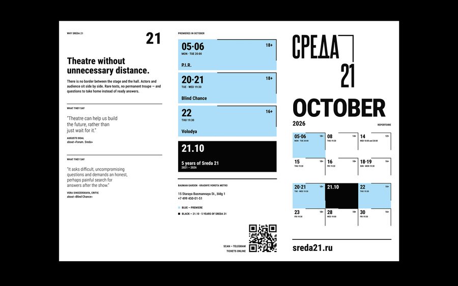
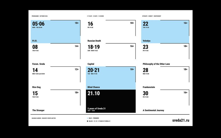
Trifold leaflet, A4. Outside: the cover and the back with premieres and a QR code. Inside: the whole month in three columns.
Desktop page, 1920 × 1080 px. All important things are visible without scrolling.
Mobile page, 360 × 800 px. One vertical stream of cards with big TICKETS buttons.
Poster for the premiere of Blind Chance. The same system, with three photos for three versions of one life.
The billboard in Saint Petersburg at blue hour.
The pillar at real scale next to a person 1.75 m tall.
A university display with the poster and the leaflet at real size.
The desktop page, the mobile page and the leaflet together.
Same rules, different distance. The typeface, the colours and the corner line stay the same in every format. What changes is how far away the viewer is, so the grid and the amount of text change too.