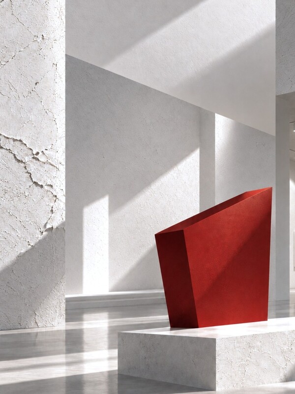
Проект был выполнен в рамках курса по прикладному применению генеративных нейросетей в креативных индустриях. Редизайн выполнялся на основе моего студенческого проекта — выставке «Не просто белый».
Рубрикатор:
1. О Бене Николсоне
2. Концепция оригинального проекта
3. Как искусственный интеллект видит пространство выставки
4. Айдентика
5. Плакаты
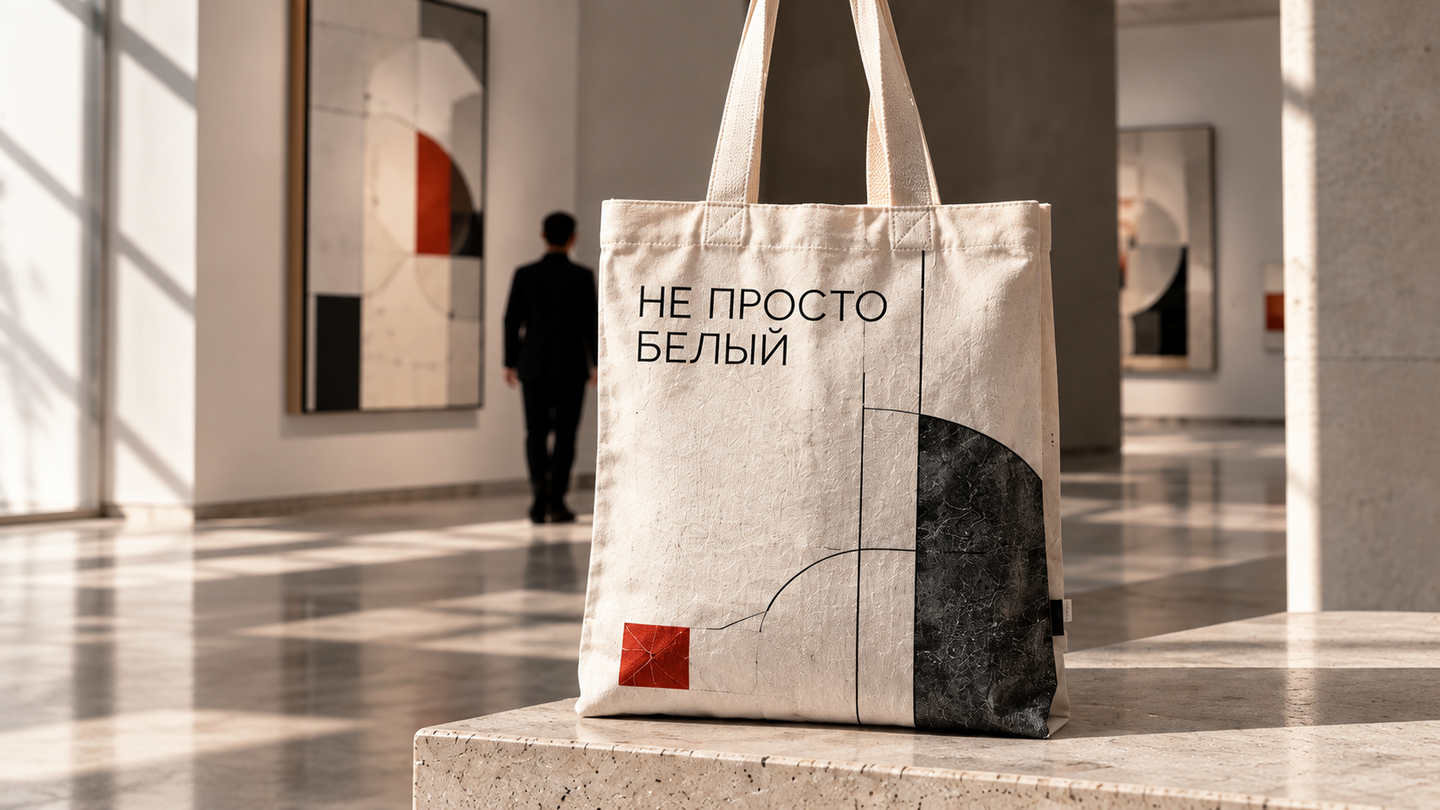
5. Мерч
6. Кейвизл
7. Магазин при выставки
8. Итоги
Бен Николсон — выдающийся британский художник-абстракционист XX века, известный своими уникальными рельефными работами и живописью. Его рельефы стали неотъемлемой частью стиля художника. Мне захотелось воплотить в проекте процесс создания рельефов, а именно — срезание их скальпелем до маленьких размеров.
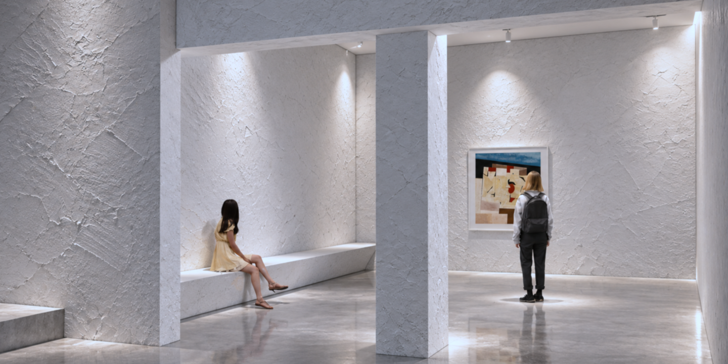
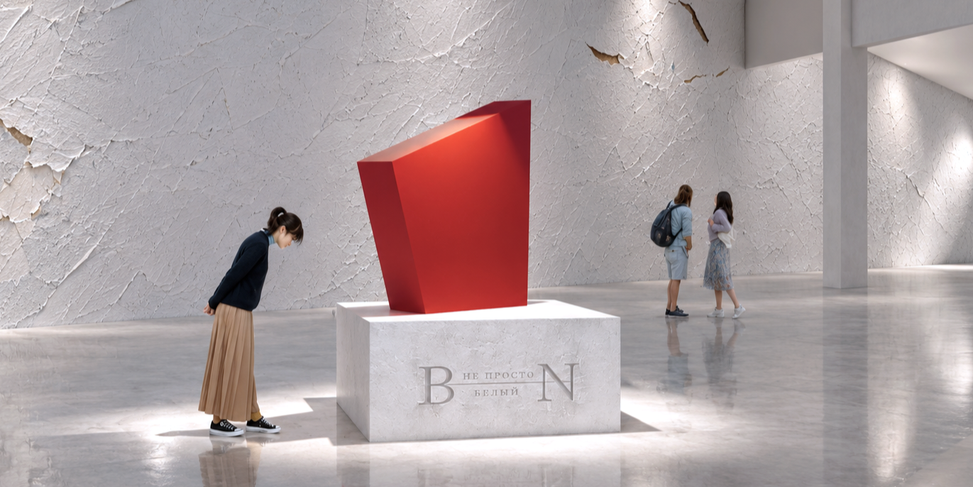
Концепция оригинального проекта
В самом начале выставки можно увидеть массивные рельефы, а к концу они уменьшаются. Идея пришла благодаря технике выполнения работ. Николсон, экспериментируя, красил рельефы поверхности тусклыми оттенками, а затем соскребал бритвой краску и дерево, из-за чего рельефы становились меньше.
Как искусственный интеллект видит пространство выставки «Не просто белый»
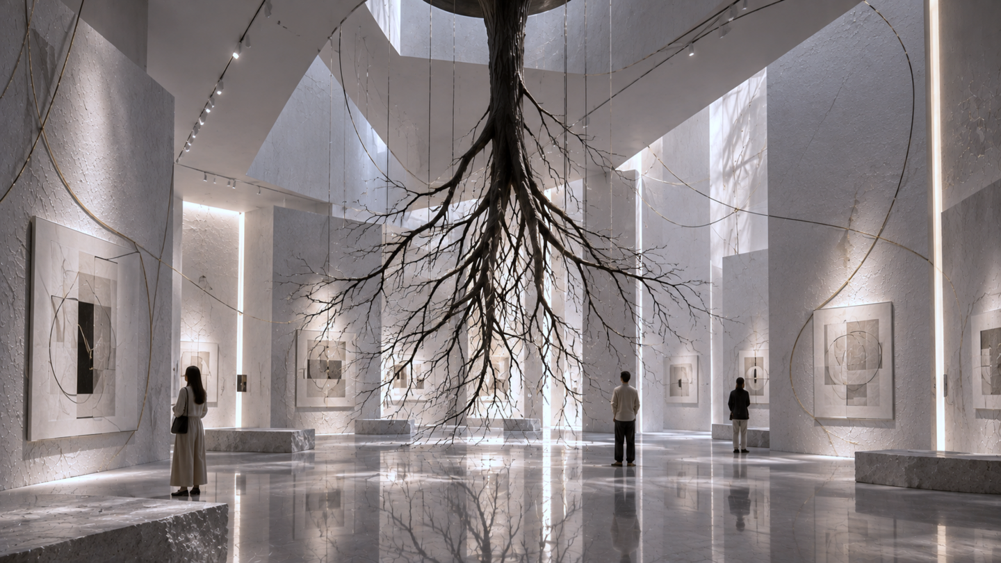
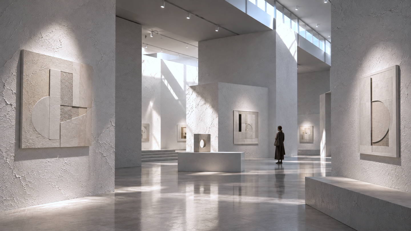
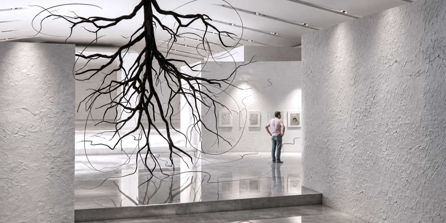
Я попросила Chat gpt показать выставку с его стороны. Мне было важно сохранить концепцию рельефов и текстур. В других аспектах я дала волю ии, задав ему некоторые рамки:Photorealistic architectural photography of «Not Just White, ” an exhibition dedicated to Ben Nicholson. Wide 16:9 format. Spacious contemporary museum with high ceilings, geometric partitions, and minimalist architecture. Color palette: milky white, light gray, stone, and graphite.
Central installation: a massive upside-down tree. Its dark trunk is attached to the ceiling, while delicate branches extend downward, almost touching the floor. Thin branches transform into elegant black lines flowing through the space, continuing onto the walls and visually connecting with Nicholson’s artworks.
The walls display abstract geometric paintings and white reliefs featuring circles, rectangles, and fine lines. Textured mineral plaster with scraped surfaces, irregular layers, and subtle cracks references Nicholson’s artistic technique.
Light-gray polished concrete flooring with realistic reflections, minimalist stone benches. Soft natural daylight combines with museum spotlights and concealed lighting, emphasizing the textures, reliefs, and dramatic silhouette of the tree.
Объект для выставки
Айдентика
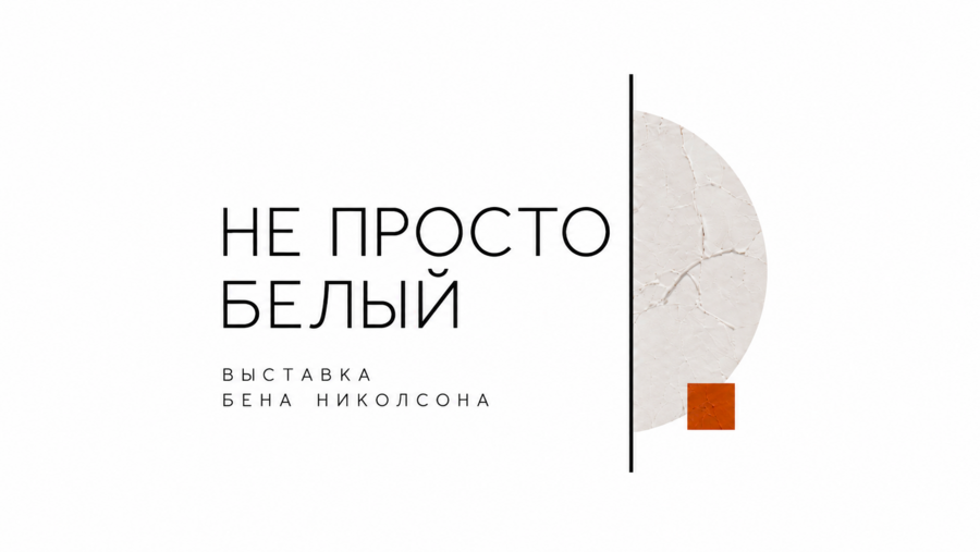
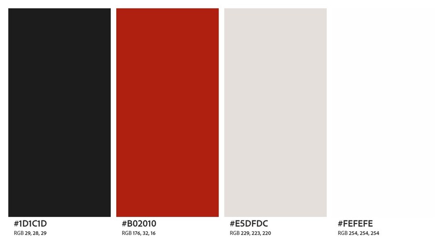
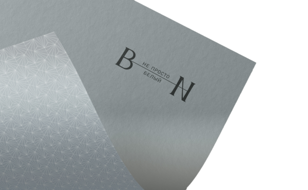
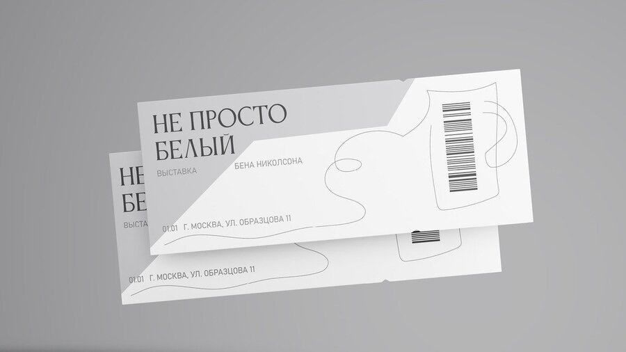
При выборе логотипа, созданного с помощью искусственного интеллекта, мне было важно сохранить визуальную стилистику первоначального проекта. Однако я решила немного обновить айдентику, заменив стиль шрифта, антикву на гротеск. Это стало одним из основных требований к нейросети при генерации новых вариантов логотипа:The main change is to replace the original serif typeface with a modern, thin, and elegant sans-serif (grotesque) font. The typography should be clean, highly legible, and carefully proportioned, with increased letter spacing.
Use a pure white background, black typography, and a subtle terracotta-red accent. Incorporate simple geometric elements: a thin vertical black line, a semicircle with a textured white plaster surface, and a small red square.
The composition should be balanced, sophisticated, and spacious, with generous negative space. Keep the original Russian title «НЕ ПРОСТО БЕЛЫЙ» and the subtitle «ВЫСТАВКА БЕНА НИКОЛСОНА».
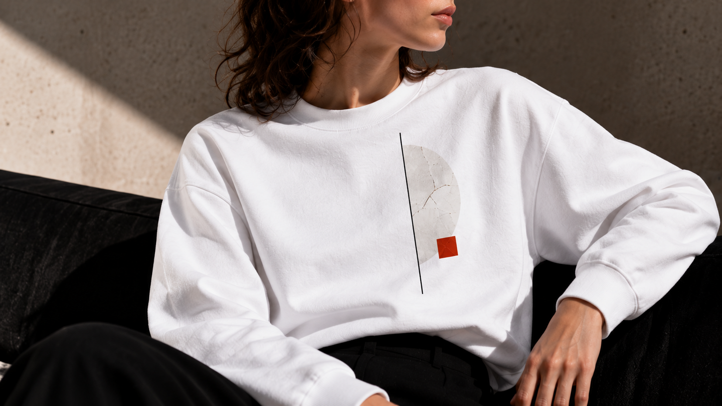
лого на футболке
Create a photorealistic fashion mockup of a minimalist white oversized cotton T-shirt for Ben Nicholson’s exhibition «Not Just White.» The front features a refined geometric logo with thin black sans-serif Russian typography: «НЕ ПРОСТО БЕЛЫЙ» and smaller text «ВЫСТАВКА БЕНА НИКОЛСОНА.» To the right, add a thin vertical black line, a textured ivory semicircle inspired by Nicholson’s sculptural reliefs, and a small terracotta-red square. Preserve the exact proportions and placement of the original logo. Show two views side by side: a close-up of the print and a stylish young woman wearing the T-shirt with black trousers and sunglasses. Natural sunlight, soft shadows, neutral architectural background, realistic cotton texture, contemporary museum merchandise aesthetic, editorial fashion photography, horizontal 16:9 format.
Мерч
Create a photorealistic product visualization of exhibition merchandise for Ben Nicholson’s «Not Just White.» Design a set of three ultra-thin, transparent acrylic bookmarks shaped as a circle, rectangle, and curved arc. Each features minimalist geometric patterns, fine black lines, frosted white textures, and muted red accents. When layered, the bookmarks form a unique abstract composition inspired by Nicholson’s relief artworks. Display all three flat on a pure white background with soft natural shadows, elegant museum aesthetics, and clean studio lighting.
При создании этого блокнота мне хотелось сохранить его визуальную чистоту. Я оставила основную поверхность белой, но добавила рельефный шмуцтитул. Он выполняет роль разделителя, который помогает визуально разграничить смысловые блоки:Create a photorealistic visualization of a minimalist notebook for Ben Nicholson’s exhibition «Not Just White.» Create a clean white hardcover with elegant geometric reliefs without using ink, inspired by Nicholson’s abstract compositions: intersecting circles, rectangles, curved shapes, and thin lines. Show the notebook from different angles, including the cover, spine, and open pages. Add paper reliefs to the center blocks. Use a clean white studio background, a subtle paper texture, soft natural shadows, and an exquisite museum‑like aesthetic.
Create a photorealistic product visualization of a sculptural desk organizer designed as merchandise for Ben Nicholson’s «Not Just White» exhibition. Made from matte white plaster or ceramic, the organizer features geometric reliefs, overlapping circles, semicircles, and rectangular compartments inspired by Nicholson’s abstract art. Include functional spaces for pens, pencils, paper clips, and small stationery items. Add a subtle muted red accent. Show the object from multiple angles on a pure white background with soft natural shadows, realistic textures, and minimalist museum aesthetics.
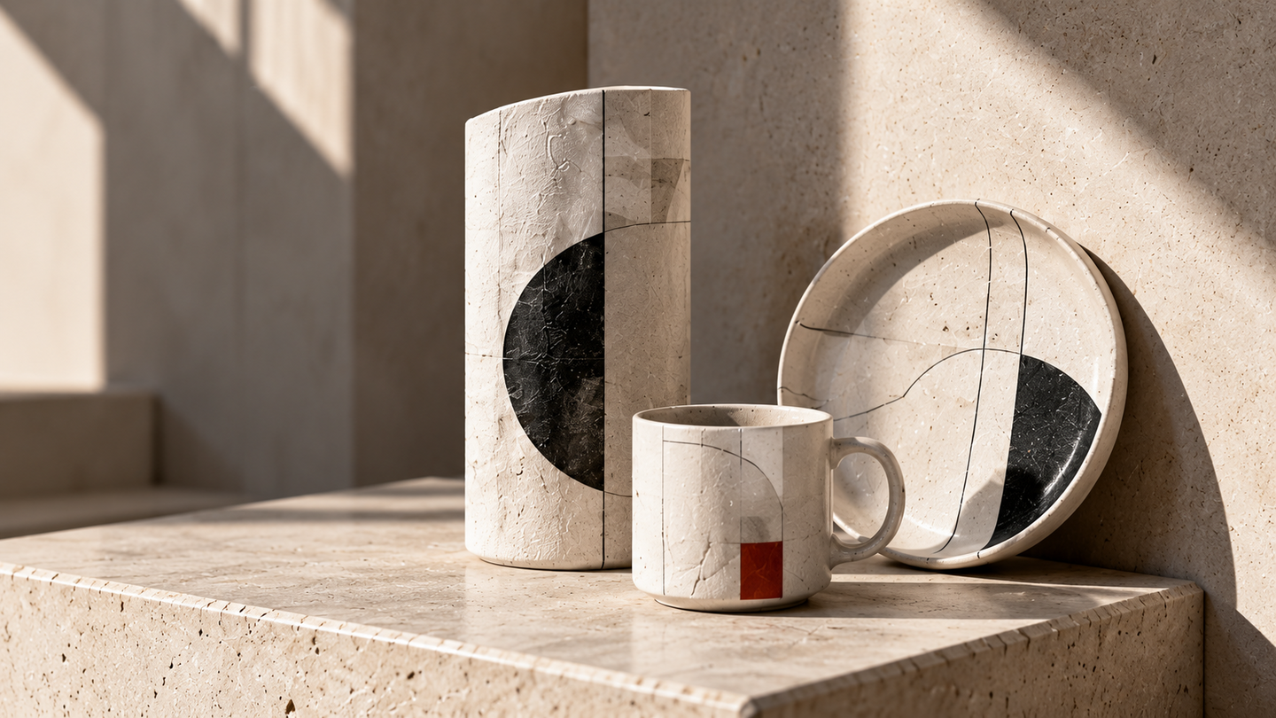
Кейвизл
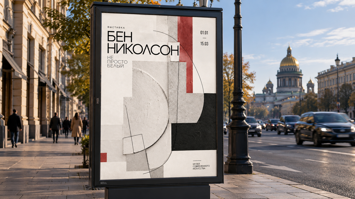
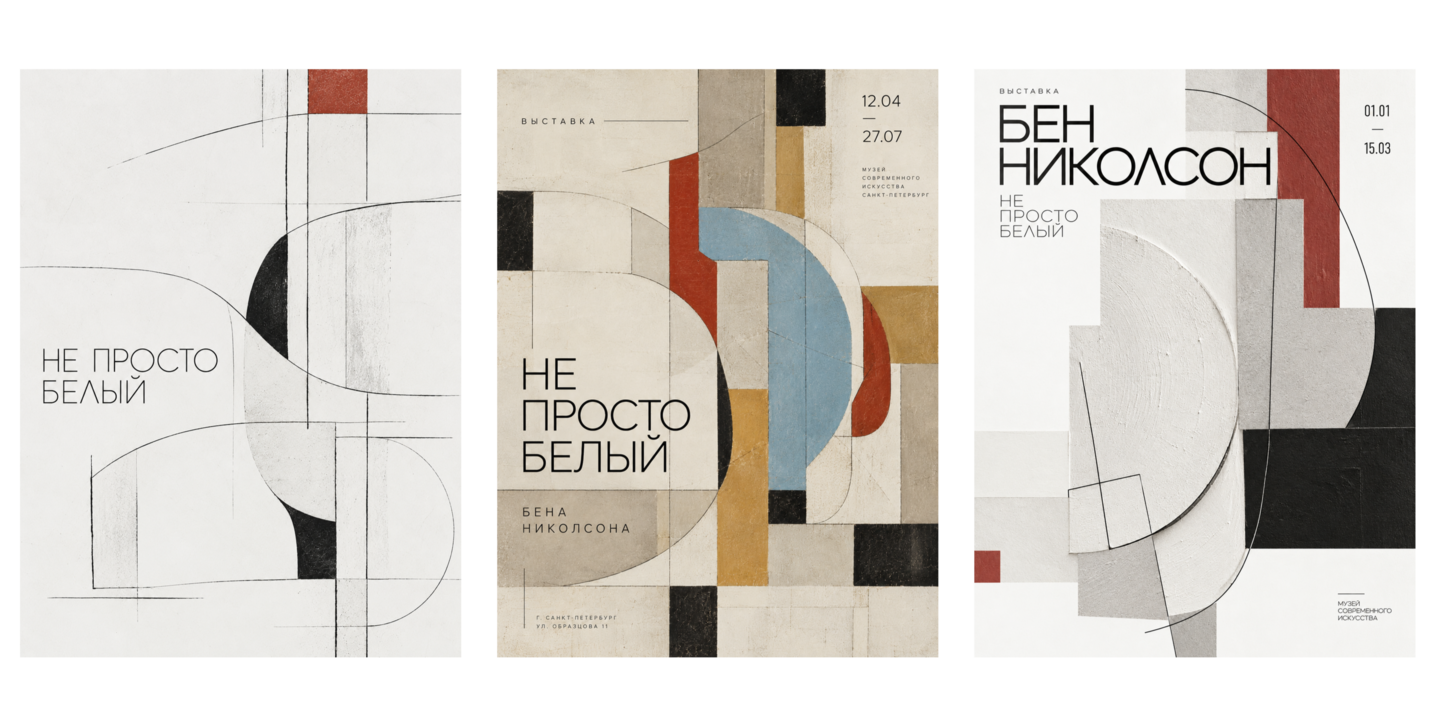
Create a series of exhibition posters for Ben Nicholson’s «Not Just White» in a new visual identity. Move away from the previous linear minimalism toward contemporary graphic design with elements of constructivism and three-dimensional abstraction. Build the compositions around geometric reliefs, overlapping planes, circles, and delicate lines. Use a clean white background, textured surfaces, black, gray, and muted red accents. Combine expressive asymmetrical layouts with bold modern typography. Reflect Nicholson’s artistic language through the interplay of light, shadow, texture, and geometry. Maintain a sophisticated museum aesthetic while emphasizing experimentation, visual balance, and a sense of lightness.