Turning meanings into conceptual design.
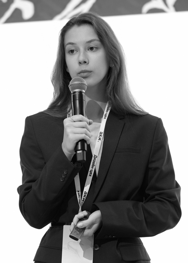
I’m Elizabeth Yaroslavtseva — a communication and media designer.I have 4 years of experience and over 40 projects behind me.I like to work with deep visual metaphors, hidden connections, meanings and unexpected concepts. I create visual identity, design books and magazines, adapt the graphics of a digital product to the company’s business objectives.I enjoy immersing myself in the theme of the project, exploring the features that can then be turned into a catchy design.Available to joining a design studio.
lizyar05@yandex.ru
Next, my work will show you who
I am as a designer.
Branding
When I create a branding or visual identity, I conduct the research part: I study the brand/project, its target audience, final goals and objectives.
After that, I find a deep and multifaceted metaphor for the visual part of the brand, turning all the meanings and ideas into an understandable visual language.
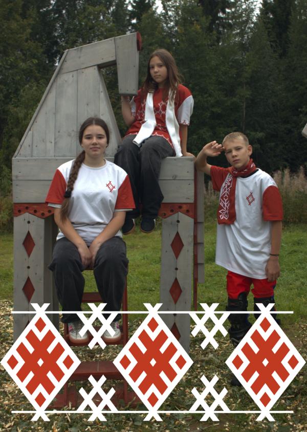
X Blagoveshchenskaya Fair on Pinega
Visual identity · Territorial Branding · Font · Merchandising
Brief
To make a branding for the X Blagoveshchenskaya Fair on Pinega in order to attract a new audience.My role
I designed typefaces, logos, created attributes for organizers and souvenirs for tourists.Decision
Visual identity design based on archival canvases with embroidery, typeface design based on the charter. Patterns from embroidery fragments.
The project was submitted to the Pinega village administration and has been implemented now.
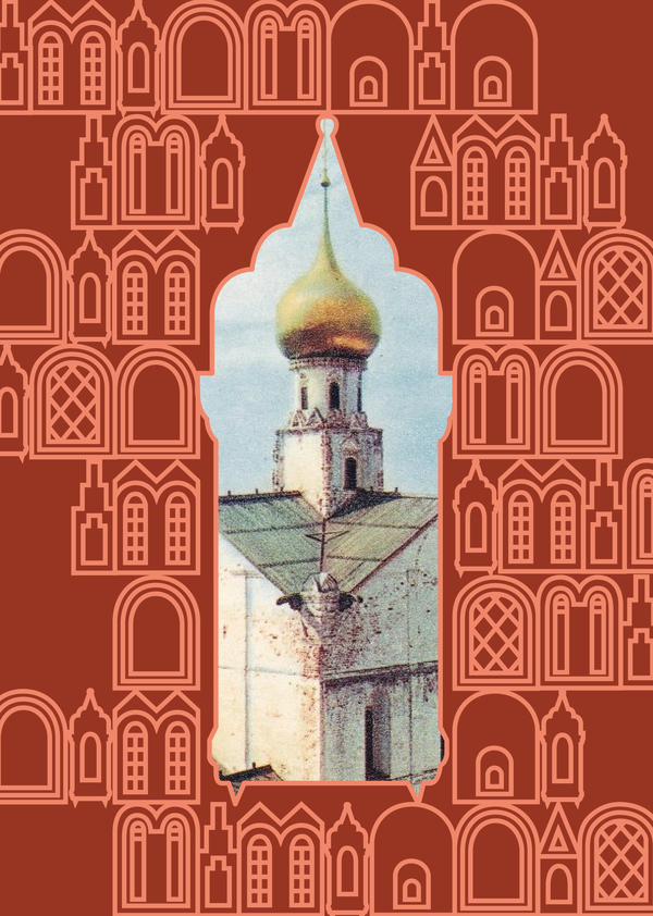
Branding of Rostov Veliky
Territorial branding · Visual identity · Merchandising
The project won a competition from the Moscow Museum of Design.
Brief
Create branding for the city so that it becomes attractive for tourists.My role
I have fully developed the branding: the logo, corporate pattern, posters and merch.Decision
The visual code of the city is highlighted — windows of different types. A pattern is made up of them, with the ability to use windows as photo frames.
The project was presented to the administration of the city of Rostov Veliky and was approved for future implementation.
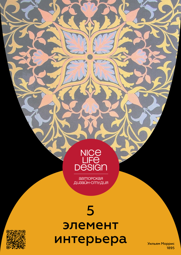
Branding for a design studio «NLD»
Branding · Promotion · Communication strategy
Brief
Develop a branding and communication message for the audience.My role
I have developed a creative task, a communication metaphor, a creative idea, as well as a logo and promotion.Decision
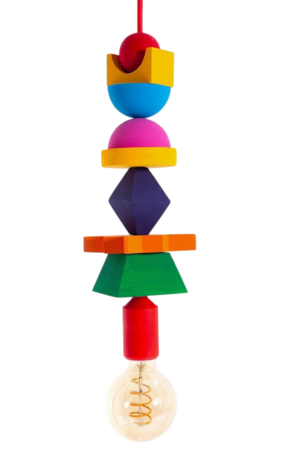
The «fifth element» was chosen as a metaphor for a creative message to the audience. Communication is based on connecting people with design using furniture from this design studio.
Editorial design
When creating multi-page publications, whether books, magazines or calendars, I build the layout of the spread so that all the material is arranged organically, with the proper number of levels.
Microtypography plays a special role in creating multi-page publications, and I use it to create the right accents.
The book «Multicolored Space»
Book · Microtypography · Typography · Visual Storytelling