Introduction
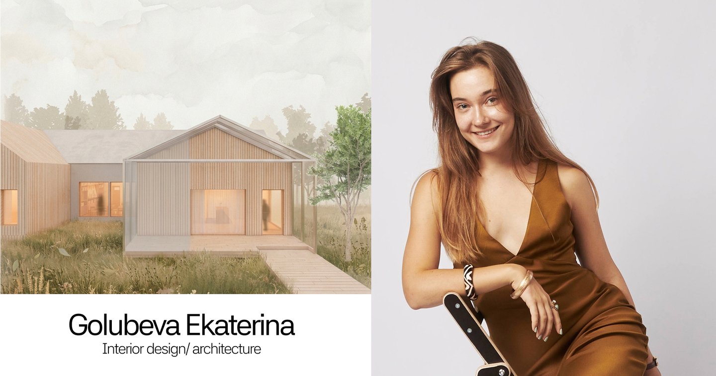
I am an interior designer based in Saint Petersburg, currently completing my degree in Environmental and Interior Design at HSE University.
What draws me to interior design is its range. I enjoy creating spaces that are completely different from one another, each shaped by the people who will live or work in it. For me, a strong project starts with a careful reading of the client’s brief. The concept, layout and atmosphere should follow logically from their needs rather than from a fixed personal style.
At the same time, I am always experimenting.
I work with colour, texture and material to find unexpected but coherent combinations, the kind that give a space its character and make it feel considered down to the smallest detail. Every new project is a chance to try something I haven’t done before, and this curiosity is what I hope to develop further through a master’s programme.
My skills
Hard skills:
Figma
photoshop
illustrator
autocad
SketchUP + enscape
archicad
midjourney & others — generative
AI tools
Soft skills:
Creative and conceptual thinking
Strong communication skills with hands-on client-facing experience
Responsibility and attention to details
Effective and self-sufficient remote work
Ability to work within multidisciplinary and international teams
Adaptability in fast-paced, dynamic environments
English — B2 (Upper-Intermediate, actively improving)
Open to business travel
Spanish — A1 (currently in progress)
Portfolio concept
The concept of this portfolio comes from my desire to bring a new colour or material into every project I work on.
For this reason, the portfolio is organised by colour. Each project is defined by one dominant colour, which sets the mood of the entire interior and guides the choice of materials, textures and details. Moving from one project to the next, the colour changes, and so does the atmosphere of the space.
1/ Concept for a Study Office at the New HSE Campus in Saint Petersburg
Colour — Tangerine
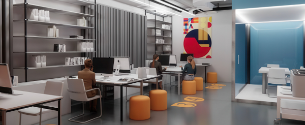
The project brief called for designing a functional suite of spaces including a study office, a faculty room, and a classroom. I identified two primary forms — the circle and the square — which divide the zones by purpose. Circular zones are designed to encourage rest and informal interaction, while rectangular zones are dedicated to focused work.
Floor plans
The colors in this project also zone the space and visually indicate the purpose and location of the various zones.
2/ Biohacking Cluster Concept
Colour — dark blue
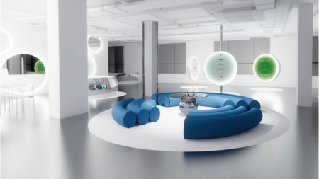
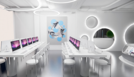
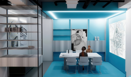
The project brief was to design a space where people could learn more about their health and body. The molecular structure was chosen as the primary formal concept, serving as a metaphor for the interconnection of all systems within the human body, similar to the bonds between atoms in a molecule.
Floor plans
The master plan reveals the concept of molecules, as the zones are connected to each other like molecules in nature.
In this project, blue was chosen as the main color for a reason. Water is blue, and water is the foundation of all life on Earth. Since the biohacking center is designed to improve health, the blue color was selected to emphasize this purpose of the center.