About me
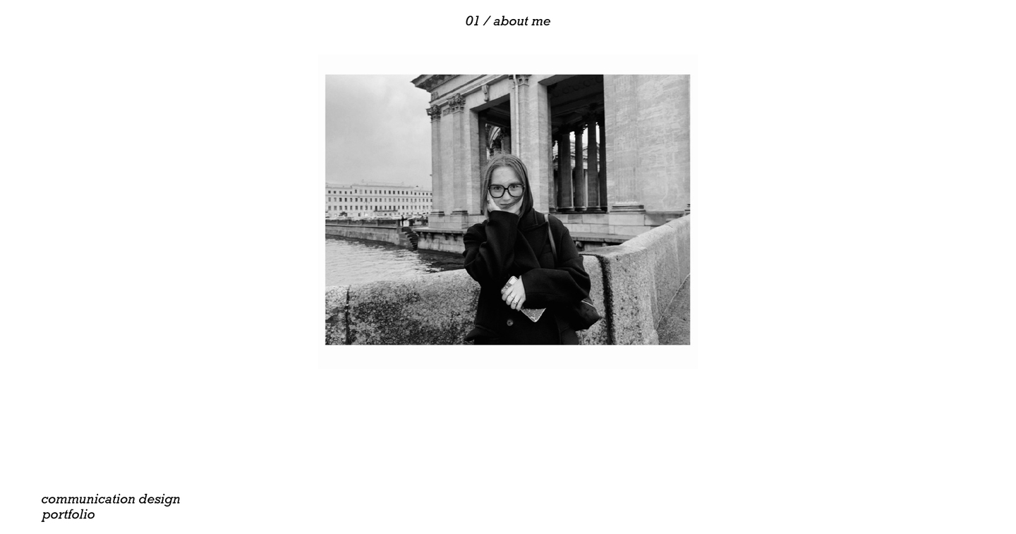
Hi! My name is Milana. I am a communication designer specializing in branding, print publications, and visual identity. I enjoy focusing on the finer details of design noticing them, bringing them to light visually, and building cohesive visual communication systems.
Stage of work
01. search
Target audience research, competitor analysis, tone of voice, identifying values, uncovering insights, developing a brand platform, finding a metaphor.02. concept development
Concept development, identifying a visual code and brand constants, exploring forms and a visual language.03. branding
Brand identity, corporate style, visual communications, brand platforms, brand touchpoints, packaging, social media design.Project
Trueshkowski
01. Trueshkowski
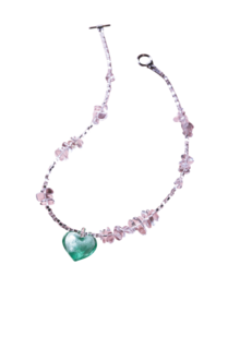
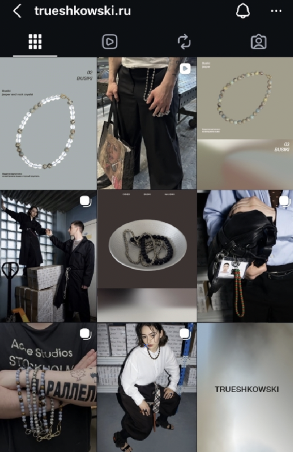
TRUESHKOWSKI is a brand specializing in jewelry and accessories made from natural stones and other materials. Its mission is to create striking, memorable accents and to add a touch of playful mischief to your day.Brief: rebranding. Rethinking and developing a new visual identity, while preserving the brand’s visual aesthetic and values.
Concept: extracted color. The visual identity is built on the principle of extracting a visual code from the material itself. The color and textural characteristics of each piece of jewelry are isolated and transformed into abstract graphic compositions. Every item is given its own unique visual identity.
Result
A comprehensive system has been developed, which serves as the foundation for the brand identity. Key constants and core meanings have been identified.AYTM Echo
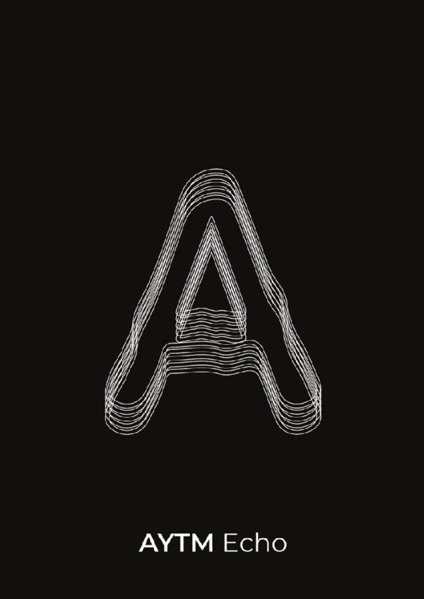
02. AYTM Echo
AYTM Echo is a display typeface inspired by the forms of modular metal shelving units. Its visual language is built upon the repetition of parallel lines, gentle radii, and a framework like structure that creates a sense of volume, rhythm, and space.Brief: font design. Development of a display typeface for the Cyrillic and Latin scripts, along with a system of symbols.
Concept: shelving units from the Danish design brand AYTM. A display typeface inspired by the forms of shelving units. Its visual language is built upon the repetition of parallel lines and a skeletal structure that creates a sense of volume and space. Each character acts as a visual echo of form an approach that evokes wire-frame constructions.