ABOUT ME
Hi, I’m Max.
I am an editorial designer working on books, magazines, and independent publications. I develop page layouts, typographic hierarchies, and image sequences around the content.
I help readers navigate complex material and shape the pace of reading, keeping the publication consistent from the first spread to the last.
I work with care for the author’s text and attention to deadlines.
MY APPROACH
A good text can die on a bad page.
I make sure it never does.
01 / BOOK DESIGN & VISUAL RESEARCH
5.18 — Echo of Freedom
THE CHALLENGE
How do you make a complex history readable?
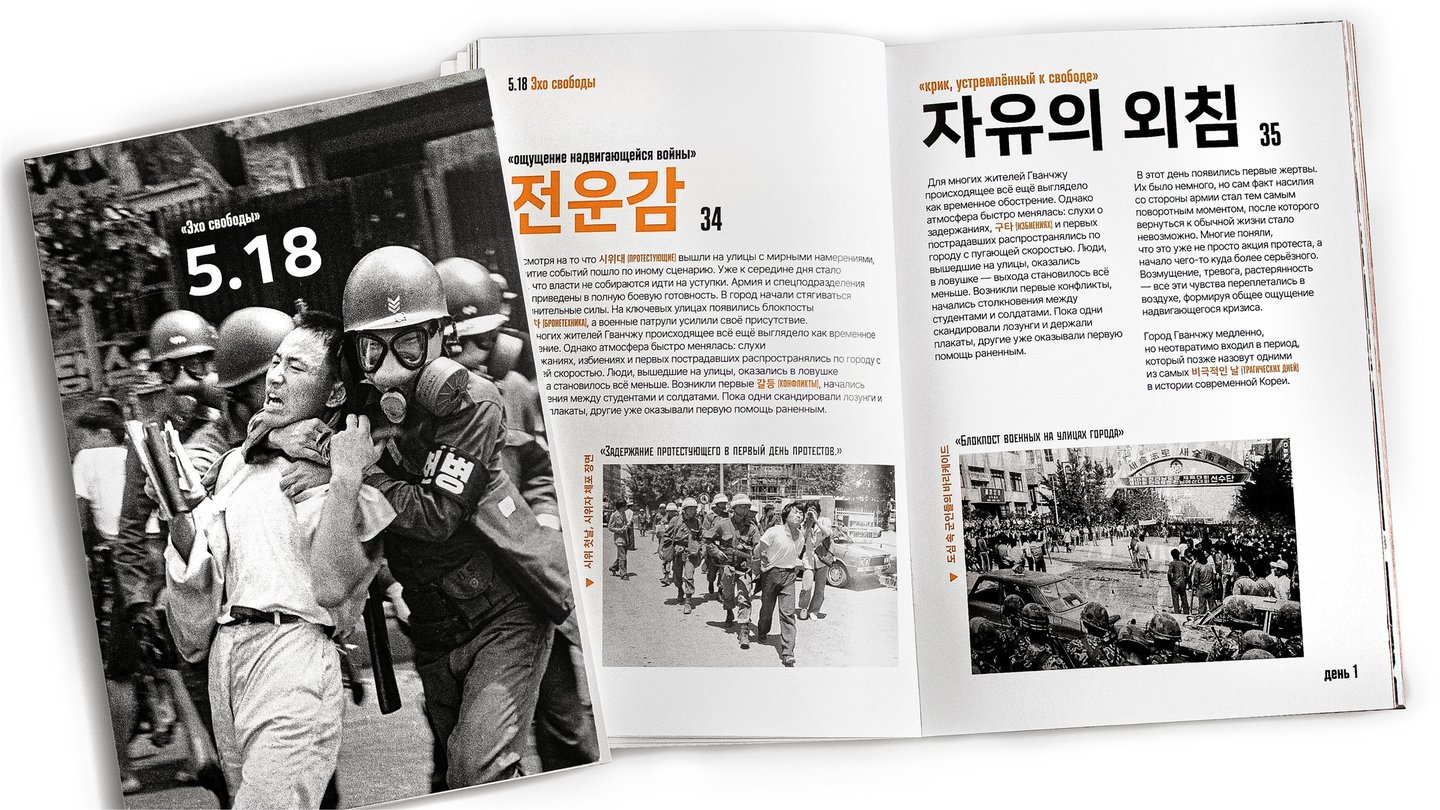
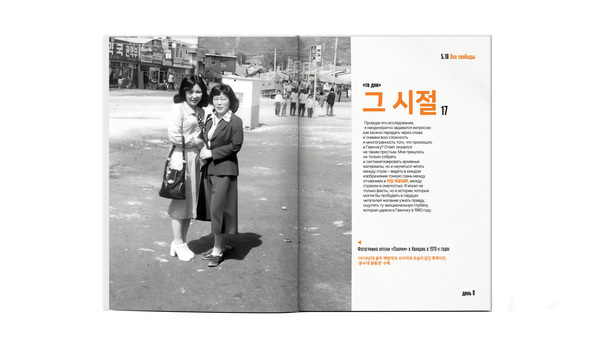
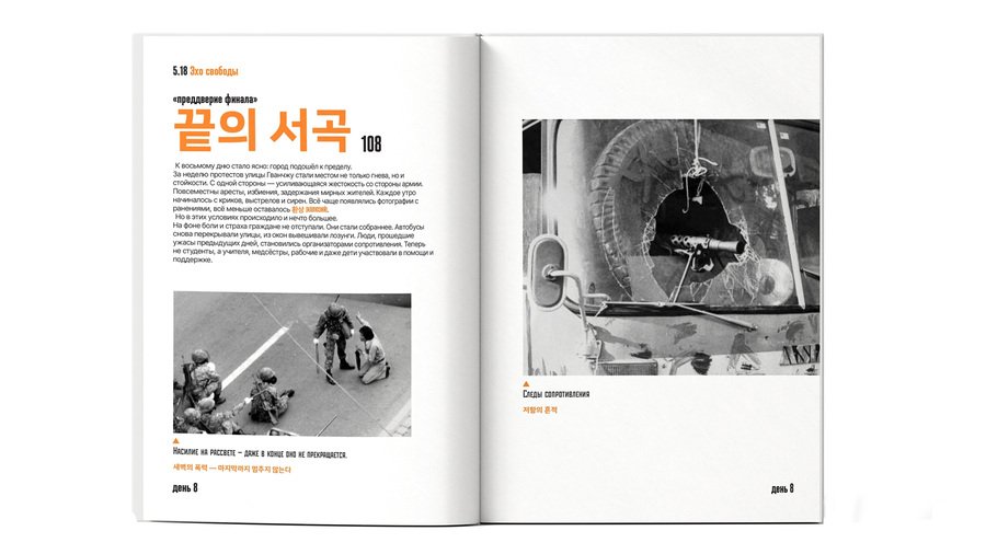
5.18 — Echo of Freedom explores the Gwangju Uprising of May 1980 through archival photographs and a chronological narrative. I needed to help readers follow the events and understand their context while preserving the emotional weight of the images.
THE APPROACH
A chronology to follow
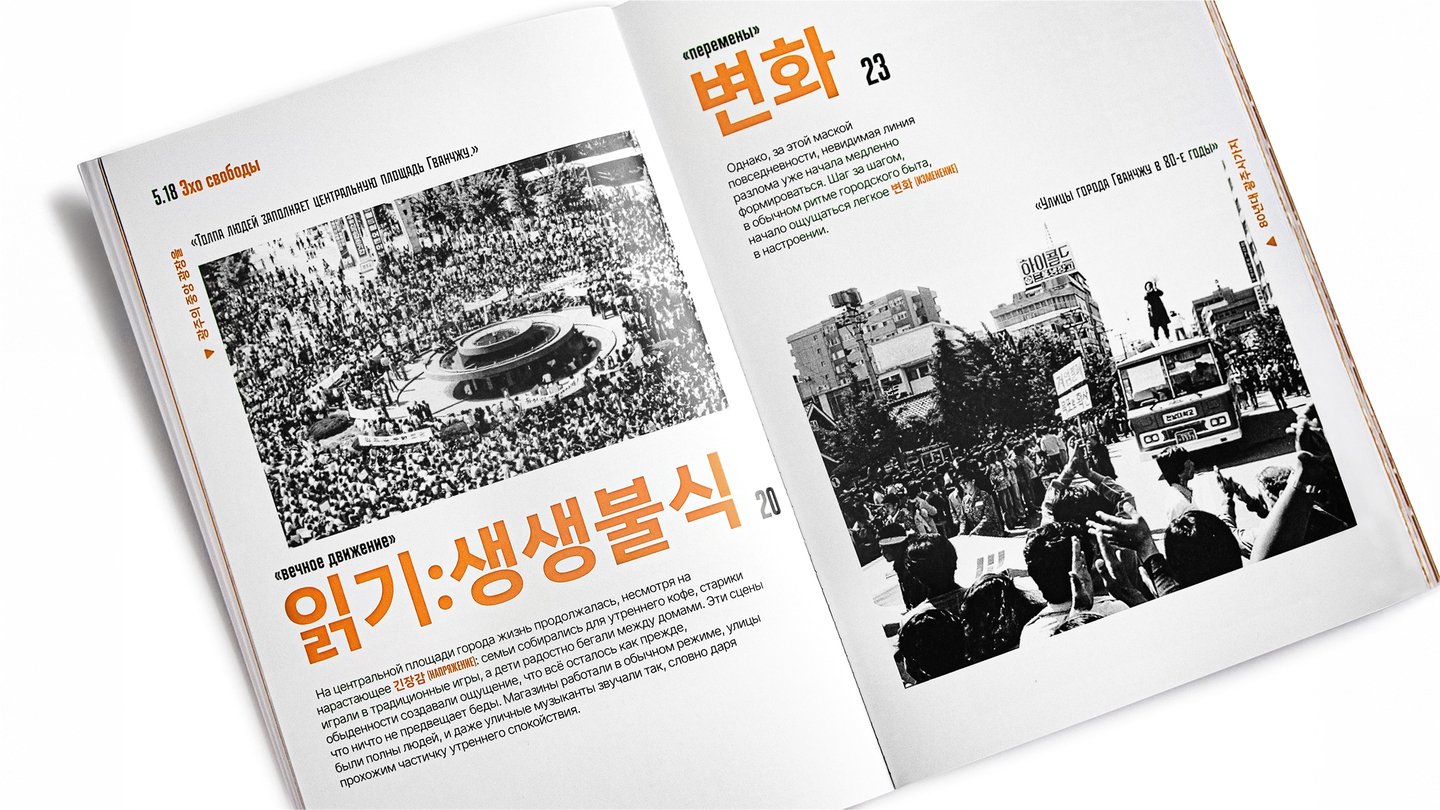
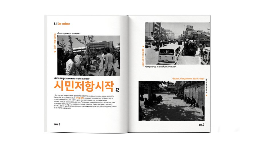
I organised the narrative by day. Recurring day markers locate each spread within the chronology, while captions connect photographs to specific scenes.
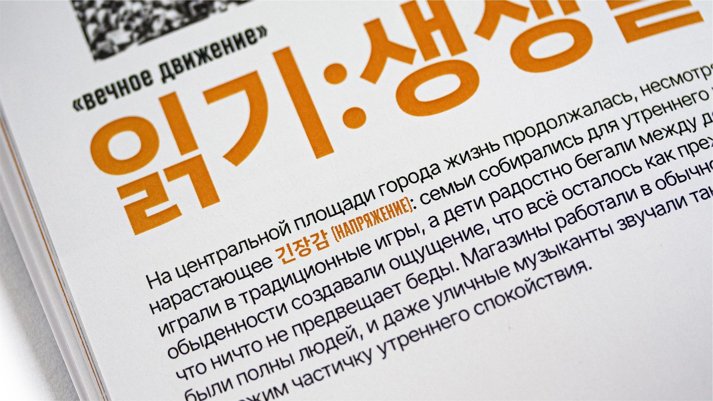
Large Korean headings introduce each theme, with Russian translations providing meaning. Orange accents link headings, selected terms, and captions across the publication.
READING RHYTHM
Between facts and photographs
Text-led spreads explain the events through columns, headings, and captions. Full-spread photographs interrupt that density and invite closer observation. I use this contrast to move between historical context and individual moments, giving each a different amount of space.
THE OUTCOME
Follow the events. Pause over the images.
Readers can follow the chronology through day markers and connect photographs to events through captions. Large image-led spreads create pauses within that sequence, allowing space for reflection alongside the historical account.
View full project ↗02 / MAGAZINE DESIGN
PSYCHO
THE CHALLENGE
What if a magazine felt like a case file?
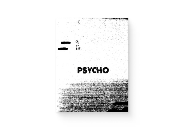
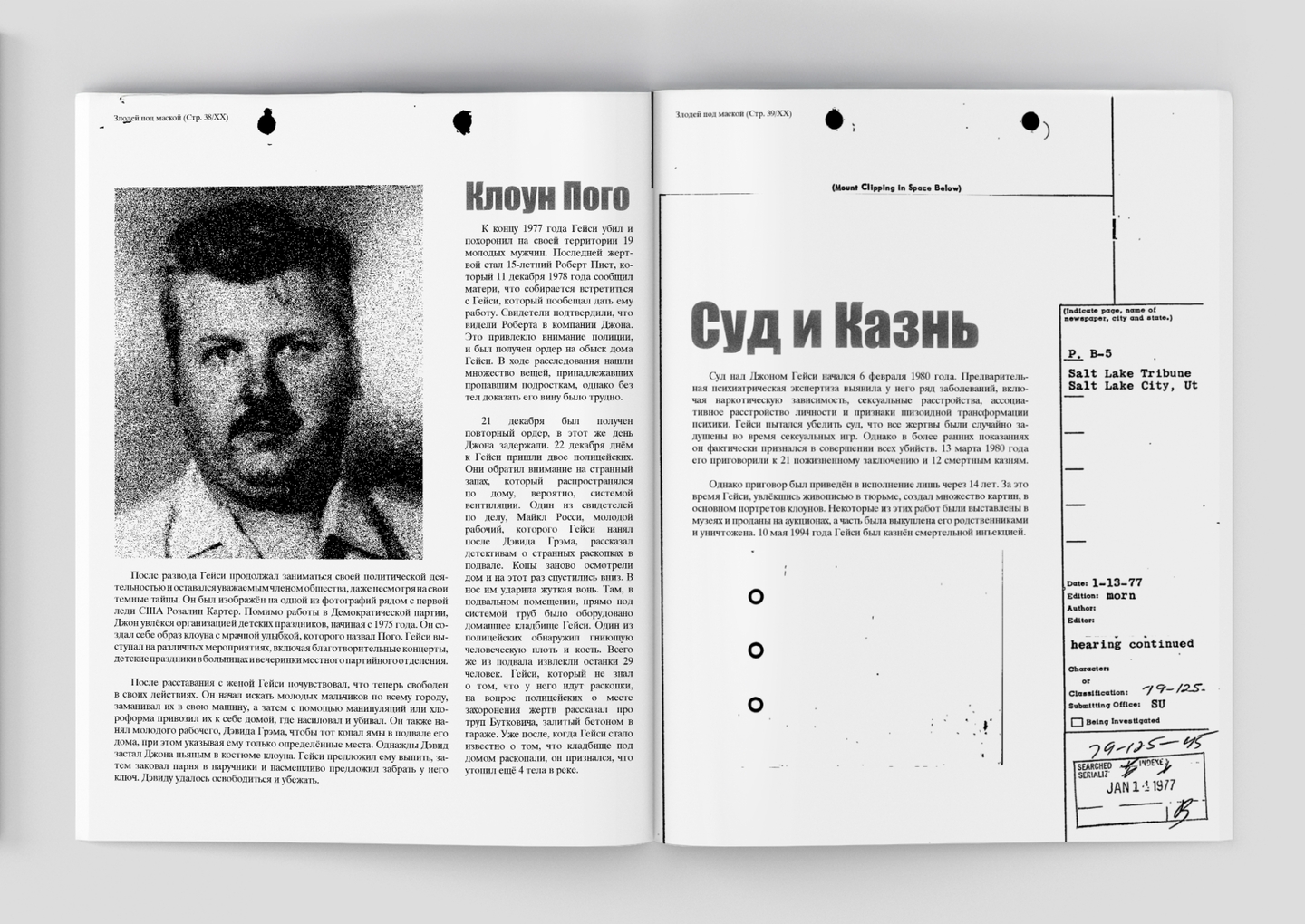
PSYCHO brings together criminal cases, profiles, discussions of myth and reality, and film reviews. I needed to give these four sections a shared identity while accommodating different article lengths and formats. The challenge was to create the atmosphere of an investigation without letting the graphic treatment overwhelm the text.
THE APPROACH
A dossier with a reading structure
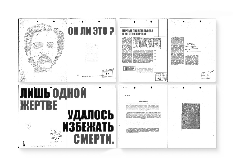
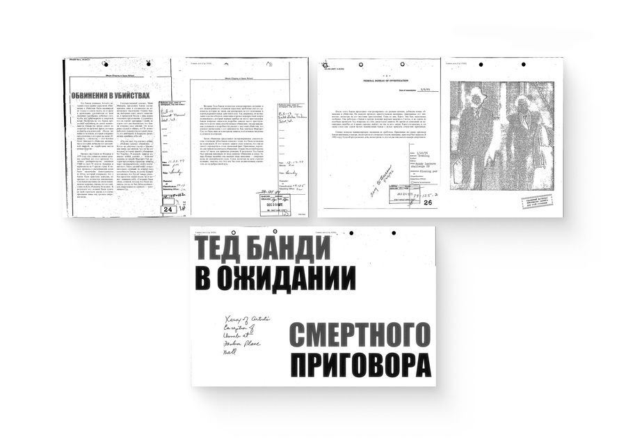
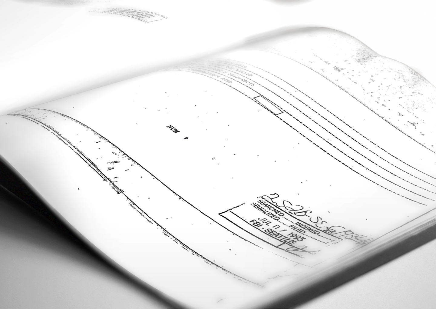
Filing marks, stamps, handwritten notes, and photocopy textures establish the case-file aesthetic. Repeating them across the issue connects articles with different subjects and formats.
Condensed headlines contrast with serif body text. Section labels and page numbers provide a consistent navigation layer within the rough graphic treatment.
READING RHYTHM
A pause at a key moment
Long articles are broken into passages with subheadings and images. At selected moments, a short statement expands across an entire spread, interrupting the smaller text and changing the pace.
Large portraits introduce another shift in scale. The sequence moves between reading a detailed account, encountering a face, and stopping at a single phrase.
THE OUTCOME
Find the section. Follow the story.
The issue can be read from beginning to end or explored by section. Recurring navigation helps readers locate material, while changes in scale distinguish detailed accounts from key statements. Both ways of reading share the same case-file identity.
View full project ↗03 / ZINE DESIGN
Suzdal — A Timeline
THE CHALLENGE
One city. Different moments in time.
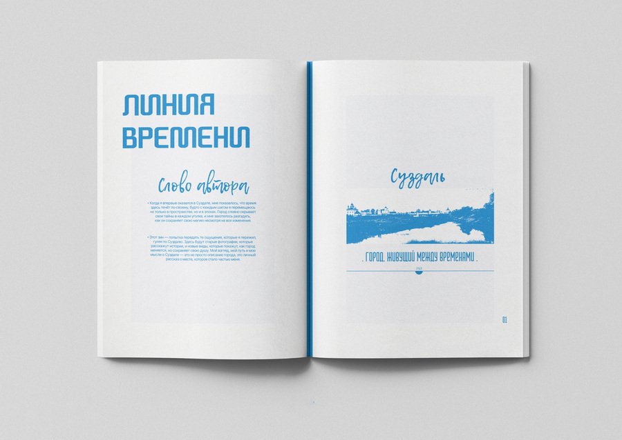
Suzdal — A Timeline is a personal guide to a city where past and present coexist. I brought together photographs from different periods, selected locations, and personal reflections. My task was to connect these materials into a coherent publication while preserving the intimate tone of a personal account.
THE APPROACH
A map for places.
Dates for comparison.
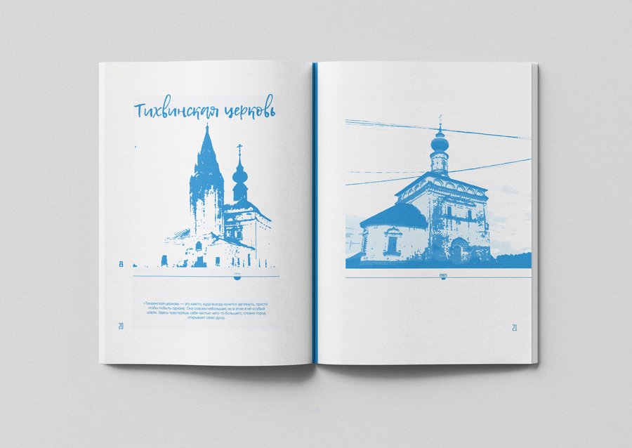
Numbers connect the locations on the map to their pages. Dates beneath the photographs identify when each view was captured, allowing readers to compare the same place across different years.
Blue image treatments bring the photographs together. Handwritten headings accompany personal observations, while structured display type introduces places and broader statements about the city.
READING RHYTHM
Space to slow down
I keep the text brief and vary the scale of the images. Paired views invite comparison, while architectural photographs extending across a spread create a pause in the route.
White space separates personal reflections from the images, giving each observation room without competing with the photographs.