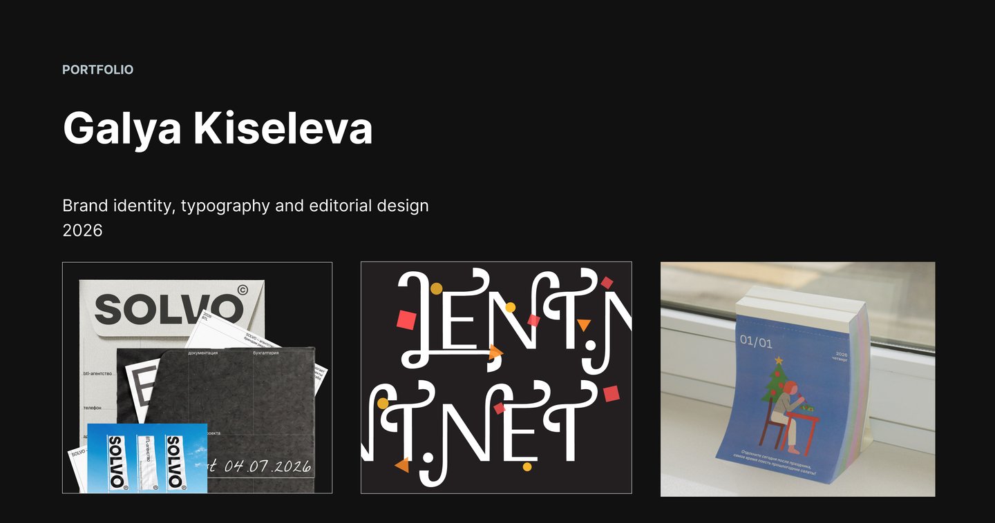
I build brand identities and typefaces that make organisations recognisable and trustworthy
For brands, institutions and studios that need a reliable creative partner, from brief to a documented system
Why work with me?
- Process: a structured path from brief to a documented system
- Typography: custom letterforms for Latin and Cyrillic
- Systems: clear rules that leave room for creative ideas
Branding
- Brand identity for a BTL agency (SOLVO)
- Custom typeface (Lent.net)
- Calendar for an oncology centre
CASE 01 · BRAND IDENTITY
SOLVO: rebrand of a full-cycle BTL agency
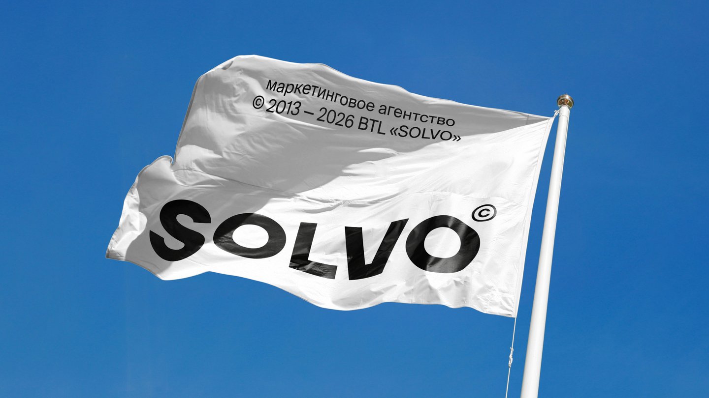
Full-cycle brand identity for an agency that runs promotions, events and offline communication for brands.Field contractors are reliable but impersonal. Creative studios are inventive but cannot guarantee budget or deadlines. SOLVO, part of the CREON group, needed an identity of its own that shows both.The identity is built on geometric lines and a Swiss typographic grid. The grid is the core metaphor: every element has its fixed place, and each project is set on the same base, so the creative idea takes its form from the system. Applied to a flag, signage, a van, posters, a bus stop stand and merchandise.
Name: SOLVO reads as «solve» in English.
Audience: brands seeking a reliable contractor for promotions and events;
Platform: mission, character (reliability, systematic thinking, creativity, responsibility, partnership);
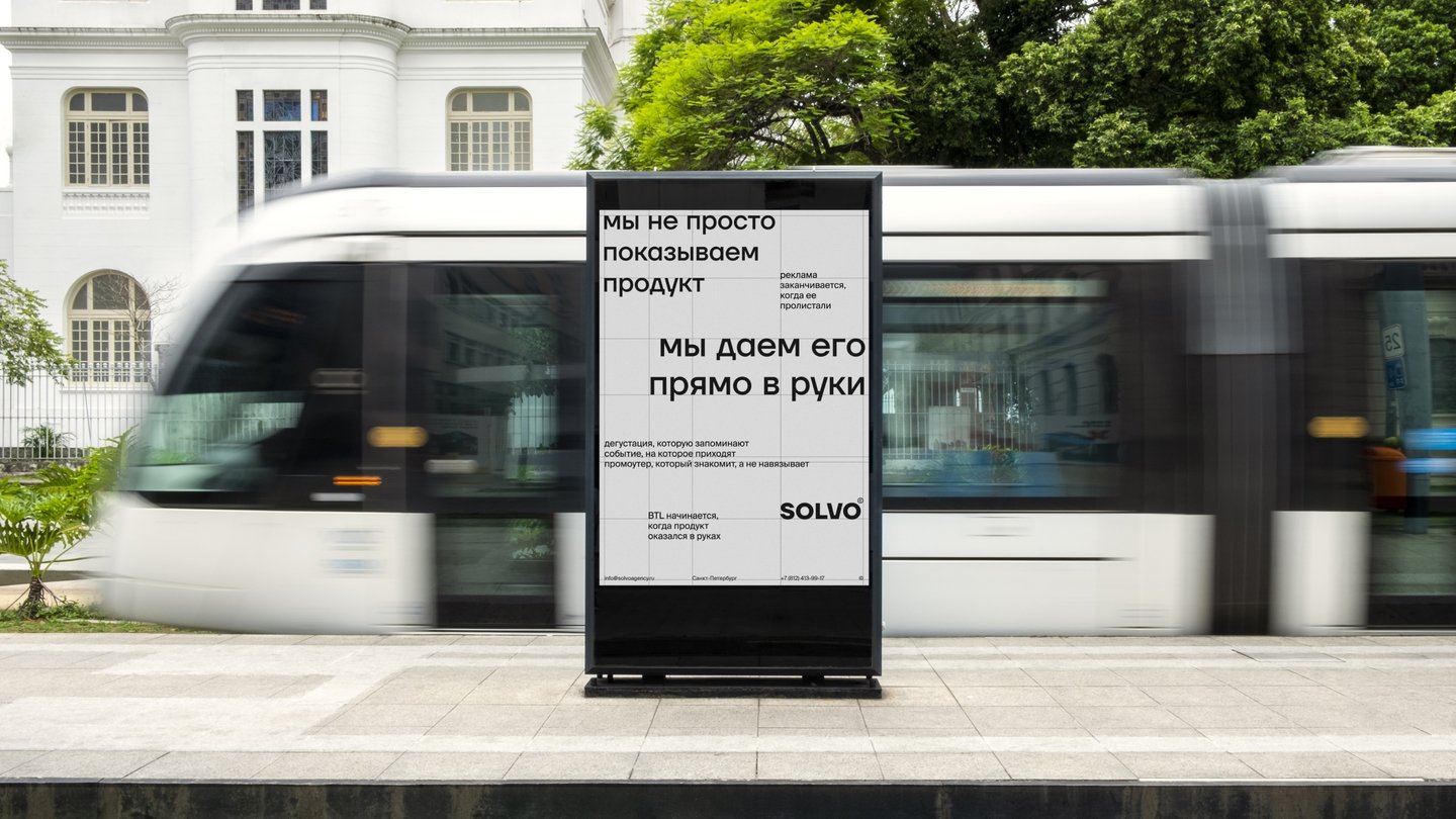
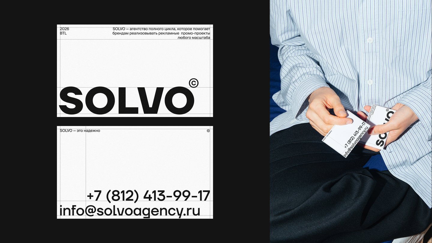
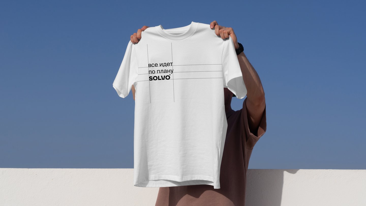
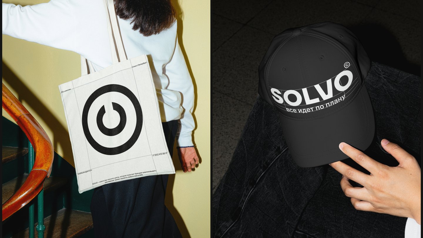
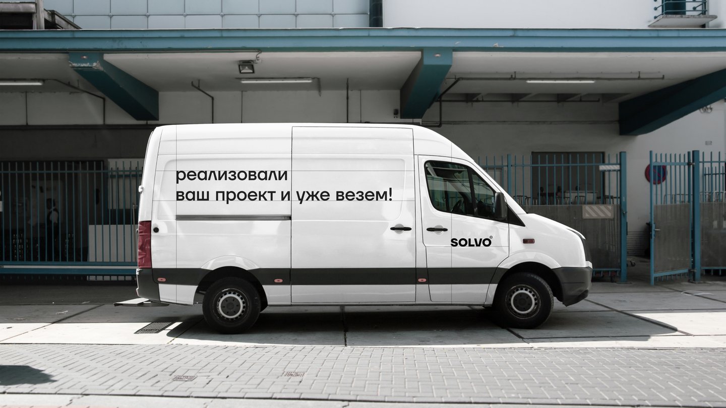
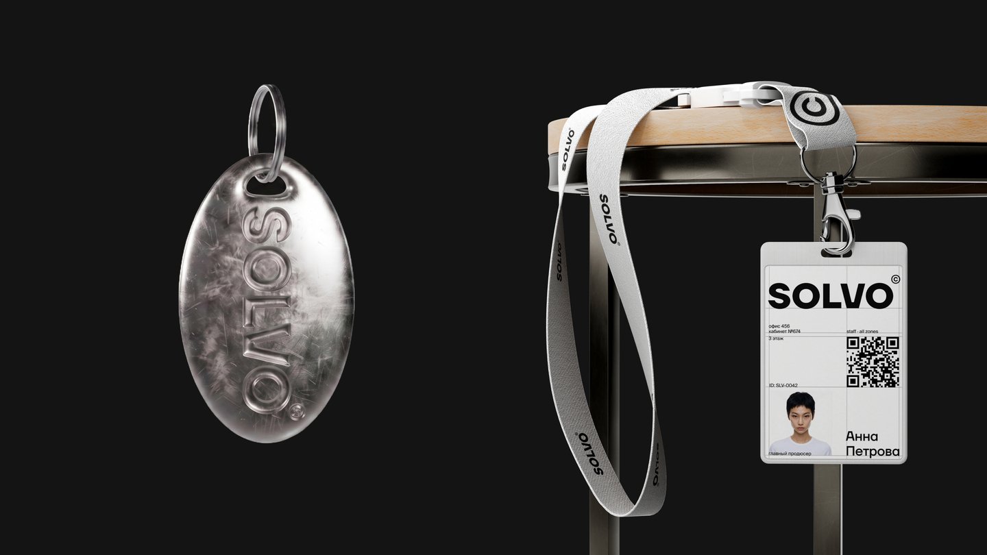
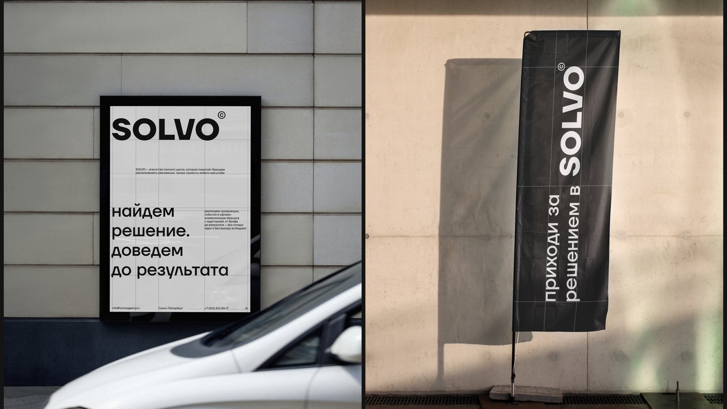
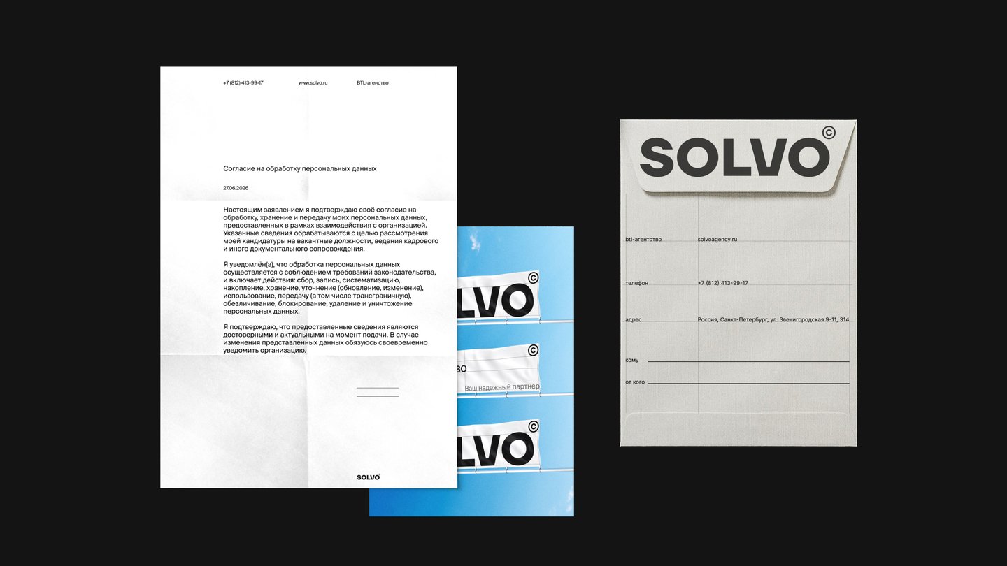
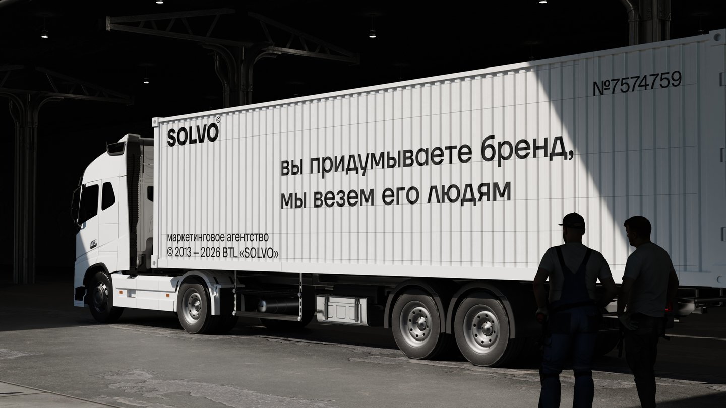
The result is a complete brand identity and a website
CASE 02 · TYPEFACE
Lent.net: a decorative contrast grotesque
A typeface inspired by ribbon forms, with alternative capitals, cut corners and extended terminals.Display faces inspired by ribbon forms are rarely drawn for both alphabets. Lent.net is a full Latin and Cyrillic typeface, so Russian text keeps the same character as the Latin.The base drawing sets the rules: contrast, cut corners and extended terminals. Alternative capitals follow the same rules, with ribbons crossing where letters meet.
Structure first: base drawing, then alternates;
Contrast, cut corners and terminal extensions define the base. Alternative capitals use extended elements where ribbons cross. Character set in Latin and Cyrillic.
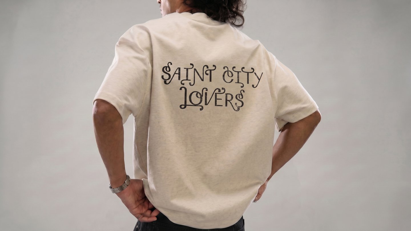
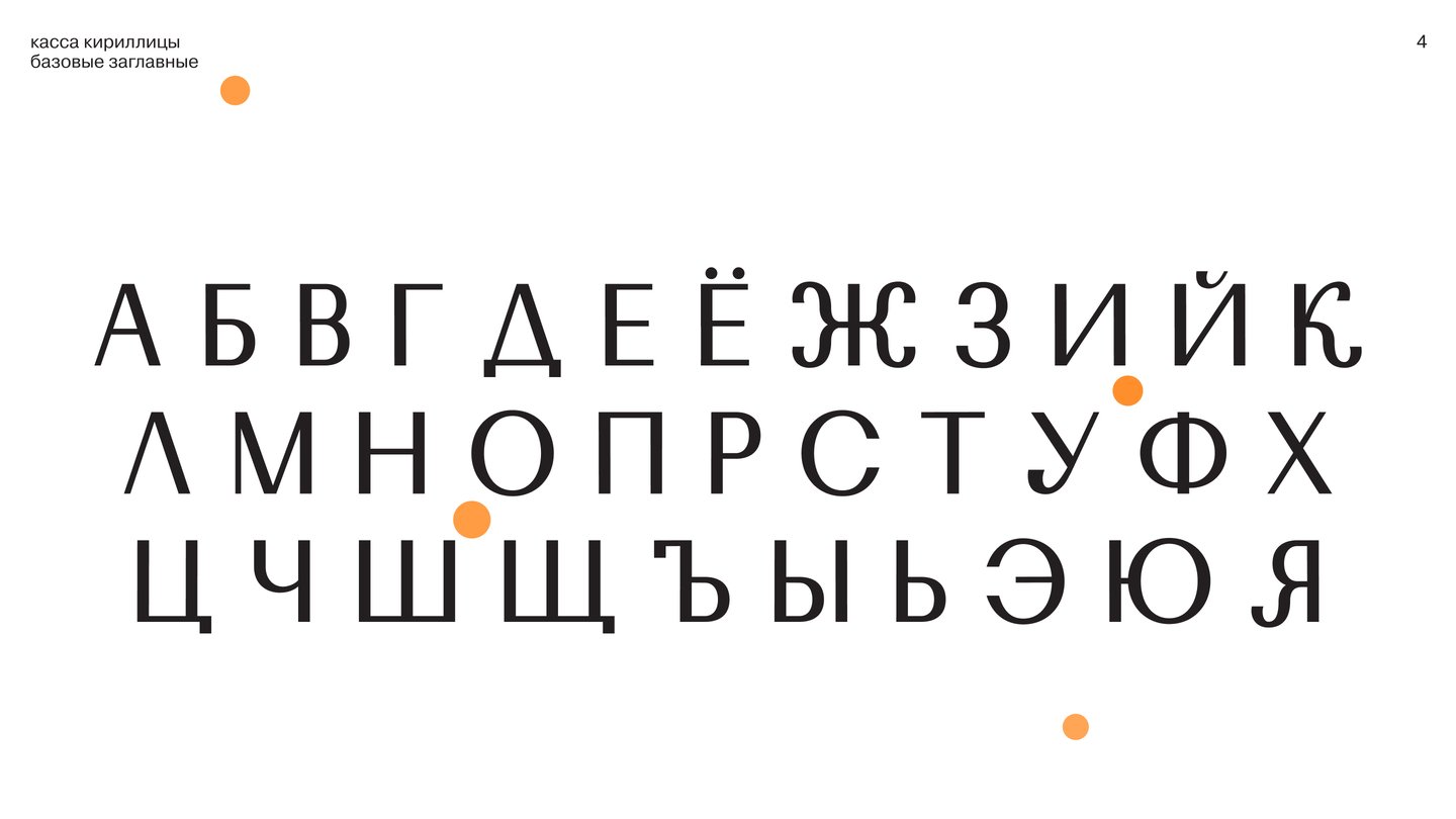
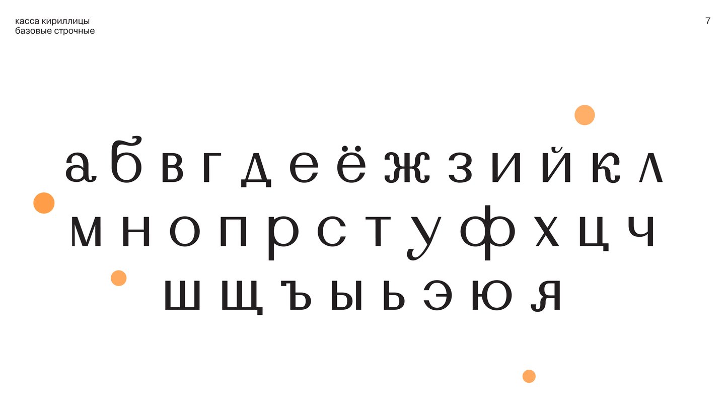
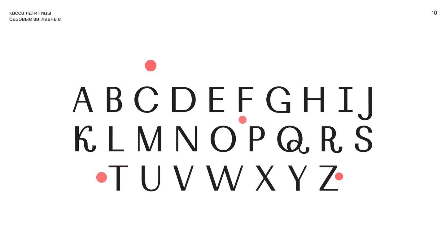
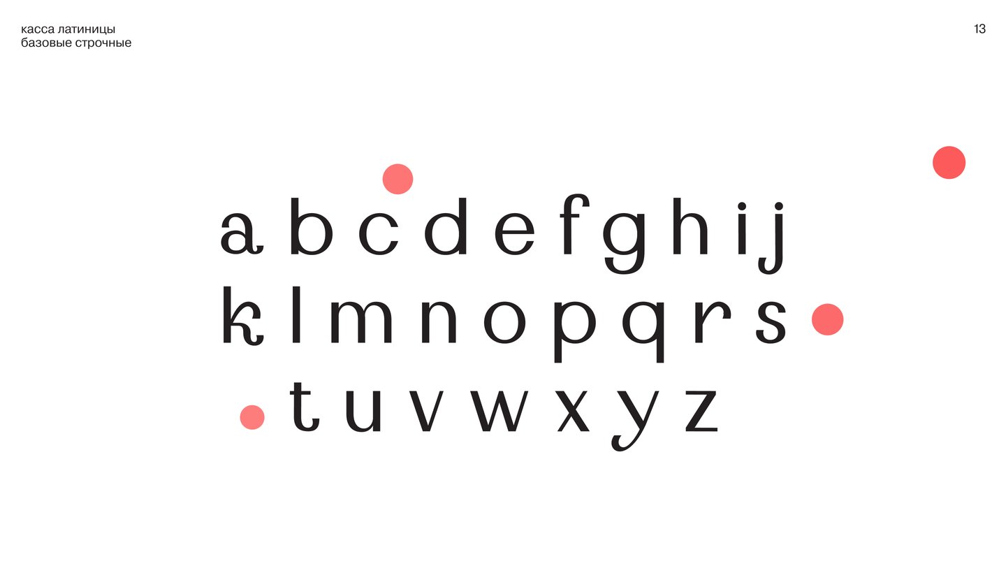
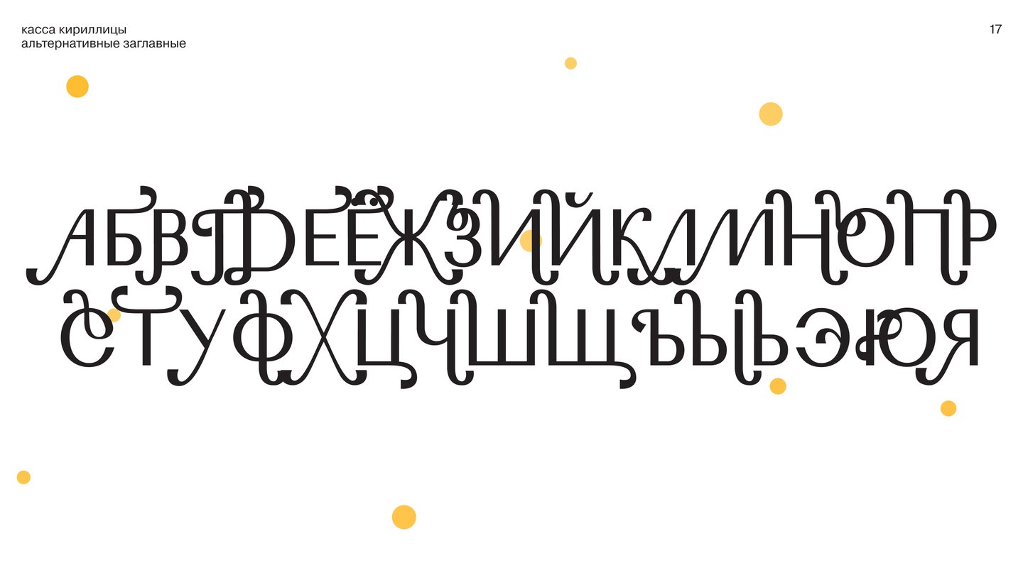
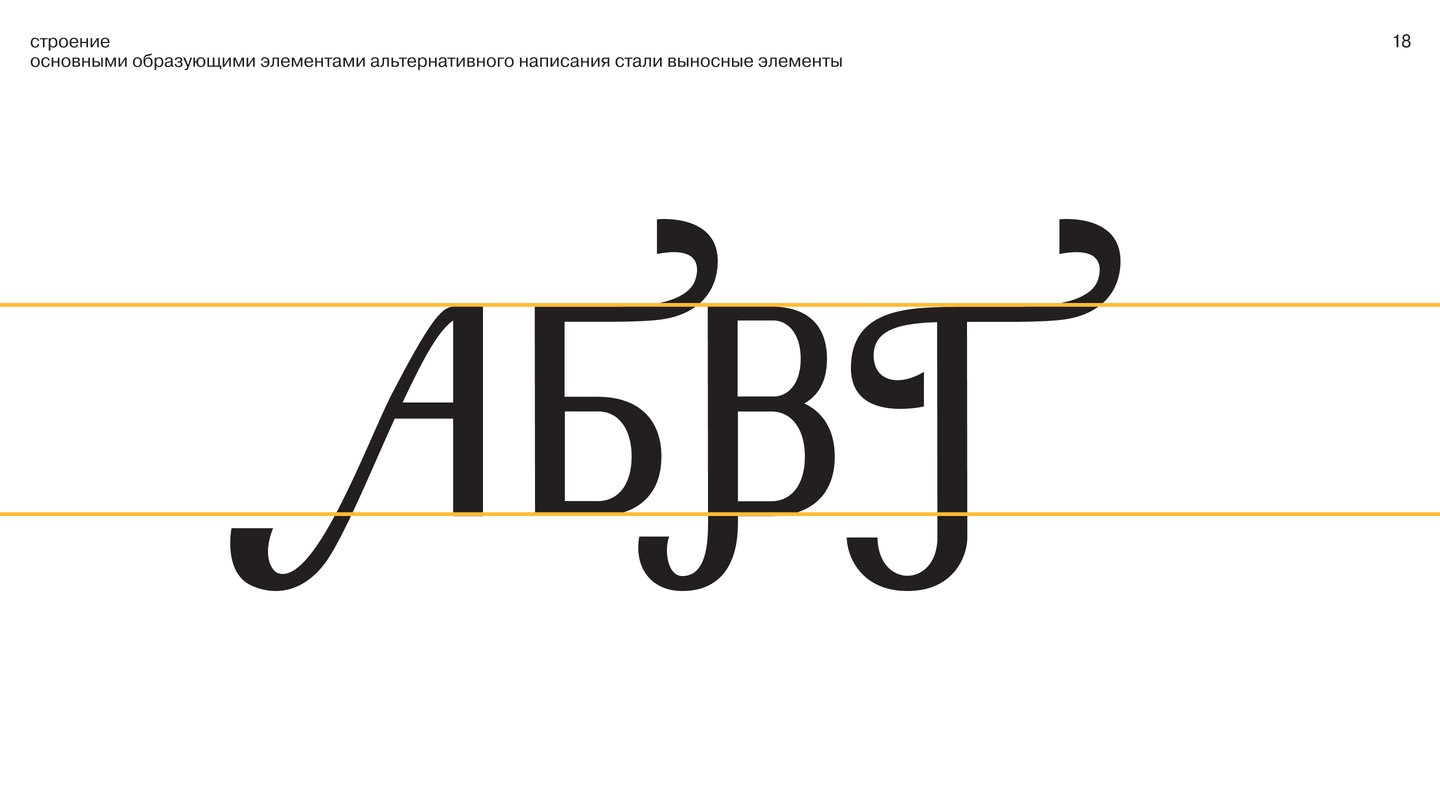
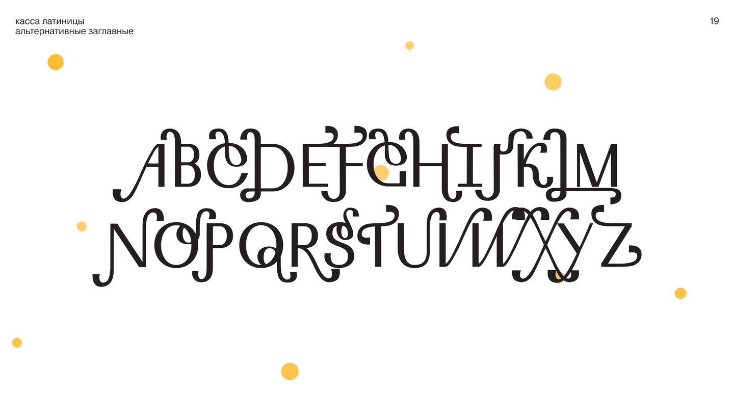
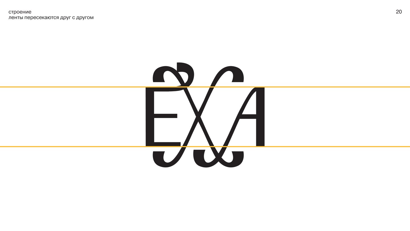
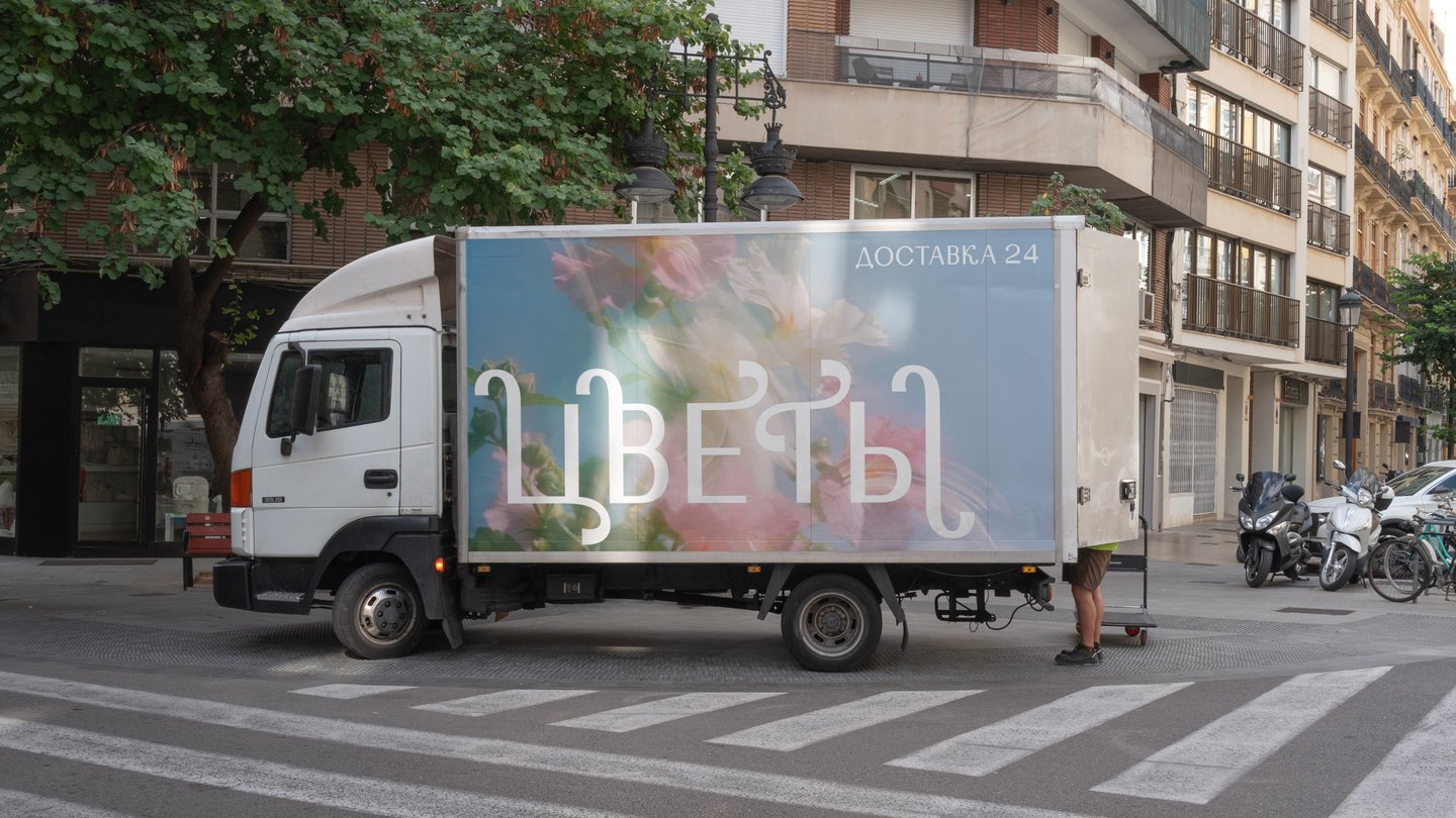
The specimen shows the family at display size and in full sets, with alternates for every capital, so a designer can set a whole headline in it.
CASE 03 · CALENDAR
Calendar for the N. P. Napalkov Oncology Centre
A daily calendar for patients, with a piece of advice on every sheet to support physical health, mood and emotional wellbeing.Patients live with daily uncertainty about their health and mood. A standard calendar tracks dates but gives no support for physical health, mood or emotional wellbeing.Each sheet carries advice on a different aspect of living with cancer, from physical health to a positive outlook. Illustrations imitate risography, which keeps the calendar warm and personal rather than clinical.
Each sheet carries advice on a different aspect of living with cancer; illustrations imitate risography
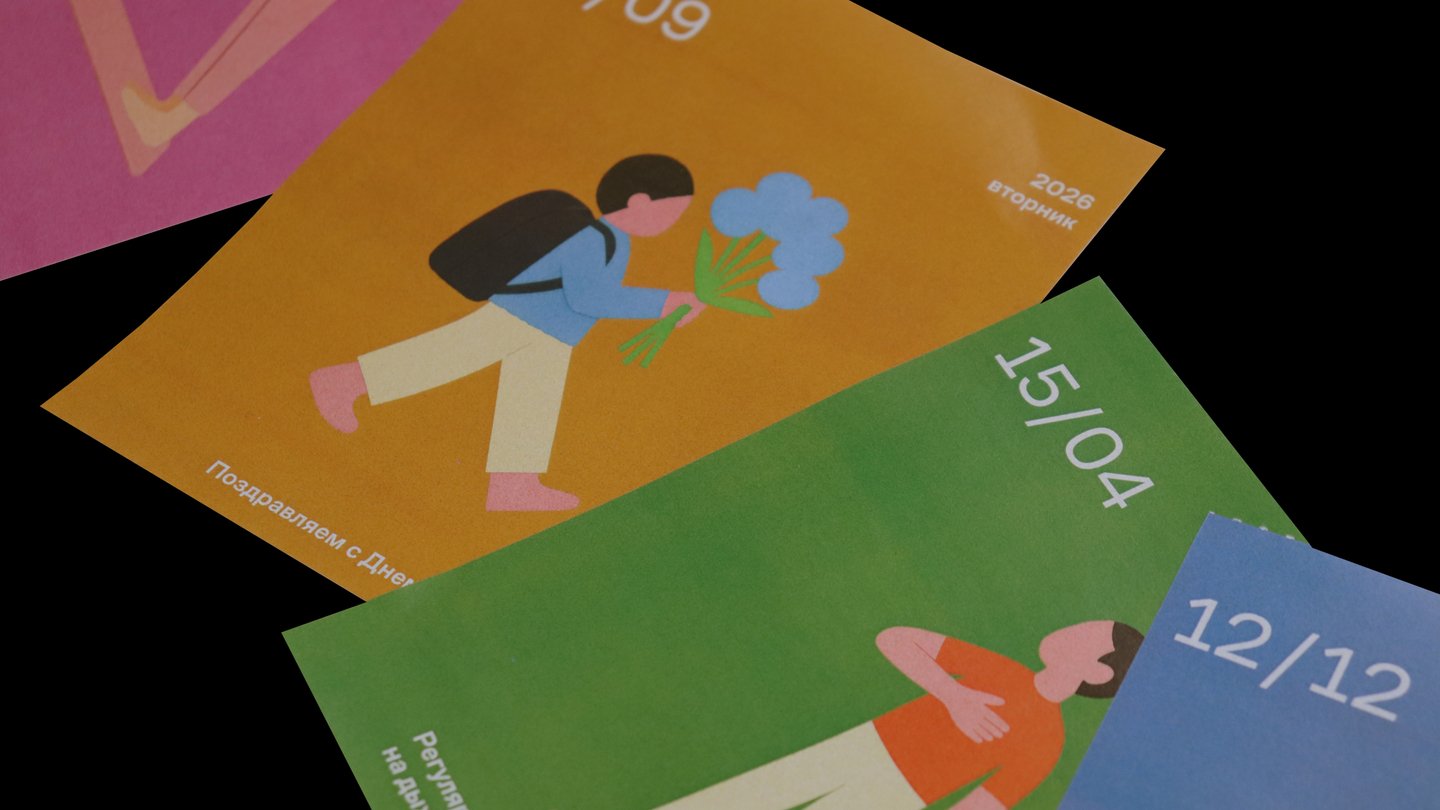
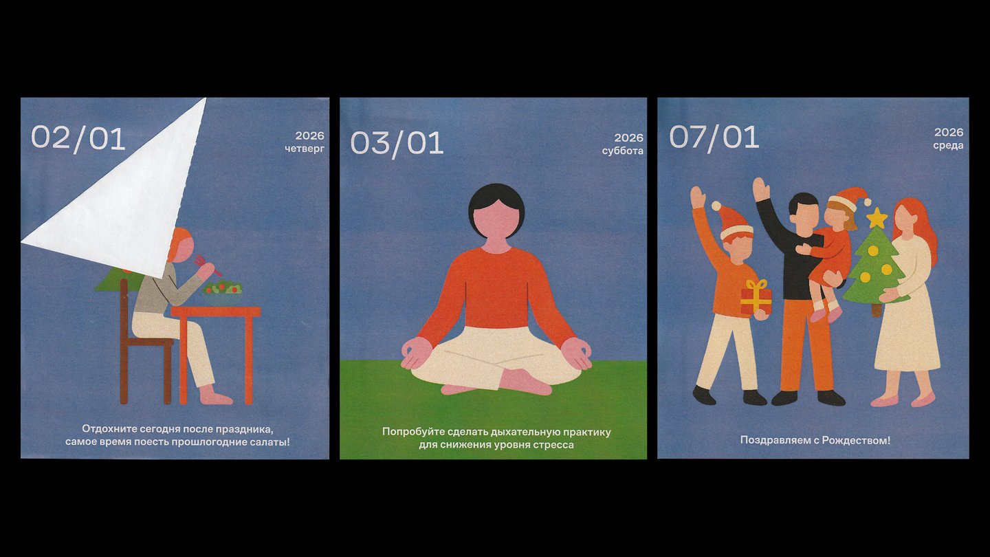
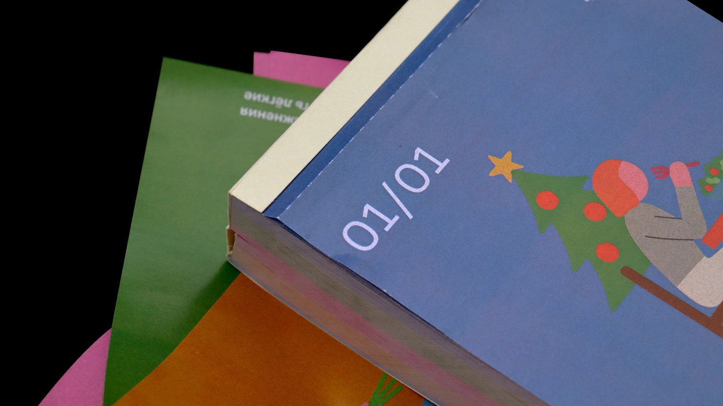
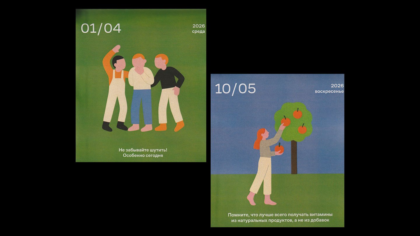
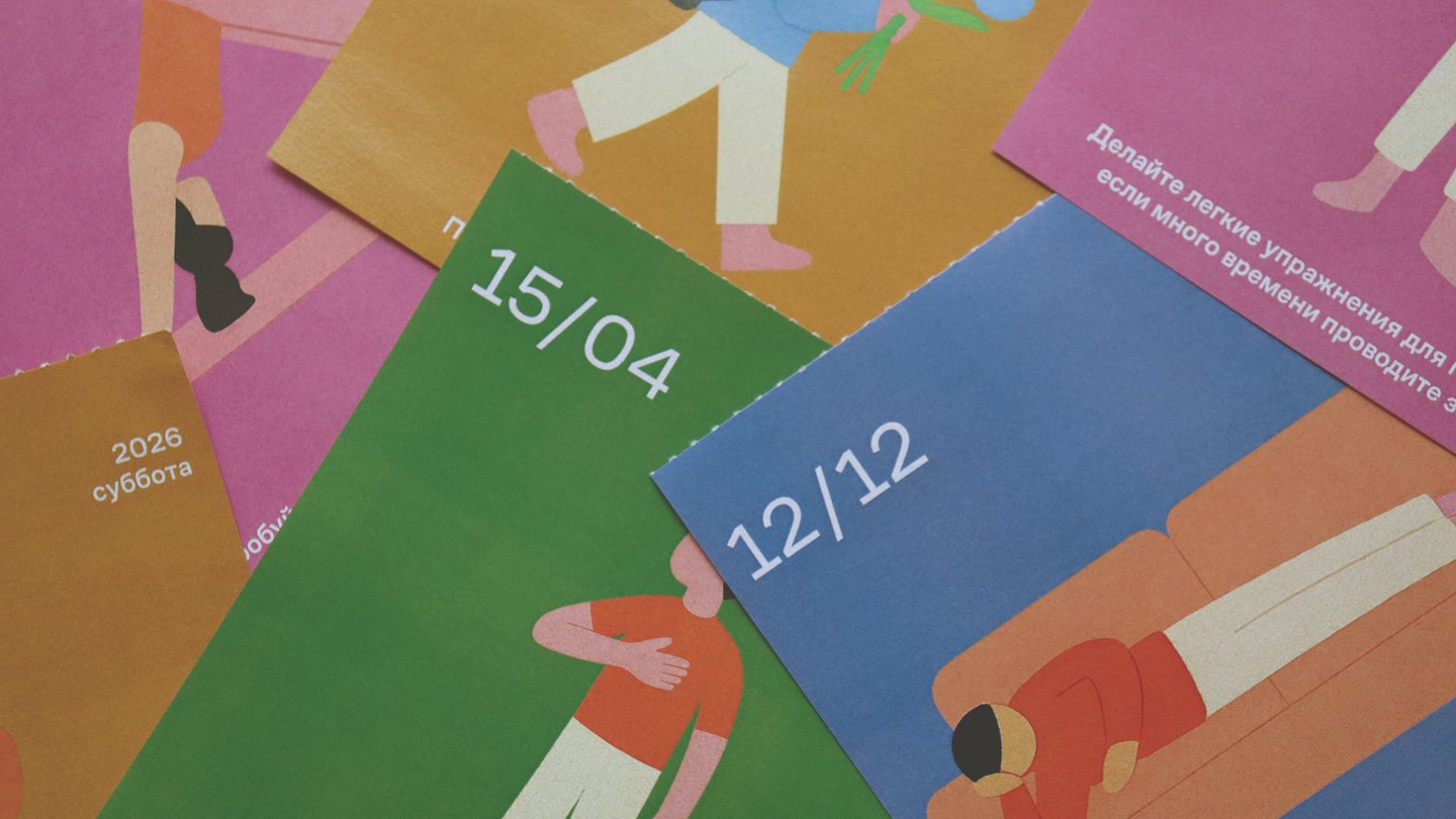
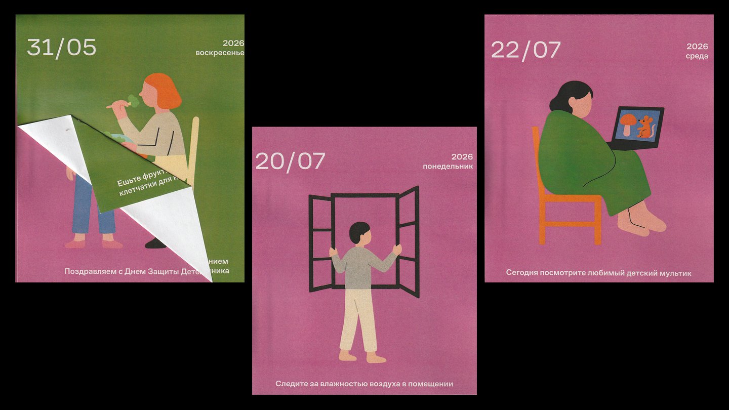
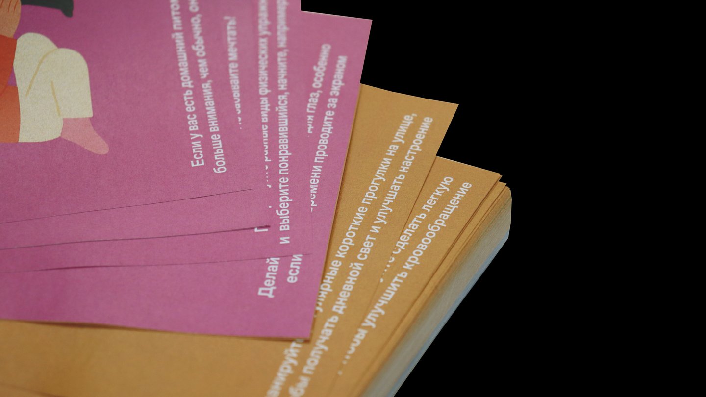
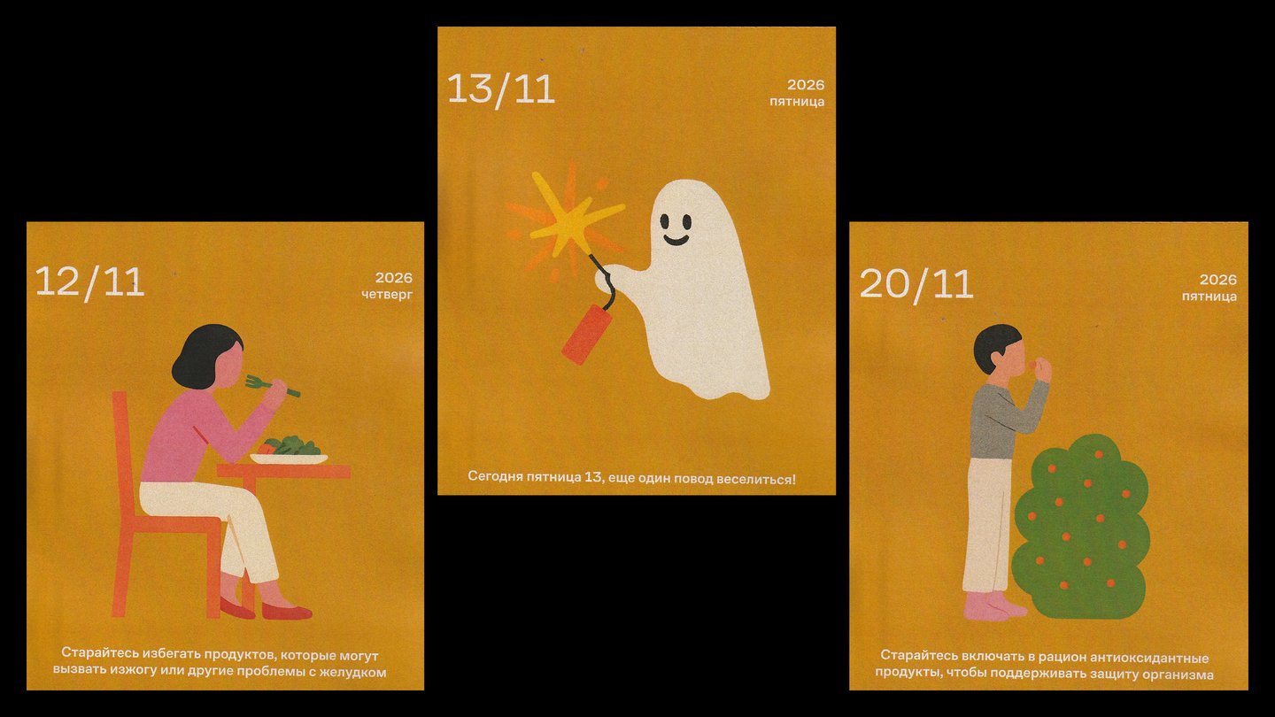
One system: the same structure on every daily page: each page shows the date, weekday, a daily reminder and advice, with the four seasons marked by colour, in an 18 × 25 cm format.