
Communication theory: NOWA

Neural interface brand for human–machine communication.
NOWA is based on the understanding that interface design is not merely functional or aesthetic — it is a form of communication. Every digital interface sends messages through structure, rhythm, tone, and visual intensity. Communication theory allows these messages to be designed consciously rather than intuitively.
NOWA website concept
From the perspective of communication studies, an interface is not a neutral medium. It shapes how information is perceived, how decisions are made, and how users emotionally relate to digital systems. In contemporary design practice, this means that layout, motion, hierarchy, and interaction patterns function as communicative acts.
NOWA adopts an interpretive approach to communication. Meaning is not fixed inside the system but emerges through interaction between the user and the interface. This position aligns interface design with contemporary art and critical design practices, where experience, perception, and context are central.
Following modern communication theory, communication is understood as a process of meaning-making through interaction rather than a one-way transmission of information.
In NOWA: • the interface acts as a sender, • the user acts as an interpreter, • adaptation functions as feedback.
Meaning is produced dynamically through continuous interaction.
brand colors
Visual research for NOWA focuses on calm digital environments, minimal cognitive pressure, and adaptive visual systems. References include: • ambient interfaces, • slow design practices, • post-attention digital aesthetics, • contemporary critical UI concepts.
The visual language avoids aggressive contrast, excessive motion, and overstimulation.
brand aesthetics
NOWA
a Calm Digital Companion
NOWA
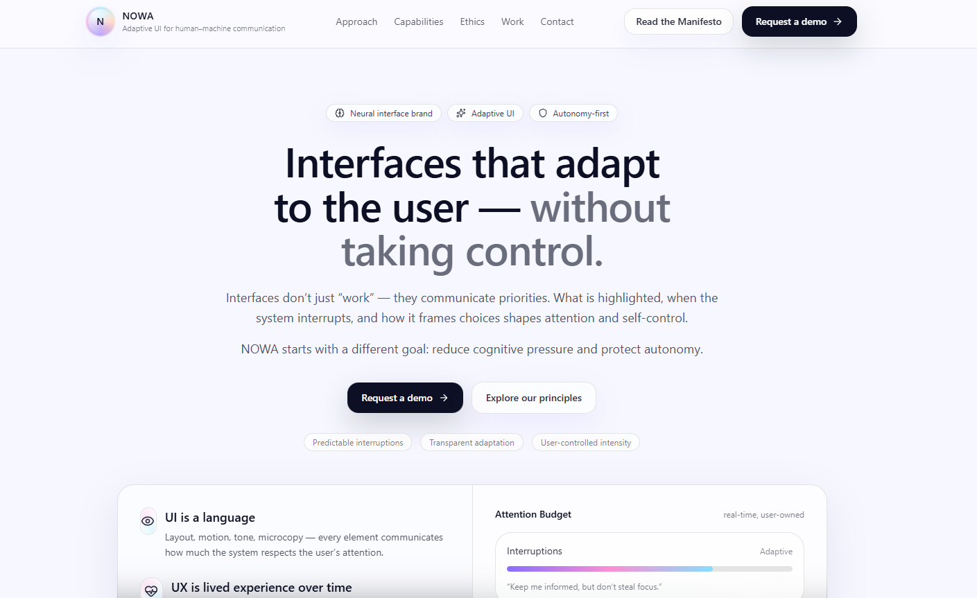
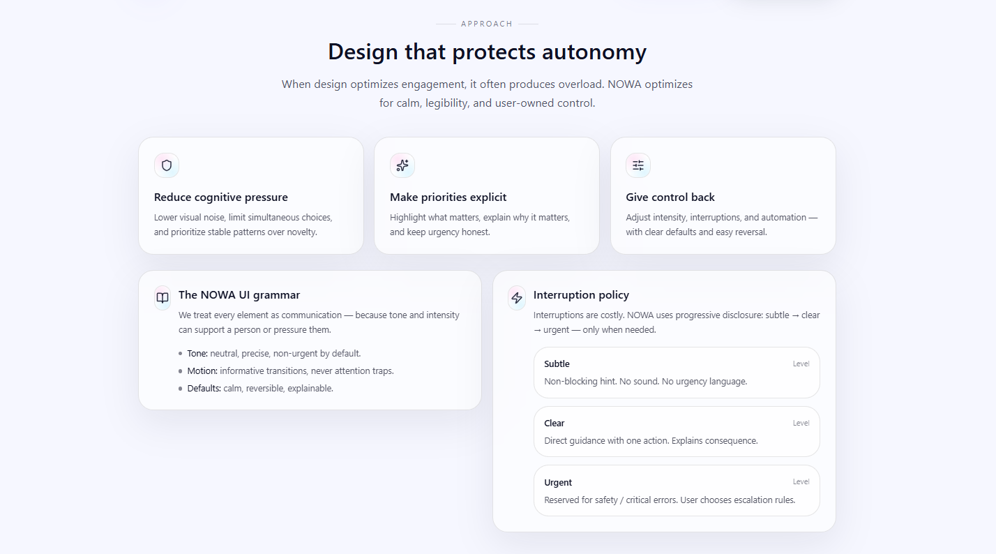
is an adaptive interface designed to support users in everyday digital interactions. It reduces overload by adjusting its form to the user’s context instead of demanding constant attention.
NOWA
does not rush, judge, or pressure. It adapts.
branded products
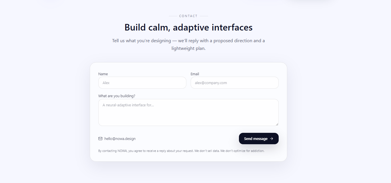
Brand Idea & Mission NOWA’s mission is to create a digital environment that respects human cognitive and emotional limits. The brand promotes: • clarity over stimulation, • adaptation over control, • calm over urgency.
Brand Story NOWA emerged as a response to attention-driven digital culture. Instead of maximizing engagement, it focuses on sustainable interaction and long-term trust. NOWA treats the interface as a relationship rather than a tool.
branded products
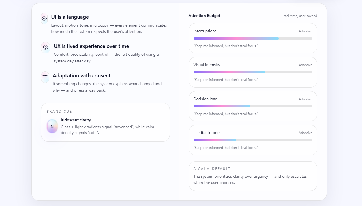
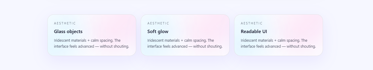
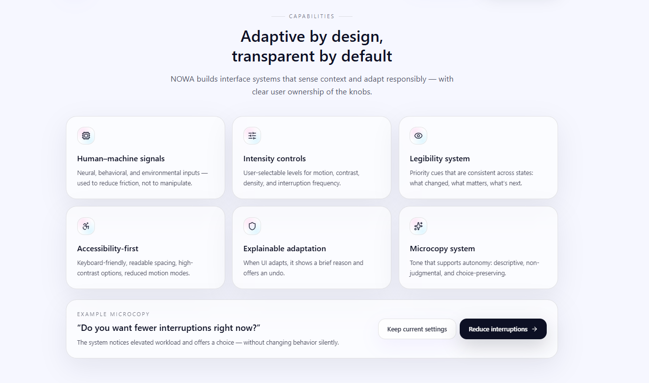
Visual Identity NOWA’s visual identity is minimal and adaptive: • soft color palettes, • restrained motion, • clear hierarchy, • flexible layouts. The interface visually communicates its state and intent.
User Experience: For the general audience, NOWA communicates through experience rather than explanation: • fewer interruptions, • calmer transitions, • predictable behavior. Meaning is formed through use, not instruction.
For a professional audience, NOWA is presented as a structured communication system rather than a lifestyle product.
outdoor advertising — billboard
Market Position NOWA positions itself as an alternative to engagement-driven interface design. Its unique value lies in ethical adaptation and communicative transparency.
System Logic NOWA operates through: • contextual sensing, • behavioral interpretation, • interface adaptation, • user feedback. All adaptations are explainable and reversible.
office
Design Guidelines To reduce communicative noise, NOWA follows strict guidelines: • consistent hierarchy, • controlled motion, • limited color intensity, • clear typographic structure.
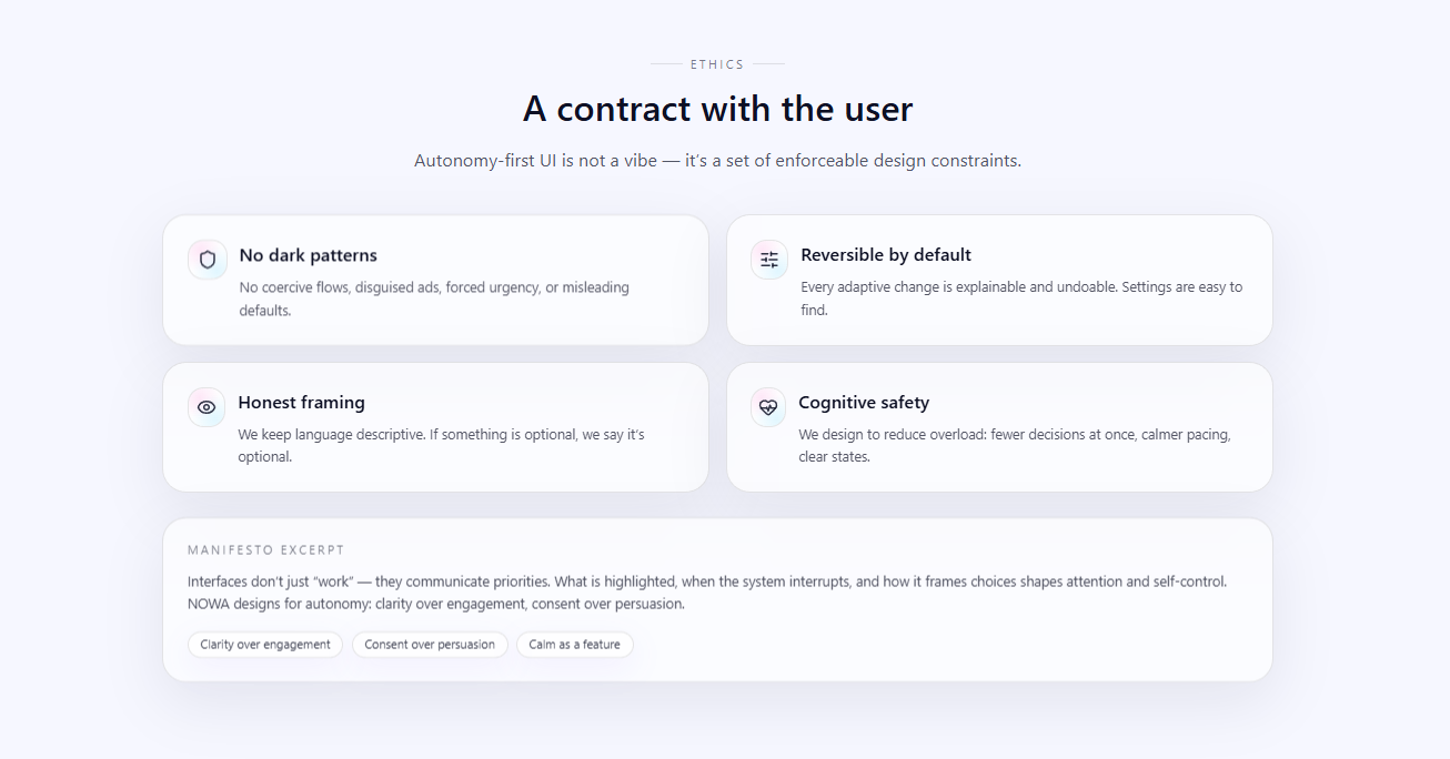
Ethical Framework NOWA rejects: • urgency by default, • shame-based language, • pressure metrics such as time-on-screen. • The system prioritizes autonomy and consent.
Communication theory served as the foundation for all design decisions in NOWA.
1. Cybernetic Tradition Communication as a feedback system. NOWA adapts interface form based on feedback to reduce noise and friction rather than increase engagement.
2. Phenomenological Tradition Communication as lived experience. NOWA avoids emotional labeling and instead mirrors the user’s experiential state through tone and rhythm.
3. Socio-Psychological Tradition Communication influences behavior and cognitive load. NOWA minimizes micro-decisions and cognitive pressure through adaptive simplification.
4. Socio-Psychological Tradition Communication influences behavior and cognitive load. NOWA minimizes micro-decisions and cognitive pressure through adaptive simplification.
5. Semiotic Tradition Interface elements function as signs: • density = cognitive demand, • motion = tempo, • color = emotional intensity.
6. Critical Tradition NOWA embeds a critical stance against attention economy logic by design.
business card
Interpersonal Communication & Politeness Theory NOWA treats interface interaction as interpersonal communication: • respectful tone, • reversible actions, • transparent explanations. This preserves user dignity and trust.
Interpretive Approach NOWA follows an interpretive communication model: • no single correct meaning, • no hidden inference, • user control remains central.
SENSE interface concept
Idea: a website that identifies the user’s emotional state through a simple test and adjusts the atmosphere.
How it adapts: • Background color and music adapt to the mood. • Content becomes calmer or more inspiring.
Example: if the user reports negative emotions, the site lowers contrast, switches to night mode, and offers a short nature video.
MINIMA interface concept
Idea: a minimalist website that learns which functions the user actually uses and hides everything else.
How it adapts: • After a week of use, only the essential buttons remain. • Navigation restructures itself based on behavior (frequently used sections move closer).
Example: an online editor that «cleans itself up» day by day until only your personal workflow remains.
Flowstate interface concept
Idea: a website that reacts to breathing through the microphone.
How it adapts: • Visual elements «breathe» together with the user. • If breathing becomes faster, the interface slows down and colors soften.
Example: a digital gallery where paintings come alive and move in sync with your breath.
ORA interface concept
Idea: an assistant‑website that changes based on the user’s biorhythms.
How it adapts: • Morning: energetic color palette, short tasks. • Evening: soft lighting, reminders about sleep and rest. • Midday: focus‑boosting suggestions.
Example: a planner interface whose visual language «lives by your schedule».
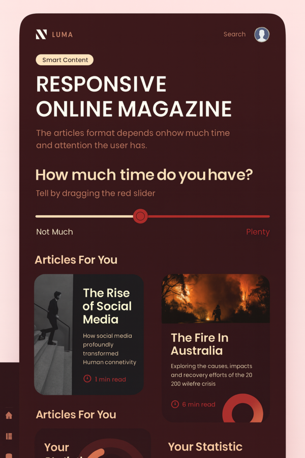
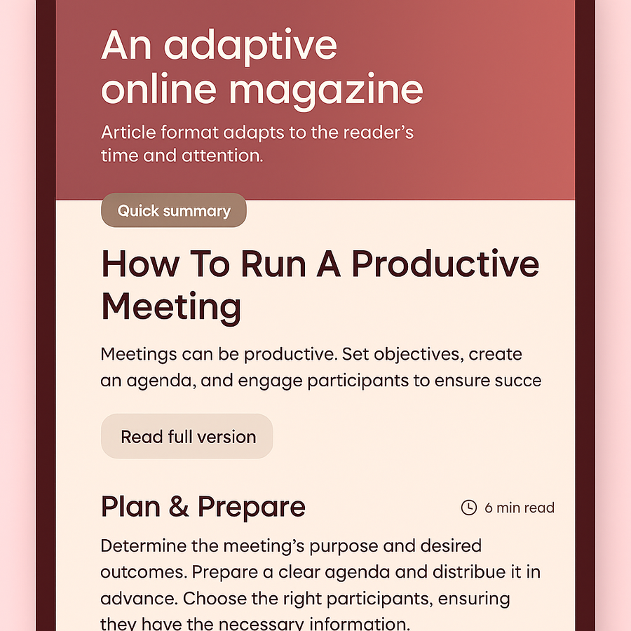
LUMA interface concept
Idea: a magazine that detects how much time and attention the reader has and adjusts the article format.
How it adapts: • If the user is in a hurry — it offers a short summary. • If there’s time — it reveals the full version with interactive details.
Example: «smart» content that respects the reader’s time.
NOWA demonstrates how communication theory can be applied to contemporary interface design. By treating UI as communication, the project creates a calm, adaptive, and ethical digital system that prioritizes human experience over attention metrics.
«Communication Theory: Bridging Academia and Practice» online-course (дата обращения: 12.12.2025)
Нейросети для генерации изображений:
https://gemini.google.com (дата обращения: 14.12.2025)
https://chatgpt.com(дата обращения: 14.12.2025)
https://sora.chatgpt.com (дата обращения: 14.12.2025)
Готовые изображения:
https://i.pinimg.com/originals/33/87/a8/3387a8e9cf7b43fdf627b6f9680ff83e.gif (дата обращения: 14.12.2025)
https://i.pinimg.com/1200x/d5/b8/56/d5b85608b4e20e65469320833802b370.jpg (дата обращения: 14.12.2025)
https://i.pinimg.com/1200x/18/5f/30/185f30c551cbe908d901f36652fa04ef.jpg (дата обращения: 14.12.2025)
https://i.pinimg.com/736x/ba/81/92/ba8192652f2822687f8f26149bfa94b6.jpg (дата обращения: 14.12.2025)
https://i.pinimg.com/736x/06/d1/f7/06d1f70197c88628c1441cf43d83fc1f.jpg (дата обращения: 14.12.2025)
https://i.pinimg.com/736x/42/51/5d/42515d2f1b330d70390da5c64e007f4d.jpg (дата обращения: 14.12.2025)
https://i.pinimg.com/1200x/4d/6f/87/4d6f87d27a79bfdfe7252db974a35c64.jpg (дата обращения: 14.12.2025)
https://i.pinimg.com/736x/fc/b5/42/fcb5422ba7cec668b51a9ec522282b49.jpg (дата обращения: 14.12.2025)
https://i.pinimg.com/736x/38/26/01/38260129accc1cd8cc6845d313069d78.jpg (дата обращения: 14.12.2025)
Мокапы:
https://mockupdownload.ru/downloads/moka-beloj-vizitnoj-kartochki/ (дата обращения: 14.12.2025)
https://mockupdownload.ru/downloads/mokap-reklamnogo-shhita-8/ (дата обращения: 14.12.2025)
https://mockupdownload.ru/downloads/mokap-ofisa/ (дата обращения: 14.12.2025)


