Communication theory: just puree
Communication theory in the design field
Communication theory considers the process of transferring meaning between sender and recipient through a system of signs, channels and contexts.
In design, it becomes a tool that allows you not just to design objects, but to construct values that the audience reads.
Any design object — logo, packaging, poster, interface — acts as a message that the viewer interprets through their experience, culture, and expectations. Semiotics helps to understand which signs and visual codes evoke the right associations: color can work as an emotional marker, shape as a symbol of function, style as a guideline for a specific audience.
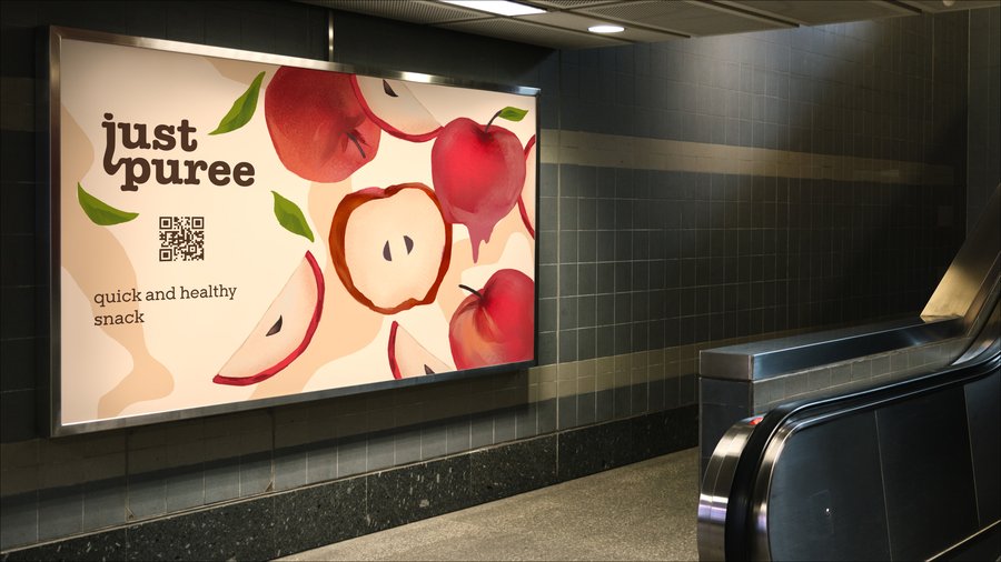
Poster in subway
Communication theory also emphasizes the importance of channel and context. The same message looks different offline, on social media, on packaging, or in an urban environment. When creating a brand, it is important to take into account how the perception and interest of the viewer change in different media.
In addition, the theory describes the concept of «noise» — anything that distorts meaning: excessive detail, overly complex symbols, inappropriate stylistic decisions. A designer should be able to reduce noise and enhance meaning.
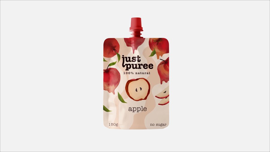
Package
Presentation to the general audience
Just puree forms
Just Puree brand is a natural fruit and vegetable puree without additives. The main idea of the brand is a clean product and nothing superfluous.
The visual system uses soft natural shades, reminiscent of the texture of mashed fruits and vegetables, and simple, friendly typography. The logo is built around the plastic shape of letters «j» and «p», which is associated with the fluidity and softness of the product.
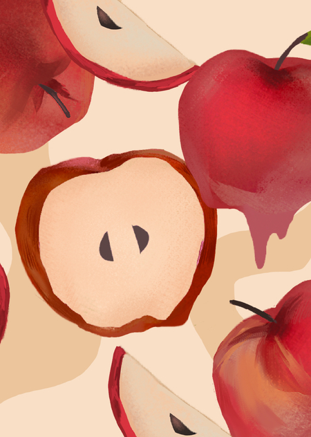
Graphic patterns are inspired by organic shapes -they convey naturalness, simplicity and a sense of «authenticity». Large, mouth-watering images of fruits appear in the promotional materials, which immediately explain what is inside the package.
The brand speaks to the audience in a simple and honest language. The main message is a quick and healthy snack made only from natural ingredients. This is a solution for those who care about their health, but live in an active rhythm.
On the packaging, in social networks and outdoor advertising, the brand looks bright and recognizable. It inspires confidence and emphasizes the naturalness of the product, while maintaining its lightness and positive visual character.
Presentation for professional audience (designers, art directors)
Just puree social media
The Just Puree branding is based on a combination of semiotically transparent visual codes and an emotional orientation of communication.
Typography is a modified grotesque with rounded shapes, creating a feeling of softness and plasticity. The letter «j» gets an elongated lower part, which visually repeats the flow or stream of mashed potatoes, forming an iconic element, also used in the abbreviated sign «jp».
The color palette is based on natural beige and brown shades with rich accents of red fruits. This system combines natural associations with high contrast, which is necessary to highlight the brand on the shelf.
Billdoard
The patterns are developed on the basis of amorphous organic spots -they simultaneously resemble the structure of fruit puree and natural shapes (fruits, peel, fibers). This creates a recognizable and holistic graphical environment that scales easily for packaging, posters, and digital media.
The illustrative style uses large brushstrokes, light transitions and texture, referring to the manual technique. This enhances the impression of «handmade», the honesty of the product and reduces the distance between the brand and the consumer.
In social media communications, a strong typographic statement is used, working in tandem with large images of ingredients. The messages are short, clear, and based on the principle of direct targeting.
In this way, the brand system is simply purged into: — visual signs symbolizing naturalness and softness; — adaptive typography; — painterly illustrative style; — modular pattern system; — the intersection of emotional and rational levels of communication.
Just puree shop bags
How communication theory formed the basis of the project
Visual keys
Culinary theory recommended making brandy simply in the form of mashed fruits and vegetables for all occasions.
1. Sender — Message — Recipient The sender is the brand, the message is the idea of a «natural product without excess», the recipient is a modern consumer who appreciates simplicity and quality. This model helped to formulate the key meaning, which then formed the basis of the visual system.
2. The semiotic approach Visual signs were chosen that are easily interpreted without additional explanations: — rounded shapes = softness and naturalness, — handmade textures = honesty and emotionality, — organic patterns = naturalness, — red and beige shades = taste and natural ingredients. Semiotics allowed us to create a brand language that is resistant to different mediums.
3. Communication levels (emotional/rational) Rational level: natural product, sugar-free, convenience. Emotional level: delicious, bright, friendly. The combination of levels provided a comprehensive communication strategy.
4. Channel and context Packaging, social media, outdoor advertising -each channel has received an adapted message.
For example: — in social networks, the emphasis is on large typography and short slogans, — on packaging — on texture, pattern and ingredients, — in outdoor advertising — on a bright illustrative row.
Minimalism, a solid palette and clear shapes eliminate visual noise and make the message easy to read.
All this made it possible to create a system where the visual form directly follows the communication task.
Just Puree visual key
List of literature and image sources
Materials from the Communication Theory course.
Anna Zaharova’s personal private project from Figma https://www.figma.com/proto/lE0IJqV8QGPYi1xLXygCZn/Untitled?page-id=0%3A1&node-id=1-42&viewport=718%2C297%2C0.2&t=VkZMYdnnxUIZeIND-1&scaling=contain&content-scaling=fixed


