Communication theory: UNIGROW
«Communication is the relational process of creating and interpreting messages that elicit a response» (Griffin).
Design is primarily a tool of visual communication, as its goal is the exchange of meanings and ideas between a brand and the consumer, which reflects the semiotic tradition.
Part 1: How communication theory works in the field of design or contemporary art
Any design (poster, logo, movie title sequence, application interface, etc.) acts as a sender, and the client as a receiver. It is important to understand that the designer’s vision may not align with the audience’s perception: each user decodes the message embedded by the designer through their own context and experience. Therefore, studying the target audience and project goals plays a significant role in design. A premium jewelry brand will use a more laconic and restrained design (calm tones, serif fonts), emphasizing the elegance, quality, and originality of the products, while a more accessible brand for young people, on the contrary, will use bright and flashy solutions to attract attention and meet the needs of a young audience: to stand out from the crowd. Thus, different brands, even within the same niches, «speak different languages».
Posters for a brand targeting a younger audience
A critical perspective allows a designer to evaluate the visual elements of different projects and correctly convey meanings and ideas; this requires the specialist to reflect on their own assumptions and obtain feedback from representatives of the necessary target audience.
Rhetoric and persuasion are no less important in design, as any project is presented to and defended before the client. The designer’s attitude is as important as the project itself, because communication and public speaking skills can have both a positive and negative impact on the person evaluating the design. Effective persuasion requires a combination of key components of persuasion:
1. Ethos (the speaker’s authority and credibility: «I have 5 years of experience in branding») 2. Pathos (emotional impact: «this design will evoke certain emotions in your audience») 3. Logos (logical proof: «testing results show a +20% conversion rate»)
Furthermore, designers face the need for self-presentation or representing their company, which is covered in PR Communication. On a personal level, a designer builds a personal brand through a portfolio and confident use of rhetoric and persuasion, while studios and agencies do so through the company website and overall advertising communication in the market.
Interpersonal and group communication in design determine the effectiveness of interaction among process participants. A freelancer communicates directly with the client, and politeness theory helps maintain working relationships, as both parties strive to «save face» during criticism and revisions. According to social exchange theory, successful collaboration is built on a balance of rewards and costs — the client pays for the work, and the designer invests time and effort. In agencies and studios, group communication plays a key role. Brainstorming, which brings colleagues together, increases productivity, but the danger of Groupthink can suppress critical thinking. Therefore, role distribution (critic, idea generator, implementer) and hierarchy, from junior designer to art director, help preserve a diversity of opinions and the quality of solutions.
When creating designs for mass distribution (advertising campaigns, retail packaging, web interfaces), it is necessary to consider the psychology of mass perception. Colors function as stimuli that elicit specific reactions: red creates a sense of urgency and action (effective for «buy now» buttons), green is associated with ecology and naturalness, blue — with reliability and stability. However, cultural context significantly modifies these meanings. While red in the West may symbolize danger or urgency, in China it traditionally signifies luck and prosperity. Similarly, typographic choices have psychological impact: serif fonts are perceived as traditional and formal, rounded fonts — as soft and friendly. Understanding these mechanisms allows the designer to create visual systems that predictably influence a mass audience.
The theory of the influence of different colors on different people
The theory of the influence of different colors on different people
Communication theory includes four key functions:
1. Description: Communication theory in the field of design helps organize information and observations about how visual solutions influence people’s choices and behavior. It allows designers to clearly and consistently describe different objects, processes, and phenomena.
2. Explanation: By relying on communication theory, designers can understand why some elements are easy to perceive and produce the desired effect, while others cause confusion. This makes it possible to build clear and effective communication between a brand and its audience.
3. Prediction: The use of communication theory makes it possible to assess in advance how a visual style will affect brand perception and what kind of response a new product may evoke from the target audience.
4. Transformation: By applying communication theory in practice, designers create solutions that change the user’s experience of interacting with a product or environment. These changes aim to improve usability, enhance visual appeal, and increase functional efficiency.
Part 2: Presentation of the brand for a general audience
Unigrow is a brand of complex mineral fertilizers. It is aimed at young families who own a plot of land and wish to grow healthy vegetables for themselves and their children. The main problem for such people is that they are afraid to buy fertilizers because they don’t know how to use them correctly, don’t understand complex chemical compositions, and worry about ruining something or using something harmful. Unigrow solves this problem by offering pre-balanced, ready-to-use formulas. The front of the packaging features an image of the plant the fertilizer is intended for, along with text like «For Tomatoes», «For Cucumbers», or «For Flowers» — this is the primary information on the package. However, the composition (for example, «N-8 K-8 P-16») is also included. Some of the audience may still want to know the details, and we are not exclusively targeting a completely uninformed public; we simply make the composition secondary, not the main focus.
Brand of complex mineral fertilizers
Part 3: Brand presentation for a professional audience
Unigrow is a brand of complex mineral fertilizers with universally balanced macro and micronutrients. The product is designed for non-professionals: young families, home gardeners, and hobbyists.
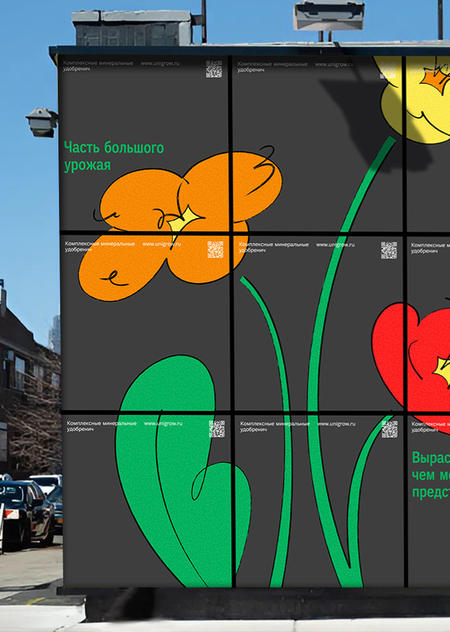
This is an example of branding for a fast-moving consumer good, where a single metaphor serves as the framework for both the visual identity and the entire communication strategy. The brand’s central metaphor is «plants outgrow the packaging». On the level of visual likeness, this is a literal depiction of tomatoes, flowers, and cucumbers bursting beyond the boundaries of the medium and growing larger than standard proportions. This visually reinforces the product’s main promise: the fertilizer yields a noticeably larger harvest than the user expects.
The indicator of the brand’s central metaphor is «plants don’t fit in the package size»
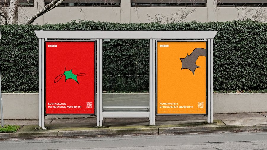
The entire visual system is subordinated to this idea. The palette utilizes rich, bright colors (pink, yellow, green, orange), which evoke an emotional response and are associated with the juiciness of a harvest. A dark background accentuates the primary colors and creates high contrast. This enhances visibility both in retail and digital environments (packaging on the shelf, outdoor advertising, social media posts). A dense, elongated sans-serif font visually mimics a plant stretching upward and outward; the text appears to «push against» the edges of the medium, reinforcing the growth metaphor.
The brand consists of rich, bright colors
The brand consists of rich, bright colors
The primary graphic language consists of stylized illustrations based on simple geometric shapes. This technique supports mass communication: the elements are easily legible from a distance, quickly deciphered at a glance, and require no special knowledge from the viewer, creating a sense of «this is simple and accessible for me». Against this backdrop, the strategic differentiation from competitors becomes particularly evident: some brands in the category use a dry, «scientific» visual language emphasizing formulas and complex labels, while others employ cluttered, outdated designs. Unigrow deliberately occupies a third position: a friendly and modern brand that stands out precisely through its communication language, rather than a radically different product type.
Simple and recognizable graphic shapes


Simple and recognizable graphic shapes
This strategy is consistently implemented across all channels: in social media, merchandise, and outdoor advertising. The same visual logic is repeated everywhere.
Part 4: Theoretical justification of approaches to brand presentation for different audiences
Brand presentation for a general audience When presenting a brand to a broad audience, it’s important to remember — you’re speaking to people who aren’t versed in design, marketing, or the specifics of the niche. They don’t understand professional details. That’s why the conversation with them is built on two simple things: emotion and obvious benefit.
You need to get the main points across right away: — What is it? (Unigrow is simple fertilizer for home and garden use). — What problem does it solve? (You don’t understand chemical formulas and worry about harming your plants? We get that). — What’s the solution? (Our formulas are pre-balanced and clearly labeled: pick the one for tomatoes, cucumbers, or flowers — and just use it).
The language should be simple and lively, free from theory or complex terms. We say it straight: «Your plants will grow bigger than you expect», «It’s safe and impossible to mix up». We intentionally keep only this key information, cutting out everything extra.
Why? Because a person in a supermarket or scrolling through their social media feed makes a decision in seconds — based on first impression, not deep analysis. If we overload them with details, formulas, or complicated explanations, we create «information noise» and simply lose their attention. Our task isn’t to tell them everything, but to give just enough so it’s clear, safe, and interesting.
Brand presentation for a professional audience For a professional audience, the approach shifts in both depth and language. What matters here isn’t just the final outcome, but the underlying mechanics: how the core metaphor functions across the entire visual system, the strategic role of the color palette, the logic behind typographic choices and information hierarchy, and how every decision is linked to the target audience’s context and the competitive landscape. The message unfolds into a detailed strategic breakdown, because this audience demands to see the internal logic behind each step and a clear rationale for every visual and textual choice — not just the final result of «it looks good and works».
Application of theoretical traditions
This division directly draws upon the theoretical traditions examined in the course.
According to Craig’s sociocultural tradition, meaning is shaped within specific cultural contexts and audience practices. As a result, the same brand must communicate differently with people whose experiences, values, and backgrounds vary.
The semiotic tradition helps explain how a single metaphor — such as «plants no longer fitting» — can operate on multiple levels. For a general audience, it may simply suggest the promise of a larger harvest, while for professionals it functions as a more complex sign, combining visual imagery, causal reasoning, and symbolic meaning.
The rhetorical tradition clarifies why different persuasive strategies are required. When addressing a broad audience, communication often relies on pathos and a supportive ethos, acknowledging concerns and offering reassurance. In contrast, professional audiences respond more strongly to logos and expert ethos, which emphasize evidence, analysis, and demonstrated competence. Importantly, this approach does not result in two separate brands. Instead, it represents a single Unigrow identity that consistently adjusts its language and level of explanation to match how each audience perceives and processes information.
Communication Theory: Bridging Academia and Practice // edu.hse.ru URL: https://edu.hse.ru/course/view.php?id=133853 (дата обращения: 13.12.2025)
Роберт Крейг (Robert T. Craig): Его статья «Communication Theory as a Field» (1999) // https://academic.oup.com/ct/article/9/2/119/4133096 (дата обращения: 13.12.2025)
On Rhetoric: A Theory of Civic Discourse by Aristotle (Trans. G. A. Kennedy) // Oxford University Press URL: https://global.oup.com/academic/product/on-rhetoric-9780195305098 (дата обращения: 13.12.2025)
The Brand Gap: How to Bridge the Distance Between Business Strategy and Design by Marty Neumeier // New Riders URL: https://www.newriders.com/books/the-brand-gap (дата обращения: 14.12.2025)
All images are taken from Daria Anokhina’s project: https://portfolio.hse.ru/Project/258320 (дата обращения 13.12.2025)

 as a Posthuman Practice of Empathy")

