ребрендинг агентства зубных фей «BANK32» с помощью нейросетей
BANK32 — банк для зубных фей и детей. С его помощью можно купить, продать, сдать на хранение или обменять зубы на деньги и наоборот.
носители с оригинального проекта
Логотип

сгенерировано при помощи Ideogram.ai
промт: Minimalist logo for a children’s bank. A simple scene of a fairy placing a gold coin under a tooth. The text «BANK32» is rendered in a friendly, rounded font that matches the soft, contour line
Палитра

создано на основе логотипа при помощи AdobeColor
Шрифт
Como Extra Bold
определено при помощи WhatTheFont
Пространство BANK32
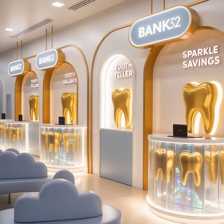
сгенерировано при помощи Ideogram.ai
промт 1: Interior design of a «BANK32» bank branch, fairytale modern style. The space is designed for fairies and children, specializing in Tooth commerce.
Key Visual Elements: - Color Palette: Strictly use the brand colors: clean WHITE, warm YELLOW (r254 g196 b0), and soft shades of GRAY. - Brand Integration: Incorporate the BANK32 logo’s visual identity: use the same custom rounded, friendly font for all signage (e.g., «Tooth Teller», «Sparkle Savings»). Use the logo’s graphic elements (e.g., a golden tooth, a magic coin) as subtle patterns on walls or glass. - Thematic Features: — Small, fairy-sized teller windows alongside regular ones. — «Tooth Valuation» counters that look like magical mirrors or enchanted crystals. — Display cases showcasing gleaming, golden teeth instead of money. — Comfortable, child-sized seating in organic, cloud-like shapes. — Magical, sparkling accent lighting.
Atmosphere & Style: Whimsical, secure, clean, and welcoming. A modern fairytale aesthetic that feels both magical and trustworthy. Bright, well-lit space with a white background, using yellow and gray for accents and furniture.
View: A wide-angle, clean view of the bank’s interior lobby, showing the teller line, waiting area, and thematic decorations.
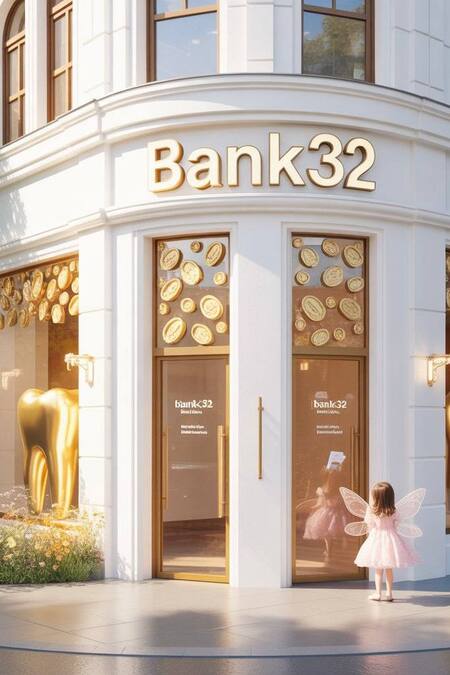
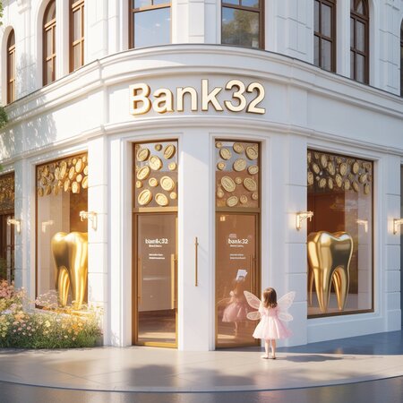
промт 2: Exterior architecture of «BANK32» bank building, fairy-tale modern style. The building specializes in Tooth commerce for fairies and children.
Main Design: - Architecture: Clean modern building with magical fairy-tale elements. Rounded corners, large welcoming entrance. - Color Scheme: Dominant white facade with accents in warm yellow (r254 g196 b0) and elegant gray details. - Brand Identity: Large «BANK32» sign above entrance using the same custom rounded friendly font from the logo. Repeating golden tooth and coin patterns as decorative elements on glass doors or facade.
Key Features: - Two entrance doors: standard size and small fairy-sized door with tiny golden handle - Display windows showing giant gleaming golden teeth instead of traditional displays - «Tooth Exchange» sign in logo’s font style - Magical sparkling lights around entrance - Small fairy garden with glowing flowers near entrance
Atmosphere: Whimsical, trustworthy, welcoming and magical. Bright daytime lighting, clean modern fairy-tale aesthetic that appeals to both children and fairies.
View: Front perspective view showing the main entrance, display windows, and architectural details in crisp detail.
зона обслуживания клиентов
сгенерировано при помощи Qwen.ai
промт: Interior of BANK32 bank main hall, consistent with exterior design. Features:
Key Areas: - White walls with yellow (r254g196b0) and gray accents - Teller counters with two height levels: for adults and fairies - «Tooth Exchange» signs in brand font from references - Display cases showing golden teeth and coins - Comfortable child-sized seating in cloud-like shapes
Branding: BANK32 logos on walls, golden tooth patterns on glass partitions Lighting: Bright, magical sparkling accent lights Atmosphere: Professional yet whimsical, clean, welcoming.
детская игровая зона
сгенерировано при помощи Qwen AI
промт: BANK32 children’s play area interior, maintaining brand identity:
Design Features: - White and yellow (r254g196b0) color scheme with gray soft furniture - «Tooth Treasure Sandbox» with golden coin dig area - Fairy castle reading nook with BANK32 branding - Educational games about tooth-money exchange - Wall graphics with golden teeth and fairy wing patterns
Safety: Rounded corners, soft materials, visible supervision area Atmosphere: Educational, magical, fun while maintaining brand consistency.
кабинет финансового консультирования
сгенерировано при помощи Qwen.ai
промт: BANK32 financial advisory office interior, same design language:
Elements: - Professional yet friendly space with white and gray base - Yellow (r254g196b0) accent walls with BANK32 logo - «Tooth Savings Plans» displays in brand typography - Digital screens showing tooth valuation charts - Comfortable chairs for parents and small seats for fairy clients
Details: Golden tooth decorative elements, fairy-sized documents Mood: Trustworthy, magical, professional financial services.
зона VIP-обслуживания
сгенерировано при помощи Qwen.ai
промт: BANK32 VIP banking suite interior, premium version of main design:
Features: - Luxury white and gray materials with golden yellow accents - Private tooth valuation chambers - «Golden Tooth Vault» display with enhanced security - Custom fairy-sized furniture with premium materials - Enhanced magical lighting effects
Atmosphere: Exclusive, secure, magical premium banking experience.
Постеры

сгененрировано при помощи Qwen.ai
промт 1: City street scene with series of BANK32 advertising posters in modern digital and physical formats. The bank specializes in tooth-money exchange for fairies and children.
Poster Designs & Placement: - Digital screen: Animated-style poster «Baby Tooth Bonus Program» with graphic of smiling tooth wearing gold crown - Bus stop ad: «Lose a tooth = Gain gold» showing fairy depositing tooth into magical piggy bank - Wall sticker: «24/7 Tooth Exchange» with moon and stars motif for night service
Visual Style: - Modern approach: Sleek geometric designs, gradient backgrounds (yellow to white), clean layouts - Colors: Brand yellow (r254g196b0) as dominant, white text, gray accents - Typography: Same rounded BANK32 font but in bold weight for headlines - Graphics: Abstract tooth shapes, simplified coin icons, subtle fairy dust effects
Urban Context: Posters displayed on modern digital billboard, glass bus shelter, and brick wall. Evening setting with soft artificial lighting.
Atmosphere: Contemporary magical, financially smart, digitally friendly. Professional yet approachable for young audience.
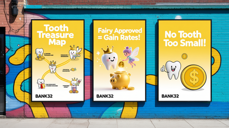
промт 2: Urban advertising campaign for BANK32 bank showing 3 interconnected posters in fun cartoon style. Tooth banking for children and fairies.
Poster Concepts: - Main poster: «Tooth Treasure Map» showing journey from lost tooth to gold coins - Secondary poster: «Fairy Approved Rates!» with happy fairy giving thumbs up - Small poster: «No Tooth Too Small!» featuring tiny tooth with giant gold coin
Design Elements: - Style: Playful cartoon illustrations with bold outlines - Color scheme: White backgrounds, vibrant yellow (r254g196b0) primary elements, gray shadows - Typography: BANK32 brand font but with playful bounce effect - Layout: Dynamic compositions with teeth and coins flowing between posters
Setting: Posters mounted on colorful city wall, slightly overlapping each other. Bright daylight.
Mood: Energetic, joyful, magical banking adventure for kids.
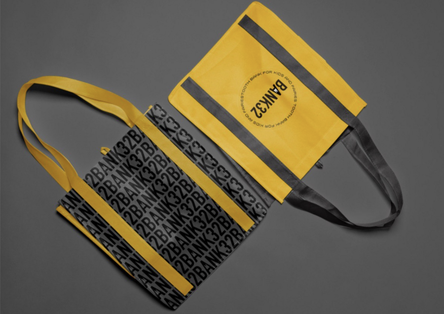
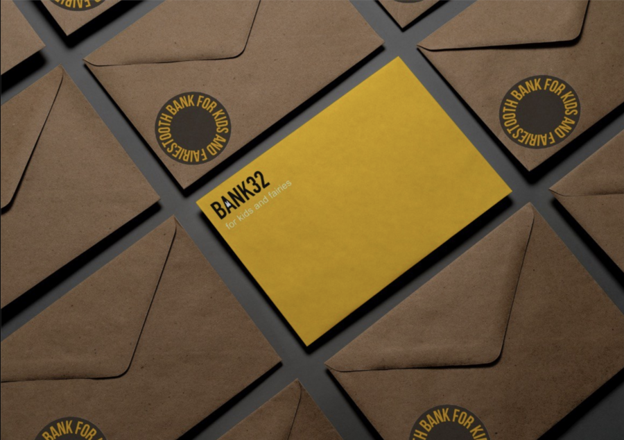
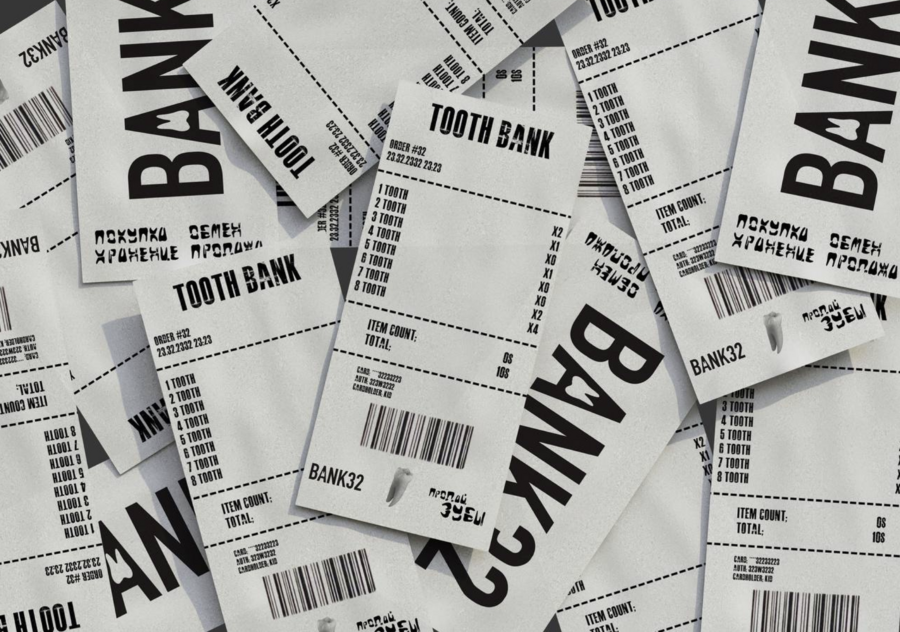
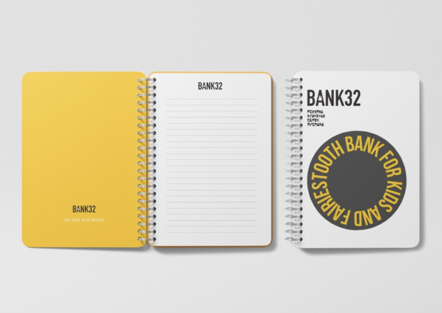
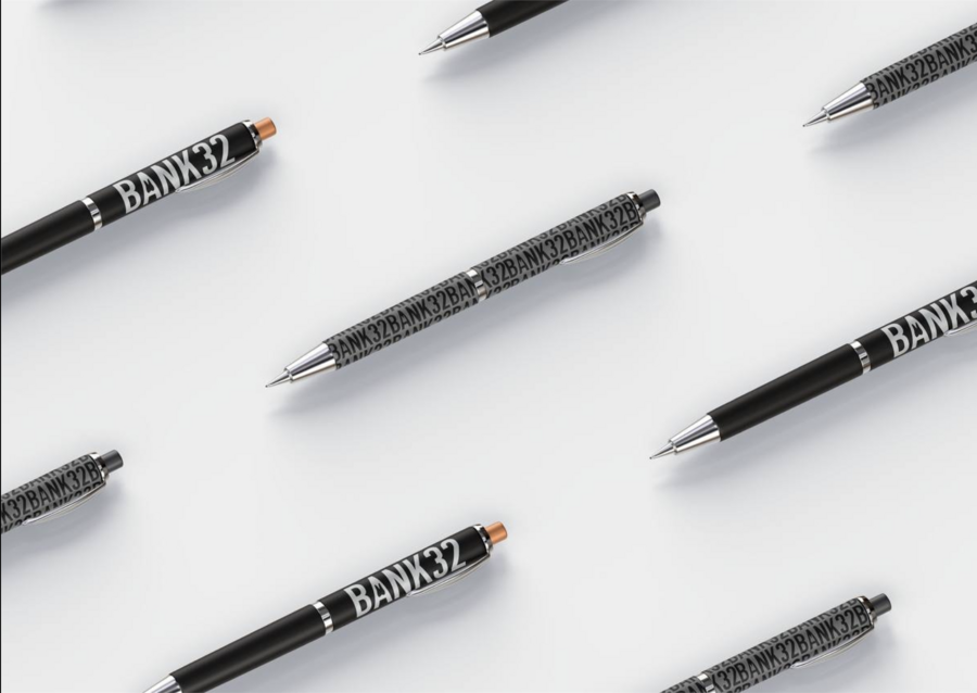
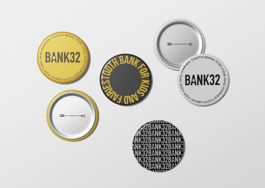
Носители
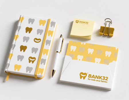
сгенерировано при помощи Qwen.ai
промт: Professional product photography of branded BANK32 stationery items arranged neatly on a white background. The set includes: a notebook, a pen, sticky notes, and a paperclip holder.
Branding Details: - Logo & Text: Every item features the «BANK32» logo and the tagline «for kids and fairies» in a friendly, rounded font. - Graphics: Minimalist illustrations of golden teeth and regular teeth are scattered as a pattern. - Color Palette: The products use a strict color scheme: clean WHITE, warm YELLOW (precise shade: r254 g196 b0), and shades of GRAY.
Style & Quality: Bright, even lighting. Sharp focus, clean composition. The image should look like it belongs in a corporate brand guideline or on an e-commerce website.
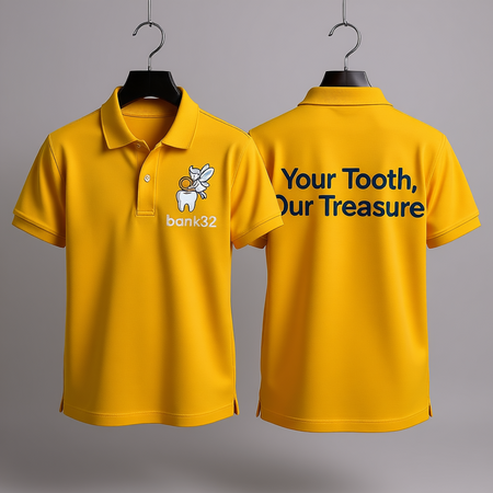
сгенерировано при помощи Qwen.ai
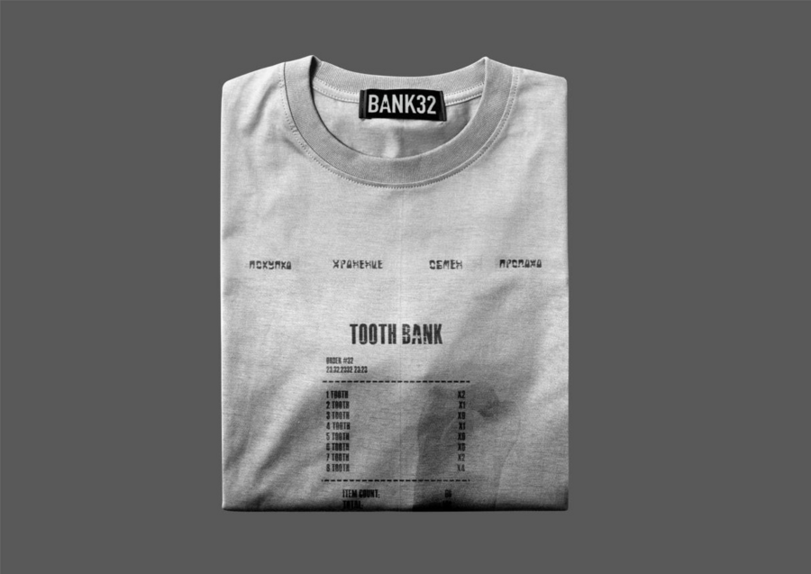
промт: Professional fashion photography of a BANK32 employee uniform.
Garment Details: - Item: A high-quality, modern-cut polo shirt or t-shirt in a vibrant YELLOW (r254 g196 b0). - Logo Placement: The BANK32 logo is embroidered on the left chest area. - Slogan: On the back, in a clear, readable font, is the advertising slogan: «Your Tooth, Our Treasure». - Style: The uniform looks clean, professional, and comfortable, suitable for a friendly bank teller.
Presentation: The uniform is presented on a hanger against a neutral gray background. The fabric texture and embroidery details are clearly visible and look realistic.
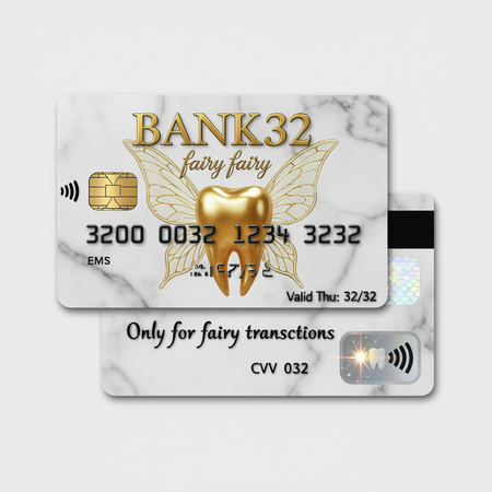
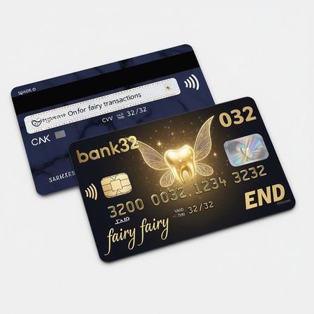
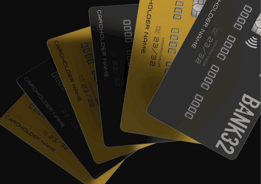
сгенерировано при помощи Qwen.ai
промт: Hyper-realistic BANK32 payment card with magical fairy tale design. Professional bank card photography.
Card Design Details: - Front Side: — Background: Elegant marble pattern in brand colors — white and shades of gray — Central Element: Shimmering golden tooth with subtle fairy wings pattern overlay — Text: «BANK32» in metallic gold font, cardholder name «fairy fairy» in elegant script — Number: 3200 0032 1234 3232 (stylized with magical sparkle effect)
Technical Elements: - Chip: Golden EMV chip with tiny tooth engraving - Hologram: Fairy wing holographic sticker that shimmers in light - Magstrip: Standard black magnetic stripe - Valid Thru: 32/32
Back Side: - Signature Strip: «Only for fairy transactions» - CVV: 032 - Contactless Symbol: Stylized as a magical sparkle
Style: Luxury bank card with magical aesthetic. Perfect plastic texture, sharp edges, subtle reflections. Lying on white surface with soft shadows.
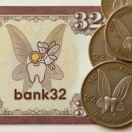
сгенерировано при помощи Qwen.ai
промт: Hyper-realistic, detailed close-up of BANK32 branded currency. The image should include one banknote and several coins.
Banknote Design (Nominal 32): - Visuals: A intricate, elegant pattern incorporating subtle fairy wings and a stylized tooth as the central watermark. - Text: Clearly displays the numeral «32» and the text «BANK32». - Style: Has the look of a real security-printed banknote with fine lines and microtext.
Coin Design (Nominal 32): - Visuals: One side features a detailed fairy wing, the other side a prominent tooth. - Text: The numeral «32» and «BANK32» are engraved around the edge. - Style: Metallic texture with a slight wear, as if it’s been in circulation. Looks like minted metal.
Overall: The image should have the authenticity and detail of a numismatic photograph, inspiring trust and value.
")
")

")