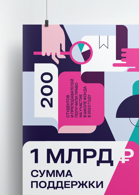
Posters for the Potanine Foundation
A design concept has been developed for the Potanine Foundation to rethink its identity. The new concept remains strict, but adds emotionality through developed vector illustrations. Geometric forms of illustrations overlap with the severity of the logo and reflect important ideas: creation, activity and insight.
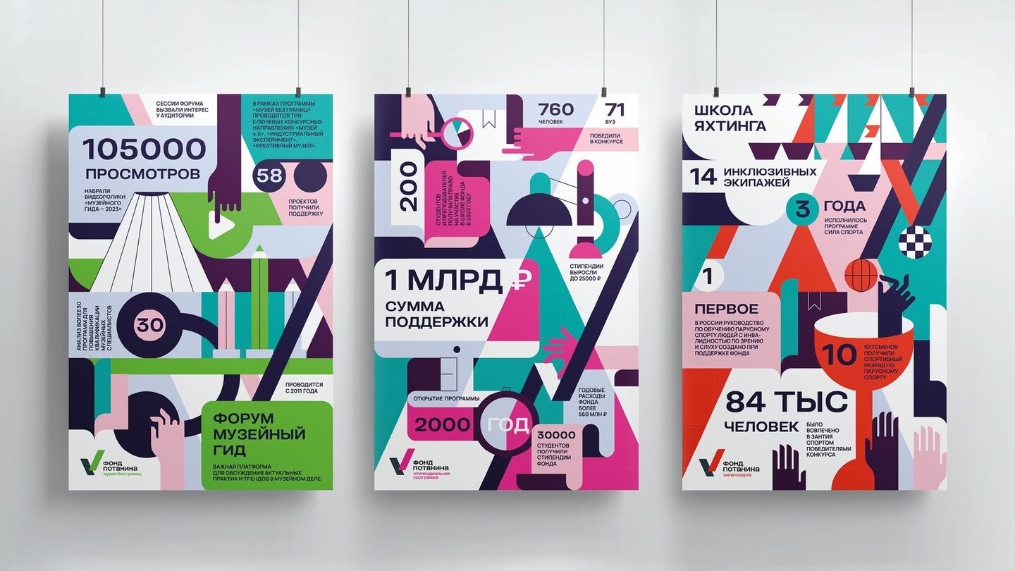
For a series of posters on the achievements of the Potanine Foundation over the past year, an additional color palette has been developed that harmoniously complements the existing brand colours. The new palette is designed to make the visual style more intelligent and culturally representative of the Fund ' s values. Posters have been carried out in the infographic genre, thus providing a clear and accessible picture of the Fund ' s achievements to both long-standing partners and potential target audiences.
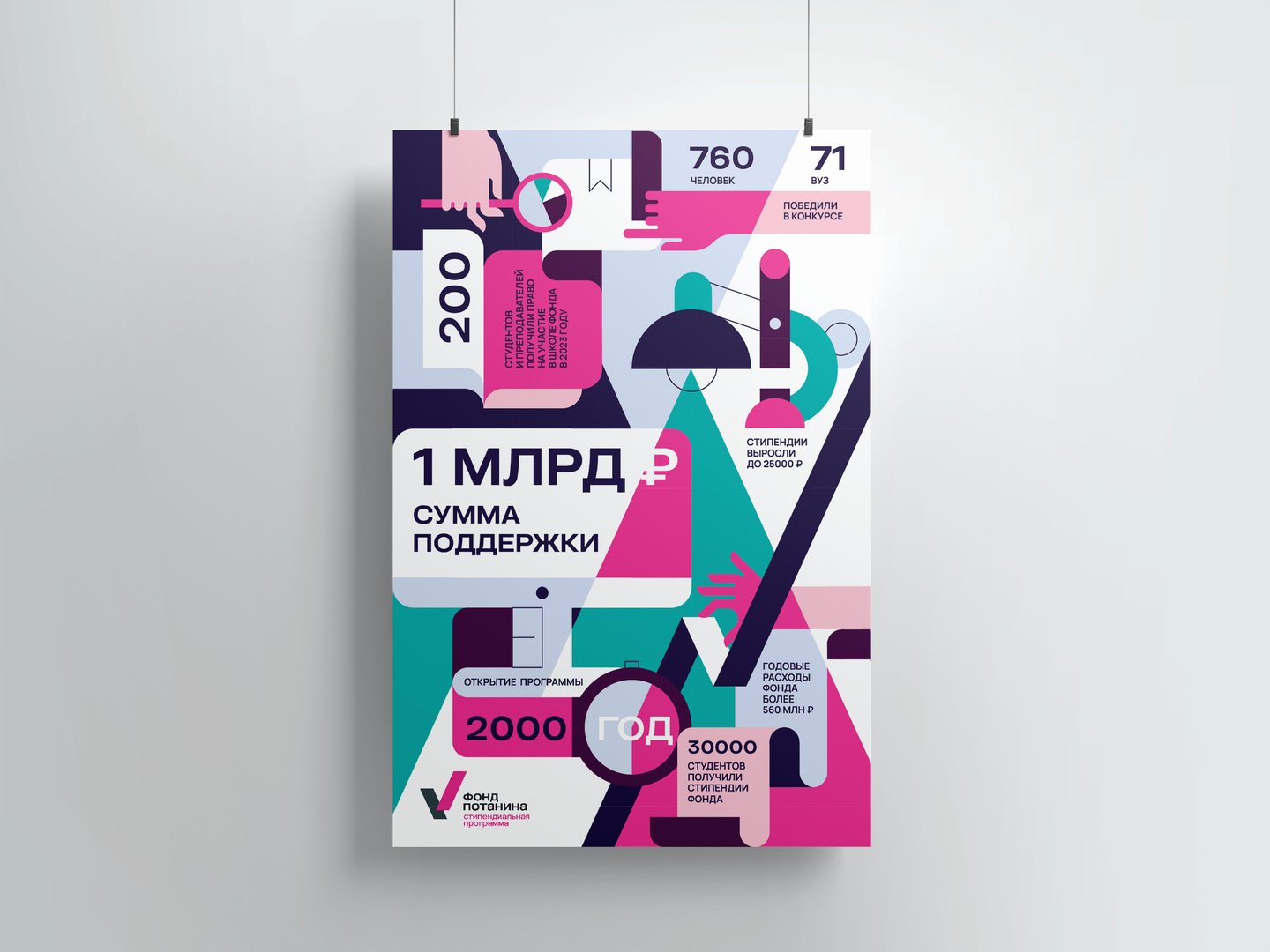
Key visual elements, such as the lines that now represent movement, statistics, medal ribbons and badges, and the overall pursuit of development and achievements, are preserved and re-thinked.
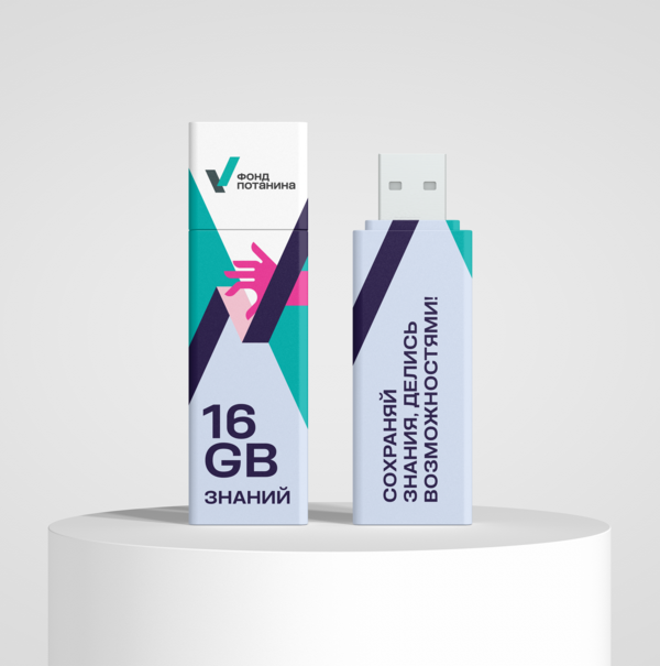
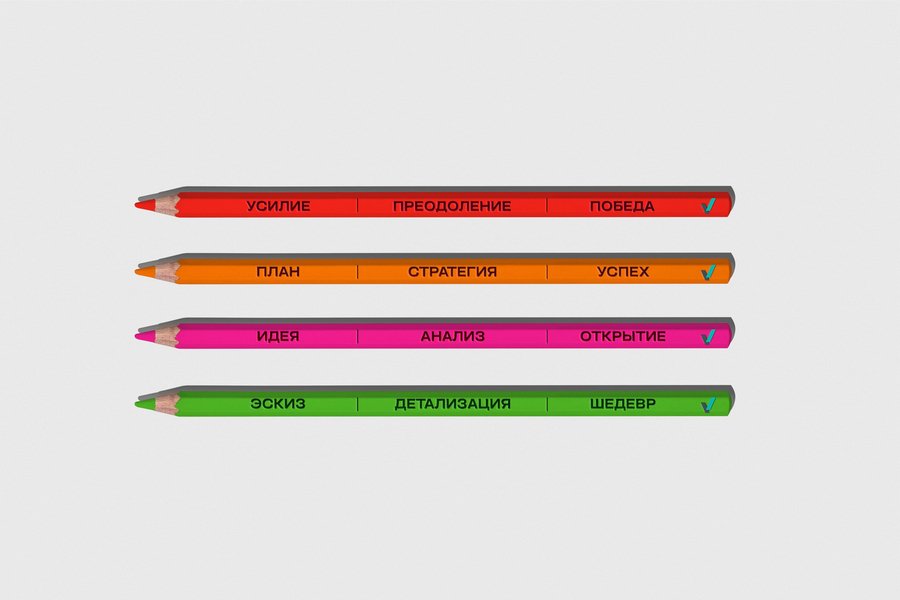
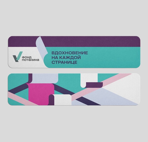
A series of souvenir products has also been developed. A key element of communication is slogans based on numerical data that highlight the many initiatives, projects and ideas being implemented by the Fund. Emphasis has been placed on demonstrating the broad scope and impact of the Fund on various areas.
