Flora&Clay
Мой оригинальный проект «Растения в повседневности» был посвящён наблюдению взаимодействия людей и растений. В данном проекте я захотела сохранить эту тему близости цветов и человеческой жизни, и решила разработать концепцию керамической лавки «Flora& Clay», где цветы неотъемлемая часть.
«Flower& Clay» — это не просто магазин керамики, а пространство эстетики и вдохновения, где керамика и цветочные мотивы объединяются в едином стиле жизни. Основная идея — привнести красоту природы в повседневность через функциональные и декоративные предметы из керамики, украшенные цветочными орнаментами.
Бренд позиционируется как проводник философии slow living: осознанное отношение к быту, наслаждение мелочами и гармония с природой.
Описание текста было создано с помощью Алиса AI: придумать описание проекта на тему открытия керамического магазина «Flower& Clay», тематика бренда — цветы в повседневной жизни
Логотип
Название и сам логотип были сгенерированы с помощью нейросети Qwen. Промпт: A minimalist yet intricate logo for a ceramic shop named «Flora & Clay». The design features a stylized, black-and-white line drawing of a simple ceramic vase. From the opening of the vase, a dense, overflowing bouquet of flowers bursts forth, rendered in the same detailed, high-contrast linework as the reference images. The flowers should be varied and lush, partially obscuring the vase. The entire logo is set against a stark white background. Style: black and white line art, high contrast, graphic, illustrative, with a touch of surrealism.
Цвета логотипа. Сгенерировано с помощью Adobe Color. Шрифт логотипа найден с помощью Font Finder.
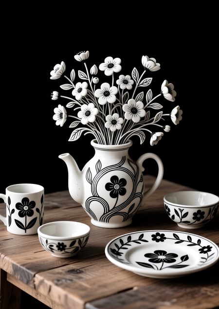
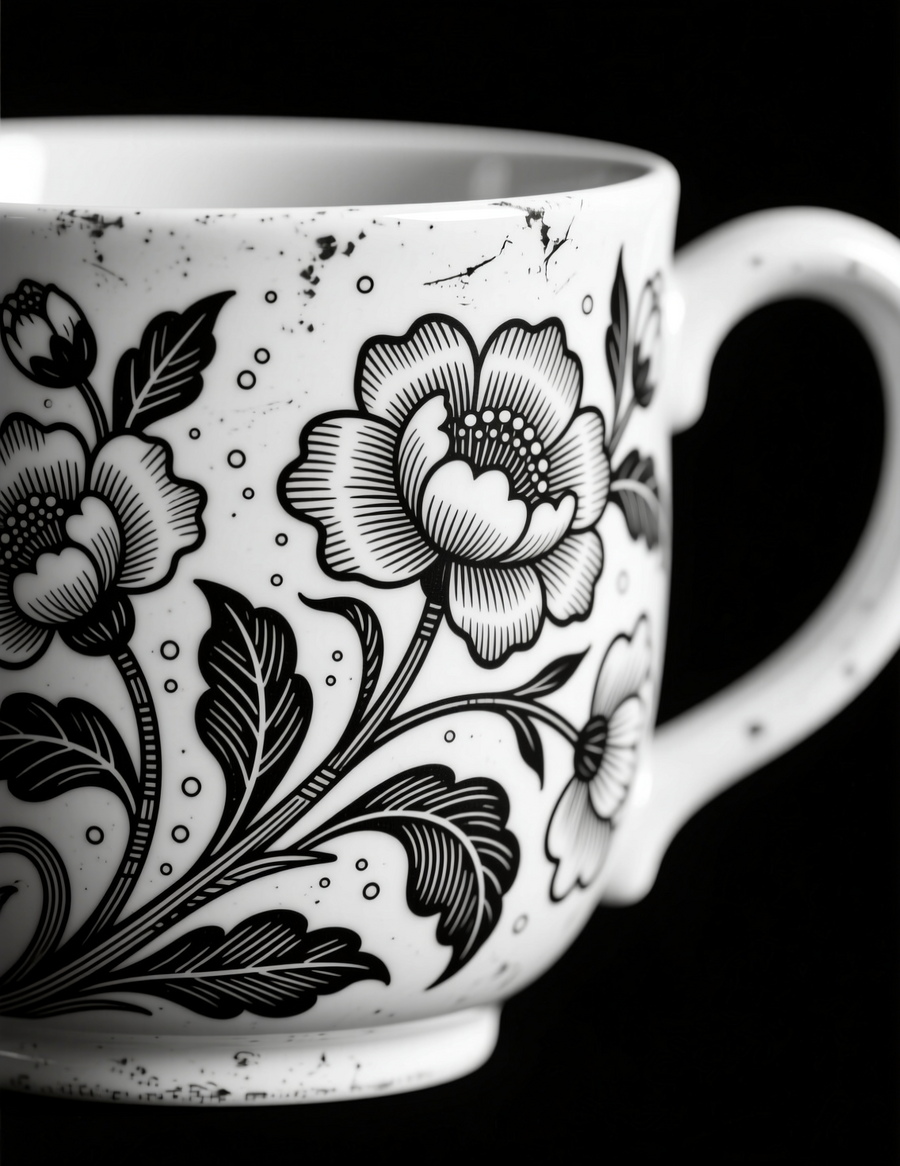
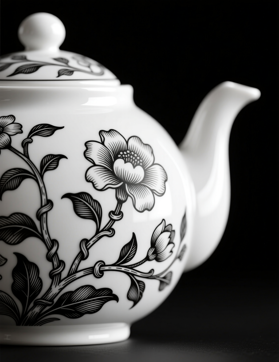
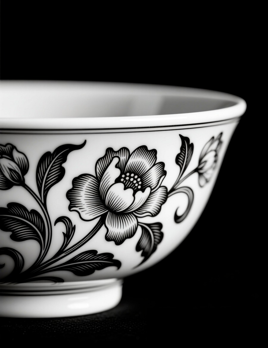
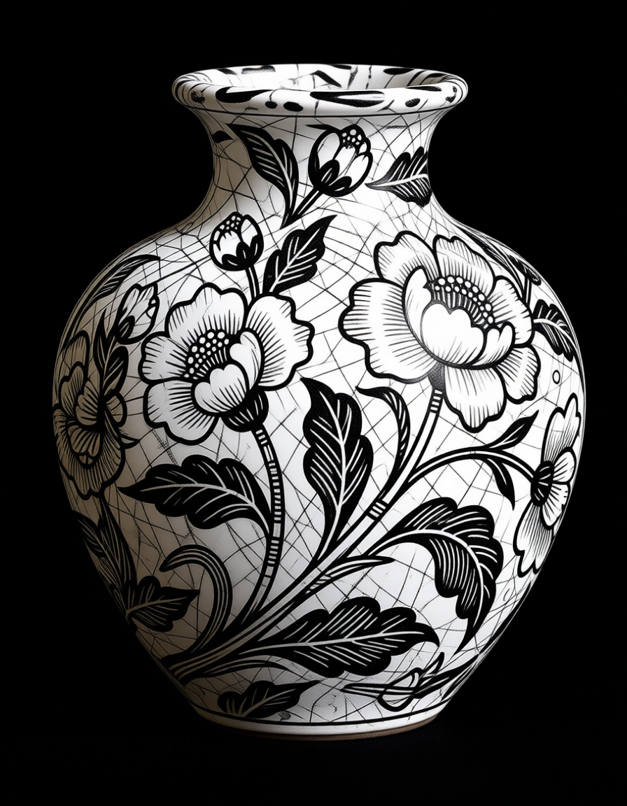
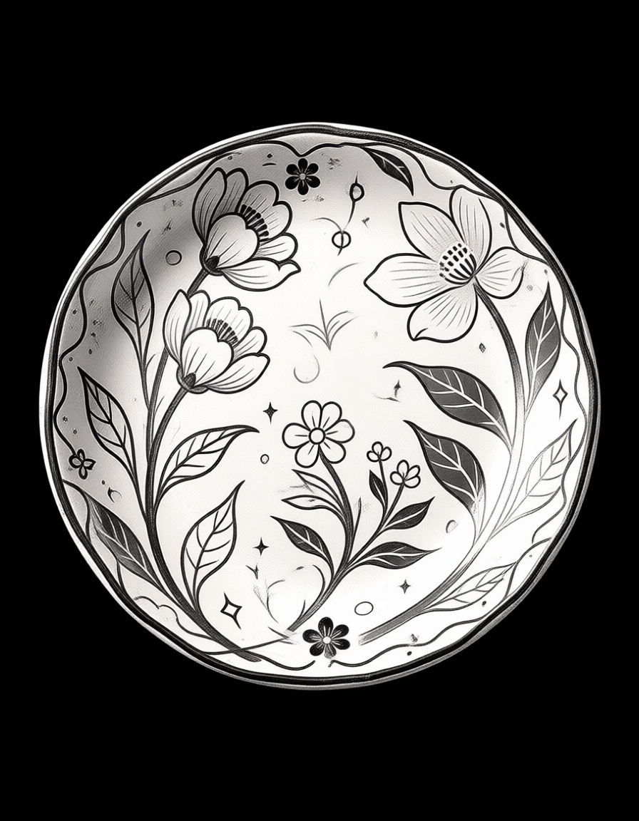
Продукты
Сгенерировано с помощью нейросети Qwen. Промпт: A collection of handcrafted ceramic products arranged on a plain surface. The items include a teapot, a mug, a small bowl, and a decorative plate. Each piece is adorned with intricate, hand-drawn floral patterns that appear to be growing directly out of the clay, merging the object with the decoration. The illustration is done entirely in black and white, using bold, expressive lines and heavy cross-hatching for texture, mimicking the style of the provided reference images. The background is solid black, making the white ceramics and their detailed floral designs stand out dramatically.
Сгенерировано с помощью нейросети Qwen, по принципу промпта выше.
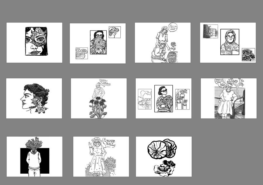
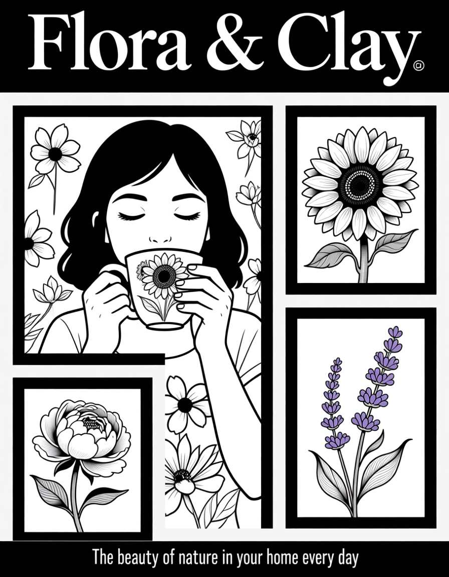
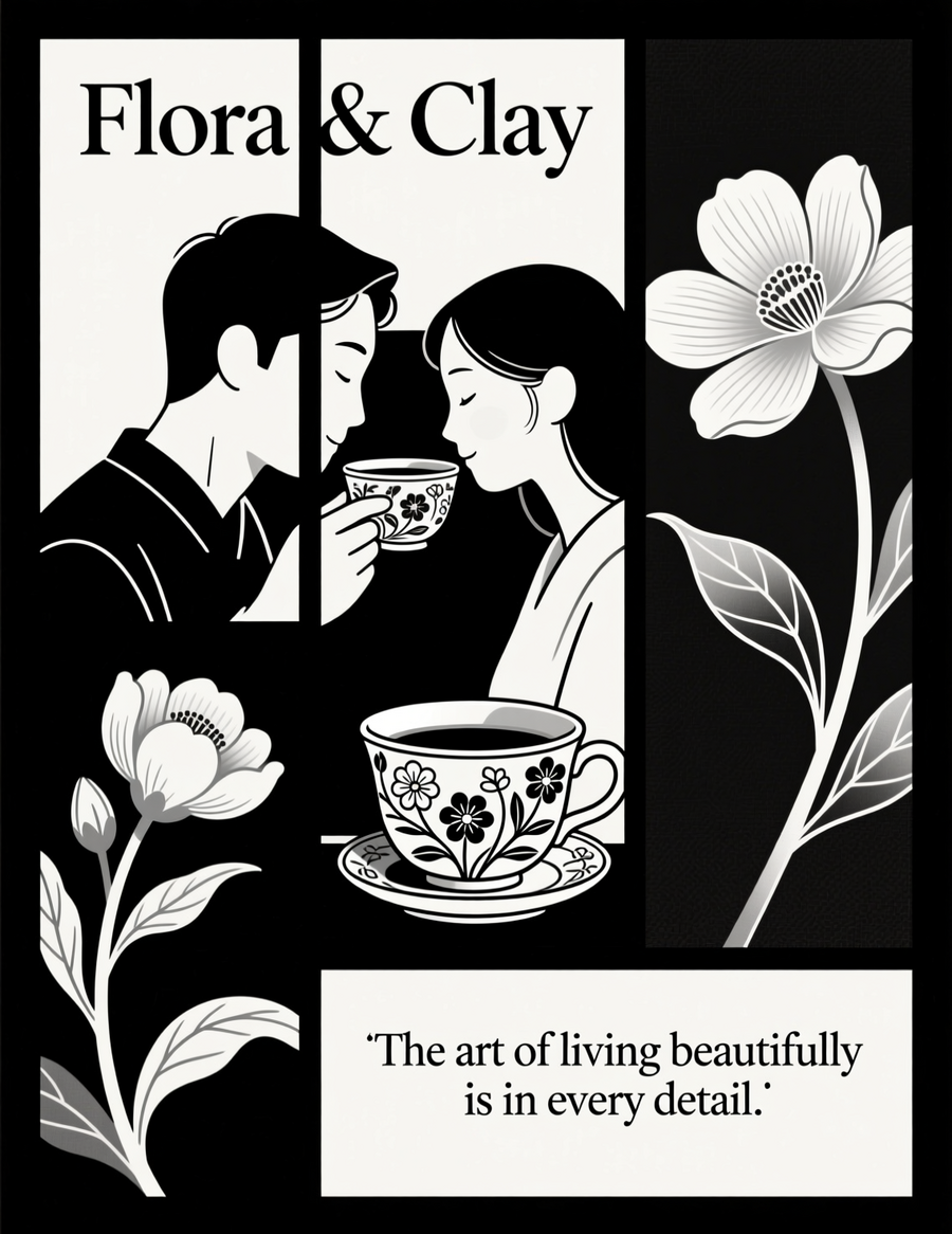
Плакаты и буклет
Сгенерировано с помощью нейросети Qwen
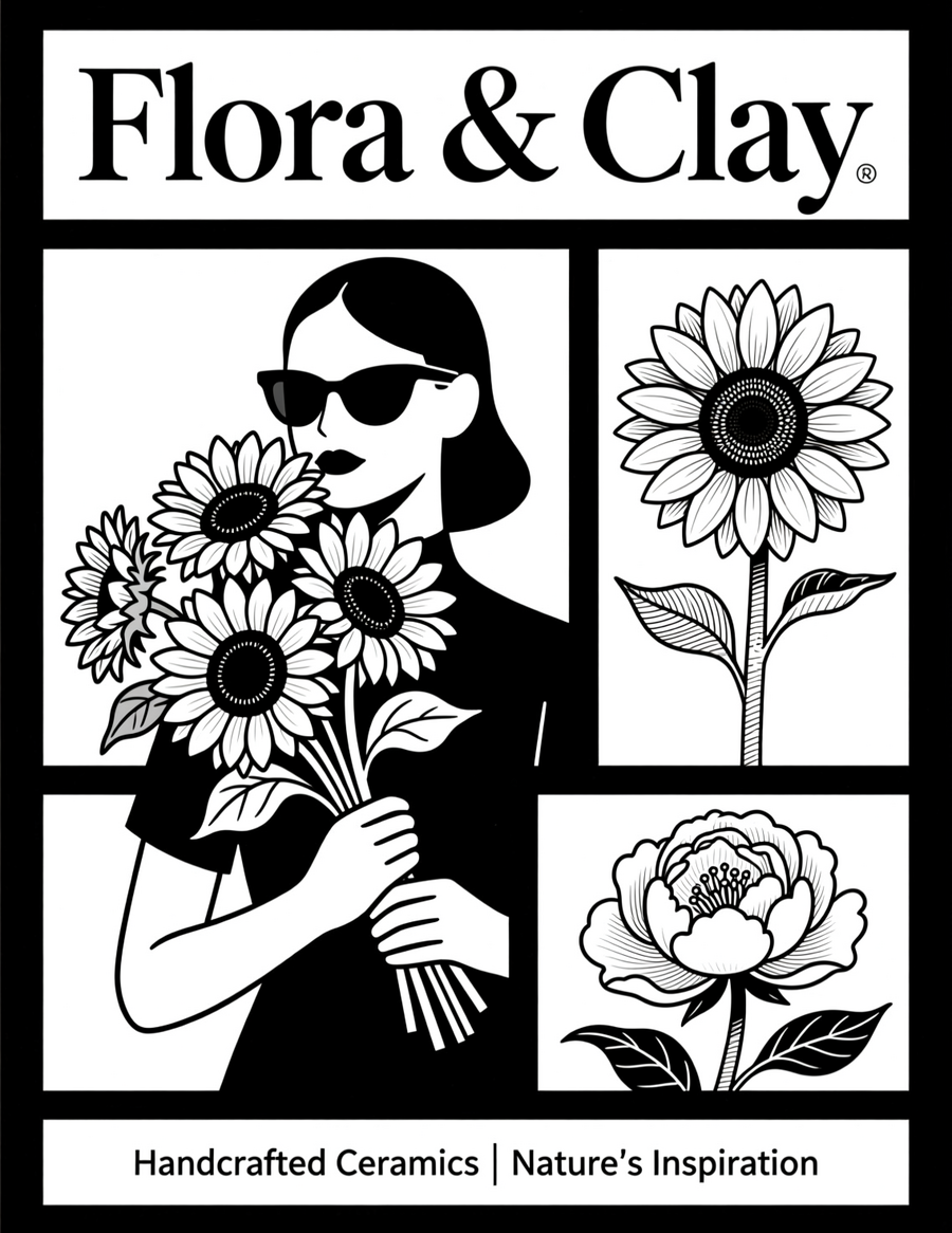
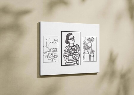
Промпт № 1: A promotional poster for the ceramic shop «Flora & Clay». The poster is divided into three panels, mimicking the composition of the third reference image. The central, largest panel shows a person wearing sunglasses, holding a massive bouquet of sunflowers that covers their lower face, rendered in detailed black-and-white line art. The top-right panel is a close-up of a single, perfectly drawn flower. The bottom-left panel is a close-up of another type of flower. All elements are framed with thick black borders. The overall style is high-contrast, graphic, and illustrative, with a focus on the interplay between human forms and nature, as seen in the provided examples.
Промпт № 2: A promotional poster for the ceramic shop «Flora & Clay». The poster is divided into three panels, mimicking the composition of the third reference image. The central, largest panel shows a girl drinking from a cup decorated in detail with flowers. At the bottom is the caption «The beauty of nature in your home every day."The overall style is graphic and illustrative in black and white, with an emphasis on the interaction between human forms and nature, as can be seen from the examples provided.
Промпт № 3: Advertising poster for the pottery shop «Flora & Clay». The poster is divided into three panels, repeating the composition of the third reference image. On the central, largest panel, a family couple is drinking from a service, decorated with flowers in detail. On the panel on the right, at the top, a close-up of one perfectly drawn flower is shown. On the panel on the left, at the bottom, another type of flower is shown in close-up. All elements are framed by a dense black border. The overall style is black and white, minimalist, graphic and illustrative, with a focus on the interaction between human forms and nature, as seen in the examples provided. At the bottom, the caption reads «The art of living beautifully is in every detail.»
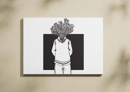
Брошюра.Сгенерировано с помощью нейросети: Qwen
Промпт: The cover of a booklet for «Flora & Clay» ceramic shop. The design features a full-bleed, black-and-white illustration. A figure in a simple sweater stands with hands behind their back, their head completely replaced by an enormous, detailed bouquet of mixed flowers, identical in style to the first reference image. The background is solid black. The shop’s name, «Flora & Clay», is written in a clean, modern sans-serif font at the bottom, in white. The inside pages would feature the product shots and shop interior described above, all rendered in the same consistent, high-contrast, illustrative style.
Пространство
Магазин снаружи
Брошюра.Сгенерировано с помощью нейросети: Qwen
Промпт: The exterior facade of a charming ceramic shop named «Flora & Clay». The storefront has a large display window filled with ceramic goods. A sign above the door features the shop’s logo (a vase with flowers)
Внутренний вид магазина
Промпт: An interior view of a cozy, artistic ceramic shop. Shelves are filled with various ceramic pieces—vases, bowls, mugs—all decorated with detailed, black-and-white floral motifs.The shop has warm wooden floors and a large window letting in light, which casts strong shadows.
Сайт
Промпт: A realistic image of a computer with a website for the ceramic store «Flora& Clay» displaying a range of products, including mugs, plates, vases, and teapots with floral black-and-white designs.
Инструменты
Во время своей работы для создания изображений я преимущественно использовала: chat.qwen.ai Для создание описания проекта: alice.yandex.ru Для генерации цветовой палитры: color.adobe.com Для определения шрифта логотипа: www.fontsquirrel.com


