Polina Artemevacurated byMila Ershova
Original size 2480x3500
BEST
December
2024

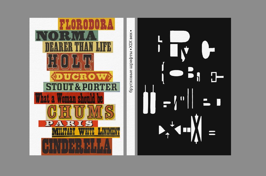
Brooke typefaces. The 19th century.
Longread translated automatically
This project is a student project at the School of Design or a research project at the School of Design. This project is not commercial and serves educational purposes
The prizewinner of the competition
DAFES choice. December 2024 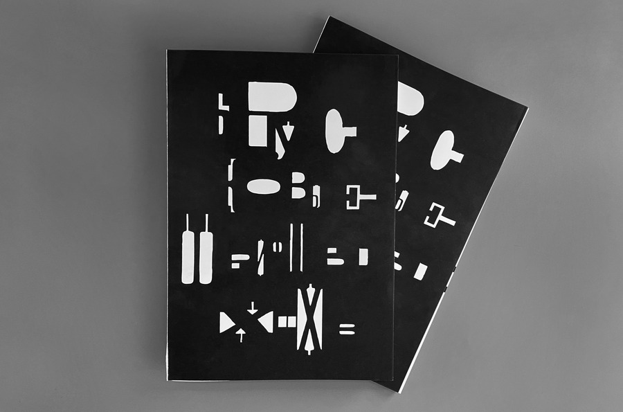
Original size 5167x3417
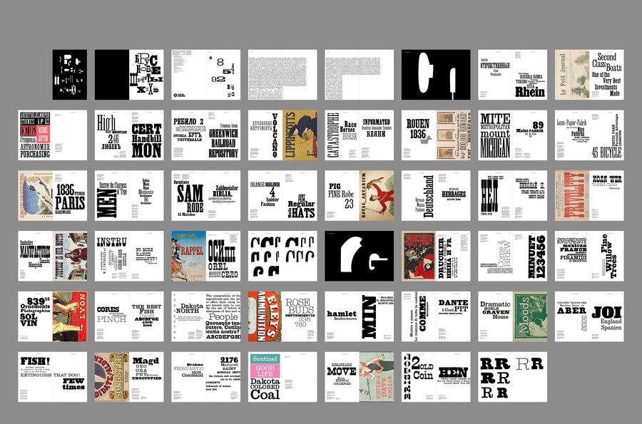
The visual study focuses on 19th-century paper typefaces. It was at that time that they became particularly popular with the promotion of advertising.
The fonts were selected from various 19th-centurypesmen, and promotional posters were found using paper typefaces and modern fonts that refer to historical scripts.
Original size 5167x3417
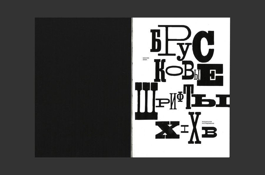
Cover design
Original size 5167x3417
Original size 5167x3417
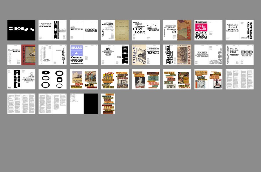
All fonts are divided into three categories corresponding to the proportions (narrow/normal/broad).
Original size 5167x3417
Original size 5167x3417
used fonts TT Slabs (for concept text, 20pt), CoFo Sans (for column elements, 8pt)
Original size 5167x3417
Original size 5167x3417
format 260×180
Original size 5167x3417
Original size 5167x3417
Original size 5167x3417
Schmutztitul
Original size 5167x2500
Original size 5167x3417
Original size 5167x3417
Original size 5167x3417
at the end of each section there is a comparative turn
Original size 5167x2500
Original size 5167x3417
Original size 5167x2500
Reversals comparing modern and historical string typefaces
Original size 5167x3417
Original size 5167x3417
Original size 5167x3417
Original size 5167x3417
Original size 5167x3417
Original size 5167x3417
Original size 5167x3417
Original size 5167x3417
Original size 3242x2144
Original size 5167x3417
Original size 5167x3417
Original size 5167x3417
Original size 5167x3417
Original size 5167x3417
Original size 5167x3417
Original size 5167x3417
Original size 5167x3417
Original size 5167x3417
More projects in graduation visual research


We use cookies to improve the operation of the website and to enhance its usability. More detailed information on the use of cookies can be fo...
Show more