Everyday clinic
The project is aimed at developing a brand style for " Everyday clinical «, which is designed to reflect the high level of professionalism and expertise of doctors, as well as to emphasize the sensitivity of each patient. The key objective was to create a visual identity that gave credibility and broadcast the value of a quality health-care clinic.


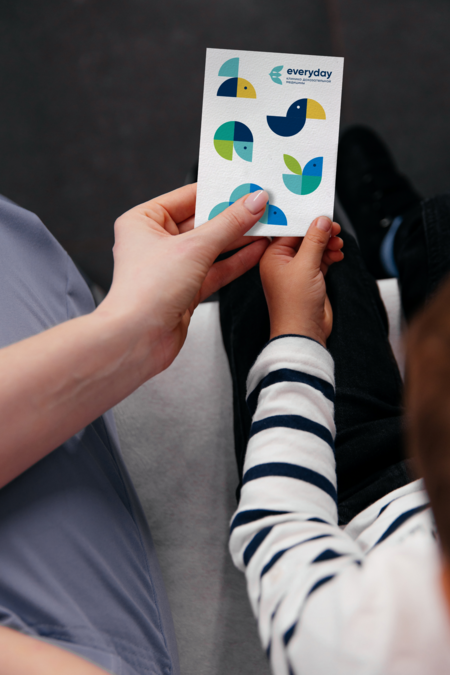
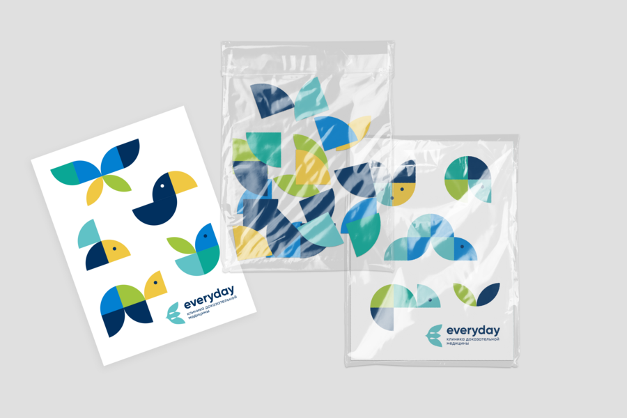
The project developed a unique logo that combines the symbols of the bird and the flower. The bird symbolizes freedom from disease and a full life, and the flower, in addition to referring to allergology, is a metaphor for children — the springs of life. The logo, which represents the hope of healing and the ability to regenerate, expresses the desire of the Everyday Clinicic to help children free themselves from the constraints of allergies and other diseases, acquiring health, freedom and the possibility of full development.

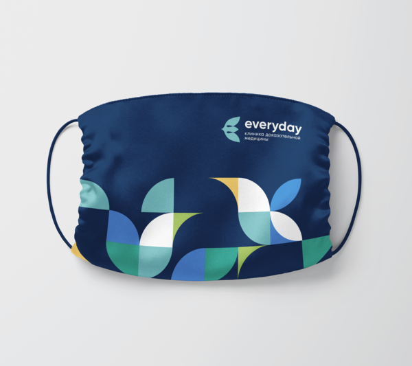
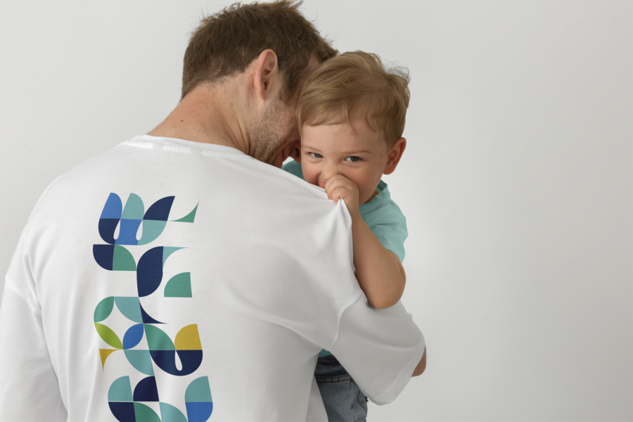
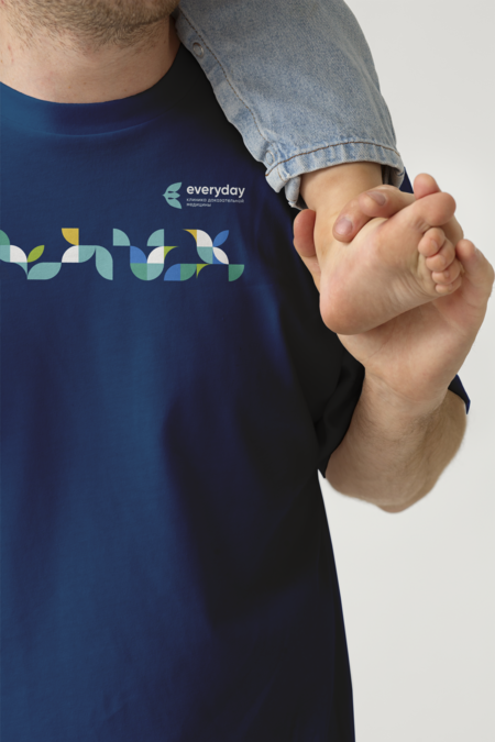
Special attention has been paid to the color palette, which not only is clearly associated with the medical focus of the clinic «Everyday Clinic», but it also conveys a sense of freshness and warmth.

Flexible graphics have also been developed that are easily scalable and adaptable to different media. These elements, gathered in a variety of compositions, contribute to creating a recognized visual identity of the brand, increasing its recognizableness and strengthening its link with the target audience. Their use in souvenir products, promotional materials and in the interior of the clinic creates a holistic and memorized image of the «Everyday Clinic».
The brand style developed is organically integrated into a wide range of media, ensuring that the visual image of the brand is consistent at all points of contact with the audience.