Communication theory: TOLKI

Announcement of the project TOLKI
Communication theory in the design field
Within communication theory, design is understood not as a neutral visual layer but as an active process of meaning construction and transmission. Communication is defined as a process in which meaning emerges between a sender and a receiver through systems of signs, channels, and contexts. In this framework, design functions as a mediator, translating ideas, values, and intentions into visual and verbal forms that are interpreted by an audience.
The classical communication model — sender, message, receiver — acquires a practical dimension in the field of design. The sender may be a brand or a designer, the message is embodied in a visual system, interface, or media artifact, and the receiver is the audience that interprets this message through personal experience, cultural background, and expectations. Meaning is not transmitted directly but is constructed at the moment of interaction.
A semiotic perspective plays a central role in this process. Design operates through signs and visual codes rather than fixed meanings. Colour, form, typography, and composition function as symbolic elements that evoke associations and guide interpretation. Effective visual communication relies on selecting signs that are culturally recognizable, intuitively readable, and stable across different media environments.
Communication theory also emphasizes the importance of channel and context. The same message may be perceived differently depending on the medium in which it appears — whether a digital interface, social media platform, or physical space. As a result, design requires the adaptation of form and presentation to specific channels while maintaining the core meaning of the message.

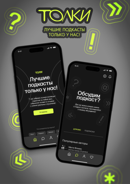
Promotional banner for the TOLKI platform
Prototypes of the TOLKI platform application adapted for different devices
Another key concept is noise — any factor that distorts or complicates the reception of meaning. In design practice, noise can take the form of visual overload, unclear hierarchy, or excessive decorative elements. Reducing noise and focusing on essential signs strengthens the message and increases communicative clarity.
Finally, communication in design operates simultaneously on rational and emotional levels. The rational level is related to function, structure, and clarity, while the emotional level shapes trust, engagement, and a sense of belonging. Sustainable communication systems emerge when these two levels are aligned and mutually reinforcing.
Presentation to the general audience
Promotional banner for the TOLKI platform
TOLKI is a platform that makes finding good podcasts easy and creates one friendly community where listeners can discuss and share their favorite shows. Instead of jumping between different platforms and getting lost in endless recommendations, users come to TOLKI to discover podcasts that match their interests and connect with people who love the same content. The brand’s main goal is simple: bring podcast lovers together in one place where discovery and conversation happen naturally.
The visual system of TOLKI is built on three core elements: a single bright accent color, a dynamic and energetic typeface, and graphic patterns based on sound waves. Together, these elements create a visual language that feels alive, modern, and welcoming.
Sound wave graphics form the visual backbone of TOLKI across all platforms. These waves are a metaphor for voices, conversations, and connection. On podcast covers, in app layouts, on social media, and on billboards, these waves remind users that this is a place where voices are heard and conversations matter.
Promotional banners for the TOLKI platform
TOLKI communicates with listeners in simple, friendly, and genuinely helpful language. They use only honest words in our communication language, which demonstrates that we understand the needs of podcast lovers. The tone is conversational, like talking to a friend who gets it.
The brand says: we make finding your next favorite podcast effortless, and we make sure you’re never alone. This positioning appeals to listeners who feel scattered across platforms, who want better recommendations, and who crave genuine connection with people who share their passions.
Presentation for professional audience
TOLKI — a podcast discovery & community platform
Promotional banner for the TOLKI platform
TOLKI is a media platform designed to structure the fragmented podcast ecosystem through user-generated reviews, curated playlists, and meaningful discussion. In an increasingly crowded audio ecosystem, listeners are often scattered across multiple services, unsure where to find insights, thoughtful reviews, or meaningful conversation about the shows they care about. TOLKI addresses this problem by positioning user experience and dialogue as the core drivers of recommendation. The platform is built for listeners who regularly engage with podcasts across diverse topics and who seek not only content, but shared interpretation and informed choice. TOLKI reframes podcast discovery as a social and reflective process rather than an endless scroll of automated suggestions.
The brand character can be defined as: — curious and research-driven; — open to dialogue and multiple perspectives; — emotionally warm, yet structurally clear.
The visual system of TOLKI is structured around three defining elements: • A single bright accent color (DEFF4D) that brings energy and visibility to the interface. • A dynamic, energetic typeface that reflects movement and engagement. • Graphic patterns based on sound waves — the foundational visual motif representing voices, conversation, and connection.
Part of TOLKI’s design system
The colour palette is based on a restrained range of dark neutrals (363636, 4D4D4D, 8C8C8C), providing a stable, low-noise background suitable for long-form content consumption. Against this foundation, a single bright accent color (DEFF4D) is introduced as a navigational and semantic highlight. This high-contrast approach improves interface readability and allows key actions, reviews, and recommendations to stand out clearly within dense informational layouts.
Typography is selected for its dynamic character and structural clarity, supporting both expressive headlines and dense textual content such as reviews and playlists. The type system is optimised for scalability and readability, ensuring consistency across editorial, interface, and promotional contexts.
Announcement of the TOLKI project interface
TOLKI’s communication strategy is based on clarity, relevance, and trust. Language is conversational and supportive, as if speaking with a friend who knows your tastes and helps you find your next favourite show. Content is structured around real user insights transforming individual listening experiences into collective knowledge. In this model, users are not passive consumers of recommendations but active contributors to a shared cultural filter.
The effectiveness of TOLKI lies in the alignment between its strategic intent, visual language, and communicative behaviour. Each design decision supports the same core idea — podcasts are a medium of voices and voices gain meaning through exchange.
As a result, TOLKI operates not just as a discovery tool, but as a cohesive media ecosystem that helps listeners orient themselves, articulate their impressions and feel part of an ongoing conversation.
How communication theory formed the basis of the TOLKI project
The TOLKI project was conceived from the outset as a communication system rather than merely a digital product. Its foundation lies in the understanding of podcasts as a medium of voices and meanings that acquire significance through exchange, discussion, and shared interpretation. For this reason, communication theory was not treated as a supplementary framework, but as the core foundation of the entire strategy.
Within the sender–message–receiver model, the sender is the TOLKI brand itself, acting as both a media platform and a cultural mediator. The receiver is an audience of active podcast listeners — individuals who do not simply consume content, but seek to reflect on it, share impressions, and find points of connection with others. The brand’s message is articulated as the idea of a more human and intuitive way to discover podcasts through community, dialogue, and trust, rather than through endless algorithm-driven recommendations.
Merch and promotional banner for the TOLKI project
A semiotic approach directly informed the project’s visual system. The key graphic motif — sound waves — functions as a stable sign referring to voices, conversations, and human connection. This visual metaphor is intuitively readable and does not require additional explanation, which lowers the entry barrier and reduces communicative noise. The use of a single bright accent colour against a restrained neutral palette strengthens both semantic and navigational hierarchy, helping users orient themselves within information-dense environments.
The typographic system reinforces this logic. A dynamic, energetic typeface reflects movement, exchange, and active participation, while remaining structurally clear and legible for extended textual content such as reviews, playlists, and discussions. As a result, visual elements operate as a coherent system that consistently communicates the brand’s values across all points of contact.
TOLKI’s project merch
TOLKI’s communication strategy is structured around the distinction between rational and emotional levels. The rational level is expressed through the organisation of the podcast ecosystem: user-generated reviews, curated playlists, clear navigation, and a transparent recommendation logic. The emotional level is shaped through the brand’s language and visual character — friendly, open, and supportive. The tone of communication is intentionally conversational and honest, creating the impression of a dialogue with someone who understands the listener’s interests.
Channel and context also played a key role in shaping the strategy. In the platform’s interface, priority is given to clarity and the reduction of visual noise, which is essential for sustained engagement with long-form content. In social media, the focus shifts toward dynamic visuals and participatory formats, while offline communication relies on concise, easily readable imagery. At the same time, the core message and visual identity remain consistent across all channels, ensuring brand coherence.
TOLKI functions as a communication ecosystem in which design, language, and brand behaviour operate in synchrony
Communication theory made it possible not only to justify each design decision, but also to connect academic models with practical application, transforming the platform into a space for meaningful exchange rather than simply a content discovery tool.
List of literature and image sources
Materials from the Communication Theory course.
Язык новых медиа = The Language of New Media. — Кембридж (MA): MIT Press, 2001. — 354 с. (дата обращения: 10.12.2025)
Кодирование / декодирование // Культура, медиа, язык = Culture, Media, Language. — Лондон: Hutchinson, 1980. — С. 128–138. (дата обращения: 10.12.2025)
All pictures from the project of Tatiana Turitsyna, Veronika Loginova and Elvira Galieva — https://portfolio.hse.ru/Project/260391


