
MAMOSTONG. communication theory
Logo
The author’s reasoning about how communication theory works in the field of design or contemporary art
Design can be understood as a form of communication in which visual objects function as carriers of meaning. Communication theory explains how these meanings are formed and interpreted through the interaction of signs, media, and situational context.
Each design element, from a digital interface to a poster or brand mark delivers a message that the audience deciphers based on cultural background, personal experience, and social expectations. Through semiotics, designers can consciously select visual codes that guide interpretation: color influences emotional response, form suggests usability or purpose, and stylistic choices signal relevance to a specific audience.

The poster
The effectiveness of a message is strongly influenced by its context and channel. A visual statement placed in an urban environment, on product packaging, or within social media will be perceived differently in each case. For this reason, branding requires an awareness of how meaning shifts across platforms and how audience attention changes depending on the medium.
Communication theory also addresses the problem of distortion, often described as «noise.» Visual overload, unnecessary complexity, or poorly chosen stylistic solutions can weaken or obscure the intended message. One of the key responsibilities of a designer is to eliminate such obstacles and ensure that meaning remains clear and accessible.
A screenshot of the site page
Presentation to the general audience
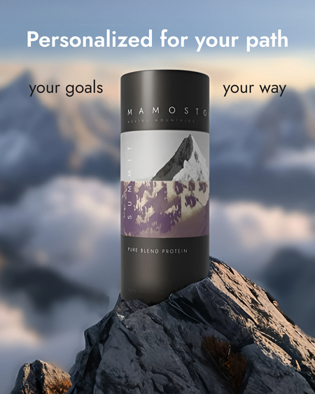
Mamostong is presented as a contemporary sports nutrition and wellness brand inspired by the Himalayan peak Mamostong (7516 m).
The concept of mountain ascent serves as a metaphor for the gradual improvement of physical condition and mental balance, where structured support plays a central role.
For centuries, mountaineers have viewed Mamostong Kangri as a symbol of ambition and perseverance. Unlike more famous peaks, it remains relatively untouched—a quiet testament to the raw, untapped potential within all of us. Its rugged terrain and secluded location serve as a metaphor for personal growth: the greatest challenges are often the ones most worth conquering.This perspective forms the emotional backdrop for the brand narrative.
The product range is designed for individuals with varied goals and levels of athletic experience, from beginners to professional athletes. The brand emphasizes steady progress, enhanced strength, improved well-being, and increased clarity.
The slogan
Sustainability and modern wellness trends are highlighted as key pillars of the product philosophy. Plant-based formulas, detox blends based on tea and matcha, and functional nutritional supplements form the foundation of the assortment. The emphasis is placed on mindfulness, balance, and evidence-informed wellness routines.
The duality of the mountain landscape — combining natural power with a sense of calm — is reflected in the symbolic structure of the brand: strength and softness, energy and grounding, movement and stillness.
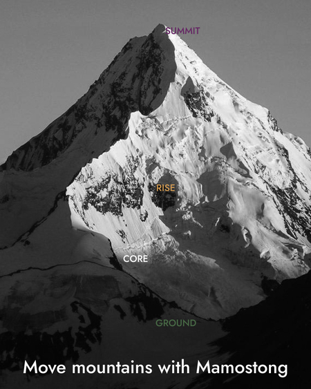
Product lines such as GROUND, RISE, CORE, and 7516M represent different stages of development, from foundational support to advanced performance. The overarching concept is summarized by the idea of Moving Mountains, symbolizing the achievement of ambitious, high-impact results through consistent effort and well-structured solutions.
Presentation for professional audience (designers, art directors)
Horizontal billboard poster
The poster
Mamostong is defined as a systemic lifestyle brand within the sports nutrition and wellness sector, constructed around the metaphor of vertical progression — a movement from grounding to ascent, from inner stability to peak achievement. The brand draws its symbolic foundation from the Himalayan mountain Mamostong (7516 m), which serves as a representation of elevated standards, ambition, and a disciplined approach to self-development. Within this conceptual framework, the brand integrates themes of physical performance, mental wellness, and sustainability, aligning itself with cultural codes rooted in mindfulness, the balance between calmness and power, and the idea of ascent as an emblem of personal evolution. The product architecture echoes this structure through four interconnected tiers — Ground, Rise, Core, and 7516M — each reflecting a distinct stage of progression and intensity.
Horizontal billboard poster
Herbal Tea Packaging
The central brand idea, Moving Mountains, conveys the capacity to overcome complex challenges and achieve high-impact results. This concept supports a communication model that operates on multiple levels: from straightforward metaphorical statements that emphasize strength and resilience to more abstract messages focused on finding balance and establishing an internal foundation before moving upward. Such flexibility allows the brand to function across mass-market and premium contexts without losing conceptual cohesion.
How communication theory formed the basis of the project
Dialogic theory and relationship management theory
Dialogic theory is especially often used in online communication. For high quality dialogue in the digital environment, we have provided a dialogical cycle — the opportunity for audiences to ask questions and receive answers. Information usefulness: The website is transparent and valuable data reflecting the brand’s mission and ideology. Also, to motivate repeat visits, many different products of different levels have been created so that the consumer can move «uphill», regular updates, new functions and interactivity occur. Successful organizations are those who know how to listen, respond, understand, and act together with those on whom their existence depends.
Channels of interaction and context
Social media, product packaging and outdoor advertising — each channel is important in promotion and communication.
— in social networks, posts are focused on visual, interaction with the consumer and conciseness of slogans — on the packaging of products — on texture, ingredients and versatility — in outdoor advertising — for a catchy illustrative series.
Minimalism, pastel colors, black and white photos and an immersive effect do not create visual noise and make the message easily perceived.
Posts for social media
Horizontal billboard poster
The semiotic approach
The selected visual signs do not require additional explanations, as they are easily interpreted by the consumer: — Mamostong Mountain = striving for heights, high standards and quality — color separation = belonging to different purposes — real photos = naturalness, natural ingredients
Thanks to semiotics, we were able to develop a brand language that functions effectively and maintains its integrity in a variety of contexts.
Packaging matcha
Communication levels (emotional/rational)
Rational level: organic certified, non-GMO, gluten free Emotional level: delicious, premium, effective.
The combination of levels made it possible to develop a comprehensive communication strategy.
The poster
List of sources
Communication Theory: Bridging Academia and Practice // edu.hse.ru URL: https://edu.hse.ru/course/view.php?id=133853 (дата обращения: 12.10.2025).
The design for this project was created by Maria Vostrikova


