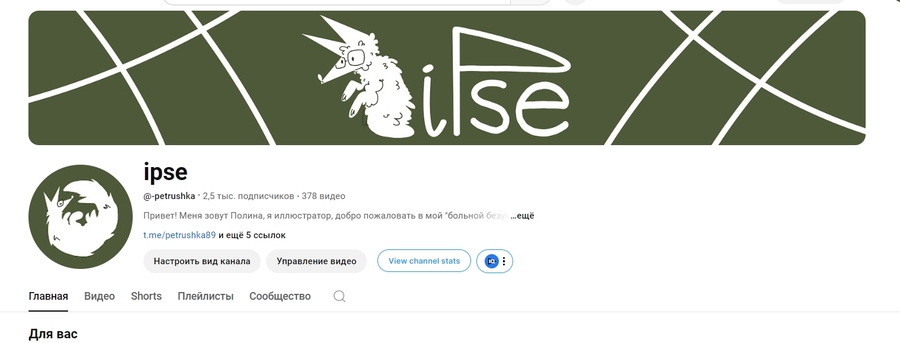
IPSY — Illustrator brand
For me, the process of creating a personal brand is an opportunity to look inside myself, so I wanted to turn to things that were important to me once as a child.
I wanted to find a short, compact and non-existent association with existing objects/understoods. The word «ipse» appeared.

If you dig deeper, in Latin this word means «self/self,» which once again gives a little hint that the brand is my little world.
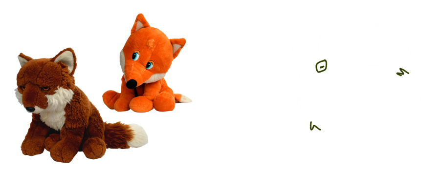
When I was four or five, I often played with teddy foxes and identified myself as part of this «stay,» so the main symbol on the logo for my brand was the fox.
Why green?
The reason to choose green is: — calm and not annoying; — it’s neutral enough to introduce it as a substrate of the site, a background video, etc., so it can be created with the help of an association with it in passive mode; — it adequately reads the text.
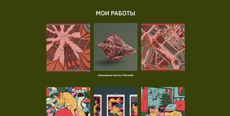
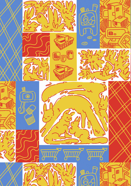
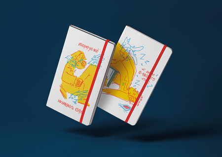
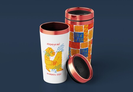
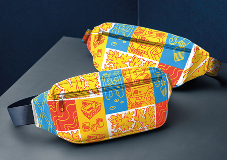
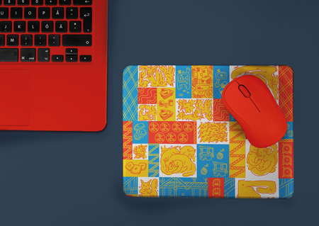
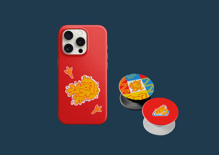
Merch Collection
The collection contains three examples-pattern, two stickers, and four illustrations of a minimalist format. This will make it possible to use them at very different rates, giving him a detailed variation.
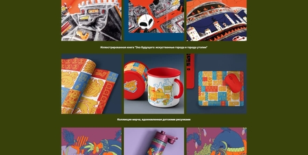
Children draw the world of adults and what is most important to them.
In the new «compilation» of the merch, this ease, irritability and child’s naivety would appear.
The world of children is not very understandable, but very interesting. For a child, the world is not a normal adult race or a gray and boring reality, but a place for unusual and bright ideas.
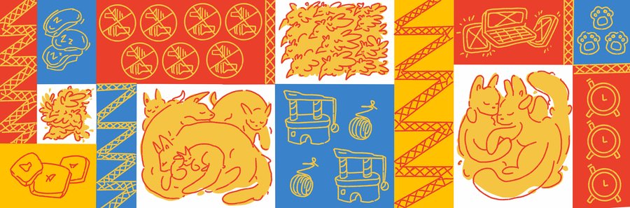
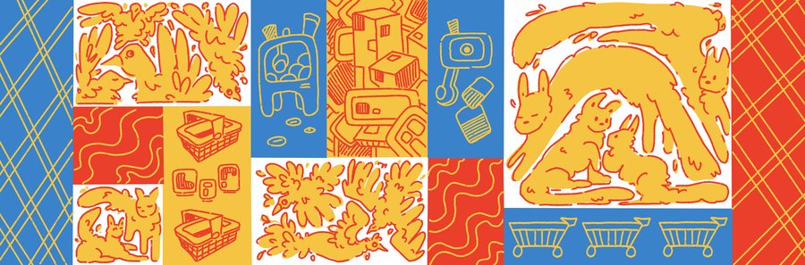
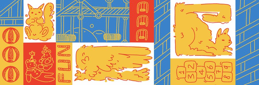
Sometimes we all need to stop and see the world with the child’s eyes.
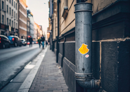
Stickers as a way to move — cladding around the city.
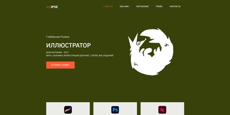
Website: https://ipsee.ukit.me/
The site is my minisite, contains basic information about the author, as well as a small portfolio from my work.