
Analysis of activity data
Description
I’ve selected physical activity data from the Kaggle website. I’m interested in such statistics because they help to identify causal relationships, learn from other people’s experiences and develop. The movement fills me with energy and new ideas, so I think it’s important and useful to analyse the effect of physical activity on the body.
Graphic types: — cello diagram — column diagram — point diagram
Work segments: — Data selection — uploading of two CSV files with statistics into the programming environment — selection of interested columns — Data analysis — Visualization of statistics using different types of graphs The main color of this project is sero-bruze. He’s the one I associate with regular exercise. Sometimes charging or sports become routine, but it is in the ordinary way that human potential is revealed.
Final schedules
Conclusion
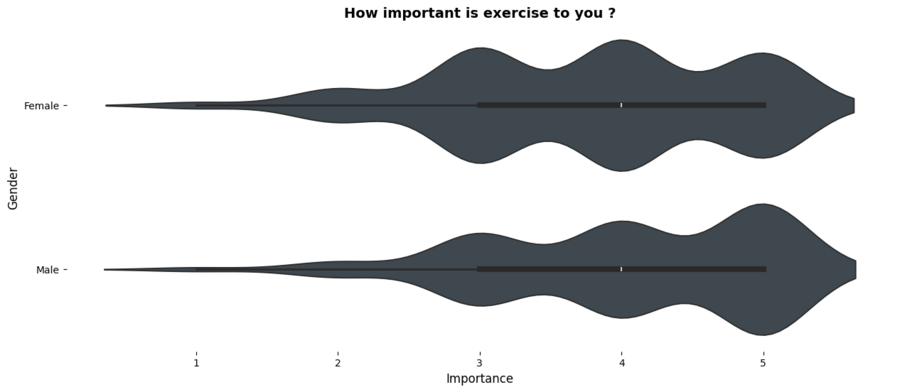
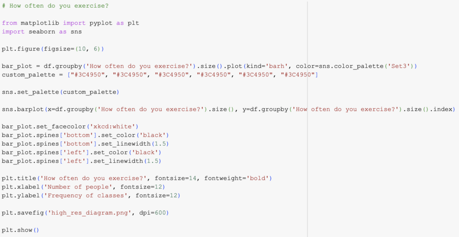
An analysis of the physical activity data showed that, according to the interviewees, the movement is more important for women than for men, but a small part of the population of five hundred people surveyed engage in sports every day, most of them train one or two times per a week. A large proportion of respondents prefer to ride on bicycles, respectively, over long distances. Also, it was possible to detect a trend in heart rate in different people who climbed on defined altitude. To sum up, it is important to note that visualization of data allows people to capture statistics using visual memory, to draw conclusions, and to change their lives to the best.
Description of the application of the generic model
I used the AI to create the cover of the project. The image is generated in Ideogram. Prompt: «Yoga minimalistic futuristization, 3d render, willustratation» https://ideogram.ai/t/explore
To improve infographics, I’ve been looking for help with GPT-ChatBot, because I needed to know the mechanics of the code that creates the style of diagrams. https://gpt-matbot.ru/


