Original size 2087x2971
Rebranding of the Aromate World Shop Network
Longread translated automatically
The project is taking part in the competition
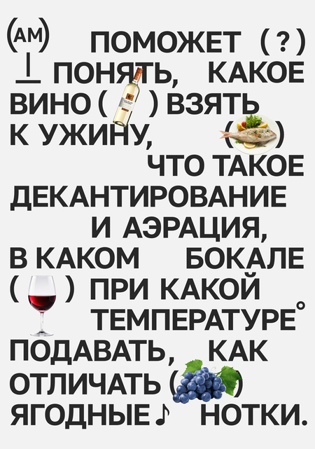
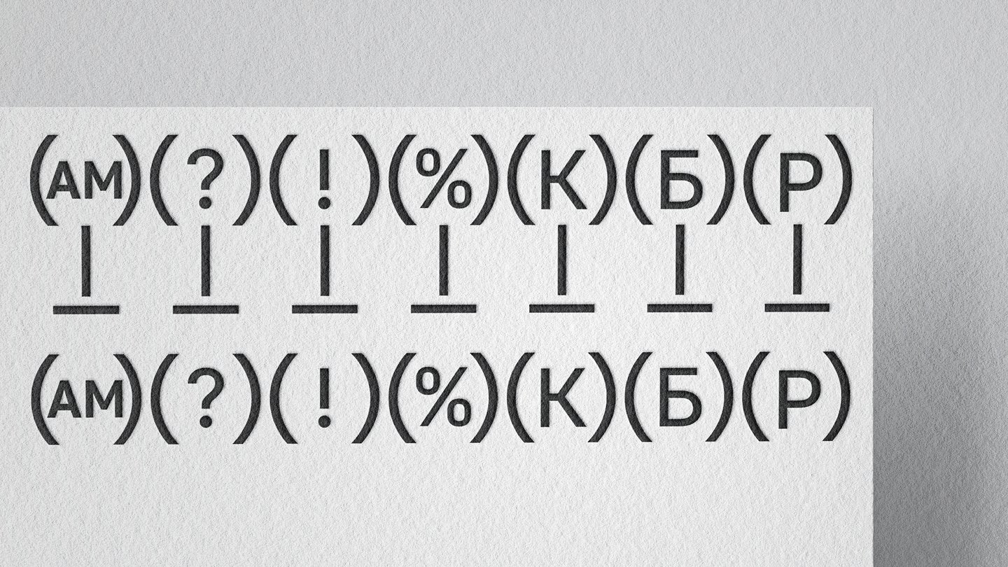
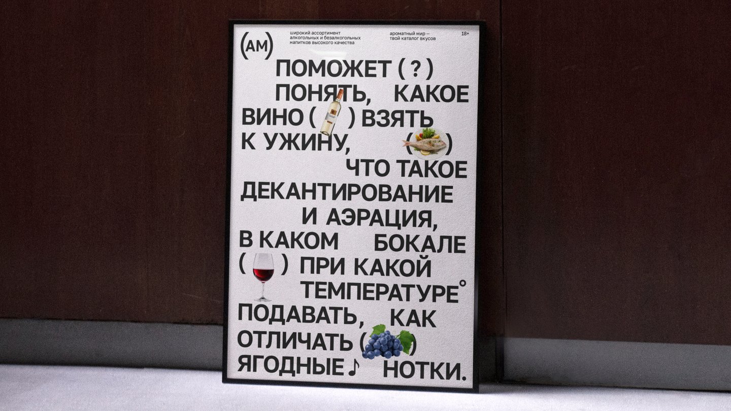
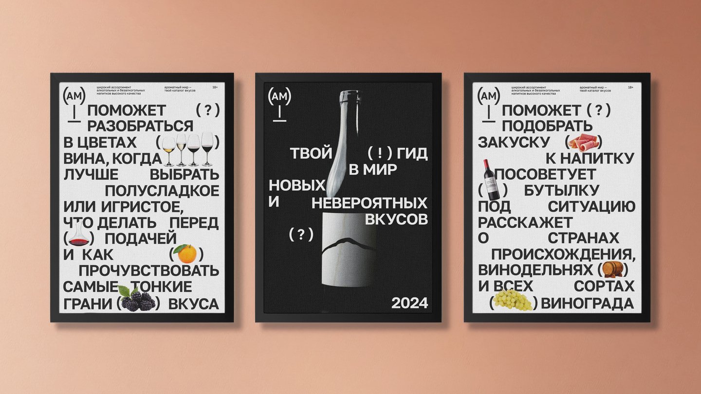
To rebrand the network of stores, < la quo; Aromat World& raquao; a more modern and typographical stylist aimed at people who want to know what they’re drinking. Visual identic language emphasizes structure and understanding through working with text and icon system.
Original size 3500x1969
Original size 3500x1969
Original size 3500x1969
Original size 3500x1969
Original size 3500x1969
Original size 3500x1969
Original size 3500x1969
Original size 3500x1969
Original size 3500x1969
Original size 3500x1969
Original size 3500x1969
Original size 3500x1969
More projects in identity & branding


We use cookies to improve the operation of the website and to enhance its usability. More detailed information on the use of cookies can be fo...
Show more