Perimetry / Eye Open Call

Description
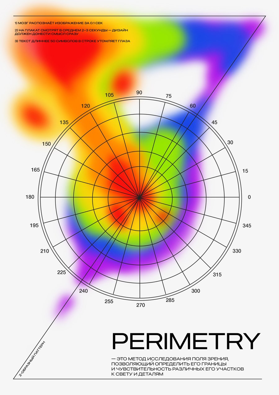
My poster is dedicated to measuring the human field of vision — perimeter. Perimetry studies how we see objects in different parts of our field of vision. Central vision is responsible for detail and colours, and peripheral vision is responsible for motion and general orientation in space. This knowledge helps to create a design that is not only beautiful but also physiologically user-friendly. I want to show how the correct location of the elements, the contrast, and the choice of fonts can guide the viewer’s view naturally, without undue stress. This poster is an attempt to combine scientific knowledge of vision with design practices to create works that will not only be spectacular but also user-friendly.

Annotations
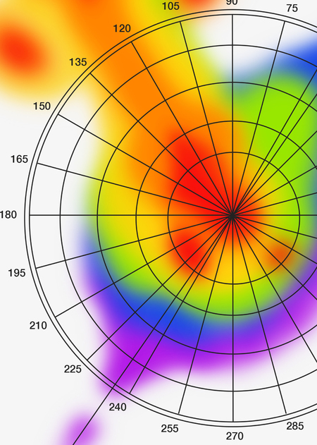
In my poster, I reflected the direction of my eyes on the Z-shaped patherna. The colour spots show the most notable points on the poster, as well as the places that are the first to look at, further highlight the Z-shaped tent. For the text content, I took a low contrast font and not the most subtle one, because our eyes are more sensitive to those fonts. The lines on my poster have a recommended length of no more than 50 characters.
Research