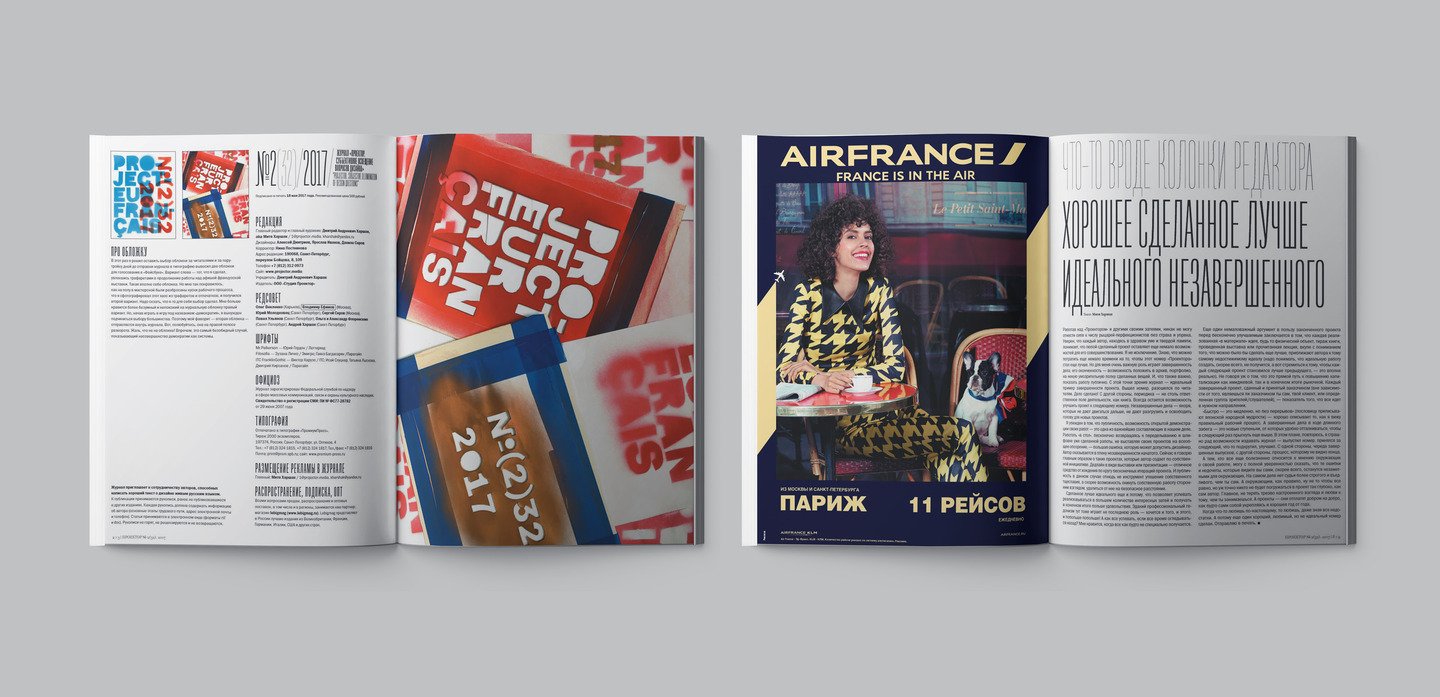
«Projector» magazine. Issue #32
This issue was created within Mitya Kharshaks' curatotial project «Fabriqué en France» in partnership with Institut Français. The exhibition of modern French poster was first shown within the program of the St.Petersburg Design Week. Next, it toured Moscow, Kazan, Petrozavodsk, Ekaterinburg, Chelyabinsk, Pskov and Vladivostok.
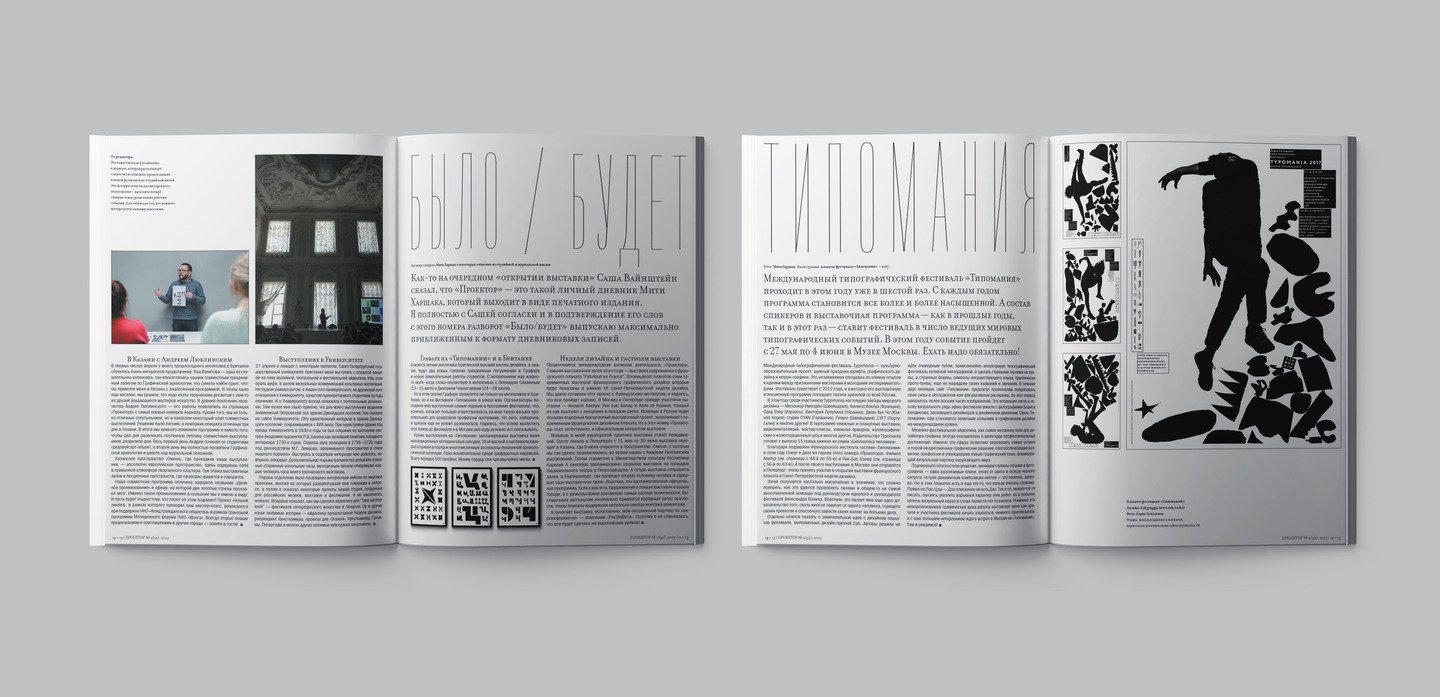
The first readers of this Projector were the participants and guests of Typomania. I believe its posters were a significant professional issue by themselves: «Emphatically planar solution, barely seen flares creating minimal volume in the pictures, freedom from color for the sake of black silhouettes, sharp and dynamic compositions — it certainly sounds great! However, these posters also say something beyond words. I can’t help quoting Lao-Tzu — depictured Dao isn’t Dao. Same here, one may write something to describe the explosive nature of these works, but their very important element immediately gets lost after a single attempt to put an image into words.
Same as the previously published Danish issue, this one is also divided into a historical and contemporary parts. The historical one is introduced by Serge Serov and his text «A Birthplace of a Poster», which numerously coincides with other publications of this issue. For example: «French always causes mishaps. Let alone this is an intranslatable name, it is also unpronounceable. We kept saying the proper [Grapyu] until last year, when I encountered Alex Jordan, one of Grapus activists. He came to Moscow to jury Golden Bee Biennale, and gave me an album calling it [Greipes]. I wondered why /Greipes/ but not [Grapyu], and he said, „Oh, this is how we are called all over the world!“
Mikhail Karasik, our regular contributor and expert in book history of the XX century, talks about the three masterpieces of a French surrealist photobook — the works by Max Ernst, Man Ray and George Yunes. «I believe that conventional printing products — brochures and magazines — were a better solution for surrealism rather than limited editions on handmade paper. In a photobook, surrealists were able to manifest themselves most ingeniously and create something different from livre d’artiste other artists were working on. Conventionally wide circulations of photobooks made them not bibliophilic, which was considered radical art by itself».
Philippe Apeloig: ‘I’m getting pickier than before: there was a time I would accept any offer, and now I’m trying to prioritize them. For example, I have a more careful approach to all kinds of jurying. However, I am still open to different tasks: I like being surprised with an unusual project, such as cooperation with a winery, or designing Sevres porcelain. The subject is not that important, the challenge is what really matters! As for money, any job should be well-paid in a perfect world, but, unfortunately, this isn’t a perfect one…»
Rik Bas Backer: «I have an inspiration box— there are pics I have collected all over these years. I start every new project with this box. It reminds me of what I consider important in design».
Michel Bouvet: «I desperately need to be heard by as many people as possible — in the street, subway or wherever else they see my posters. In a nutshell, a graphic designer should be true, sincere and creative. Money, awards and stardom is just vain rushing around».
Alex Jordan: «Advice? I guess if you have been a student, you’ve already tried forging your own path. Next comes real-world professional life called „learn something new every day“. Less following trends. More of the right environment. Being a designer requires certain responsibilities».
Vincent Perrotet and Annette Lenz: «I’m not keen on earning money just to earn money. I believe making large sums rarely avoids betraying yourself. One of my posters says: „Money rules the fools’ lives“. I can’t do a quality job if I don’t agree with its ideological concept. If a customer tries to force me to do something, I quit».
Alain le Quernec: «I’m trying to be a good graphic designer, because I consider quality design as a decency. A newspaper, which is arranged in a way, comfortable to read, is also design, although no one has ever thought of it. However, I rarely show off with my job, same as my colleagues. I like presenting my posters because I fancy their laconic language. I believe they are a kind of music from the past performed by me. This is my utopia».
Catherine Zask: «I’m potentially interested in anything that gives me food for thought. Creativity is what the world is based on, there’s everything to enhance it. Trends very well mark everything one shouldn’t take up, although it’s a good idea to be aware of them. When being an artist, the only person to tell you what is important is you».


